
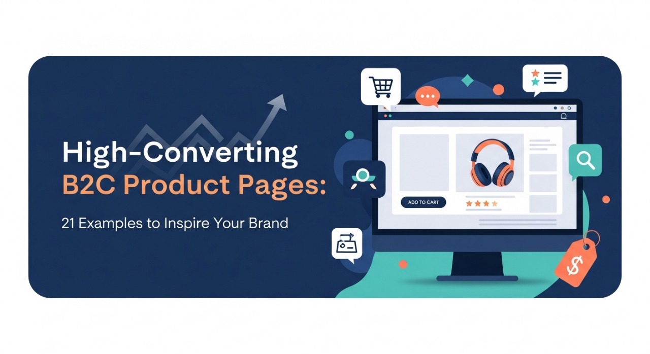
A B2C product page design is more than just a digital storefront; it is the place where customers decide whether to trust your brand and make a purchase. In the competitive online markets of the US and UK, a product page is often the first and last impression a shopper has before buying. If designed well, it can convert casual browsers into loyal customers.
If designed poorly, it can lose sales instantly. Here we will be explaining 21 inspiring examples of high-converting product pages and providing practical lessons to help you design your own.
Why a Strong B2C Product Page Design Matters
Every online shopper lands on a product page with one question in mind: Should I buy this? The way you answer that question determines your conversion rate.
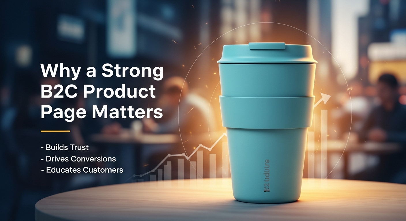
A well-built B2C product page designs does three key things:
- Informs customers clearly – Shoppers want accurate details, benefits, and clear pricing. Without clear information, hesitation grows and sales are lost.
- Builds trust – Reviews, return policies, and transparent shipping information reduce hesitation. Trust signals show customers they are making a safe choice.
- Encourages action – Clear calls-to-action guide customers toward the next step. Bold buttons, persuasive copy, and a friction-free checkout can make the decision effortless.
For the US and UK markets, where online shopping is highly competitive, even small improvements like adding lifestyle images or simplifying shipping details can lead to big results. Customers in these regions expect speed, transparency, and reassurance. Meeting these expectations not only boosts conversions but also strengthens brand loyalty.
Core Elements of a High-Converting B2C Product Page Designs
Before discussing examples, let’s understand the key elements every successful page should include:
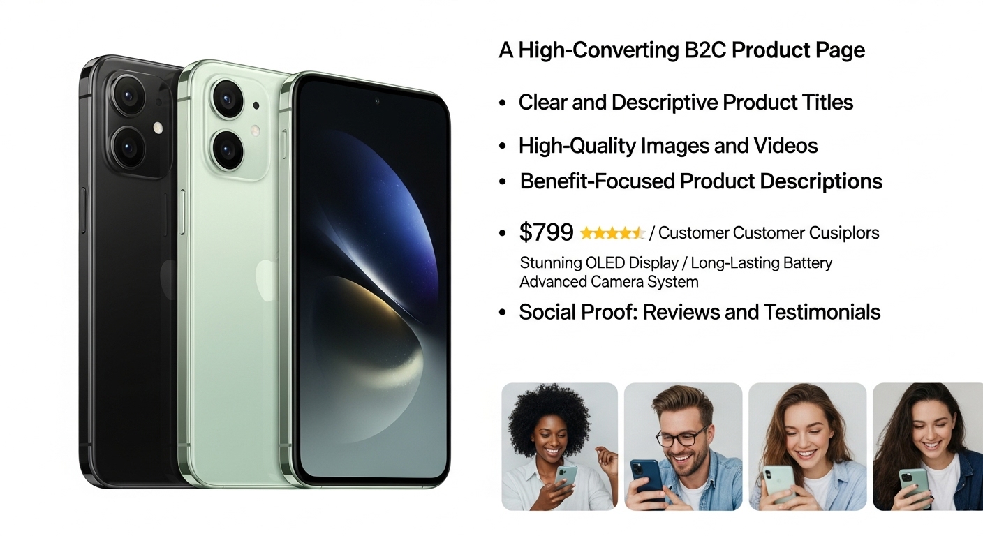
Clear and Descriptive Product Titles
Shoppers don’t want to guess. A straightforward title helps them know exactly what they’re buying. Adding relevant keywords can also improve search visibility, ensuring your product is easier to find.
High-Quality Images and Videos
Visuals bring products to life. Multiple angles, close-ups, and lifestyle images help customers imagine the item in their own lives. Videos can demonstrate use cases, making the product more relatable and easier to understand.
Benefit-Focused Product Descriptions
Instead of only listing features, explain why the product matters. How will it make the customer’s life easier, better, or more enjoyable? Use storytelling where possible to connect emotionally with buyers.
Social Proof: Reviews and Testimonials
Most buyers trust customer reviews as much as personal recommendations. Display them prominently. Including star ratings, verified purchase labels, and photos from real customers further increases trust.
Transparent Pricing and Shipping Details
Hidden costs are one of the biggest reasons for abandoned carts. Always list prices, shipping times, and return options clearly. Offering free shipping thresholds or clear delivery estimates can further encourage purchases.
Prominent Calls-to-Action (CTAs)
Buttons like “Add to Cart” or “Buy Now” should stand out. Use bold colors, clear wording, and place them above the fold. Adding urgency, like “Limited Stock,” can also drive quicker decisions.
Mobile Optimization
With most shoppers in the US and UK browsing on phones, a mobile-friendly B2C product page is essential. Responsive design, thumb-friendly buttons, and easy navigation make the buying process smoother on smaller screens.
Fast Loading Speeds
Slow pages lose buyers. Studies show even a one-second delay can reduce conversions by up to 7%. Optimize images, use reliable hosting, and reduce unnecessary code to keep your product pages fast and seamless.
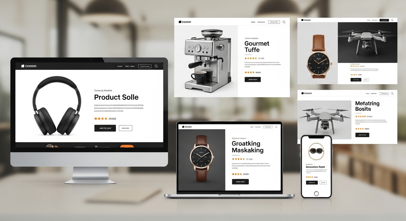
21 Inspiring Examples of High-Converting B2C Product Pages
Let’s discuss real-world examples and what you can learn from them.
1. Apple – Minimalism and Clarity
Apple uses large, high-quality visuals with minimal text. Their B2C product pages keep the focus on the product, making it look premium. Each page includes clean white space, smooth scrolling effects, and interactive product previews. Apple rarely overwhelms with technical jargon instead, they highlight the emotional value of their products, like how an iPhone fits into daily life or how AirPods make listening effortless.
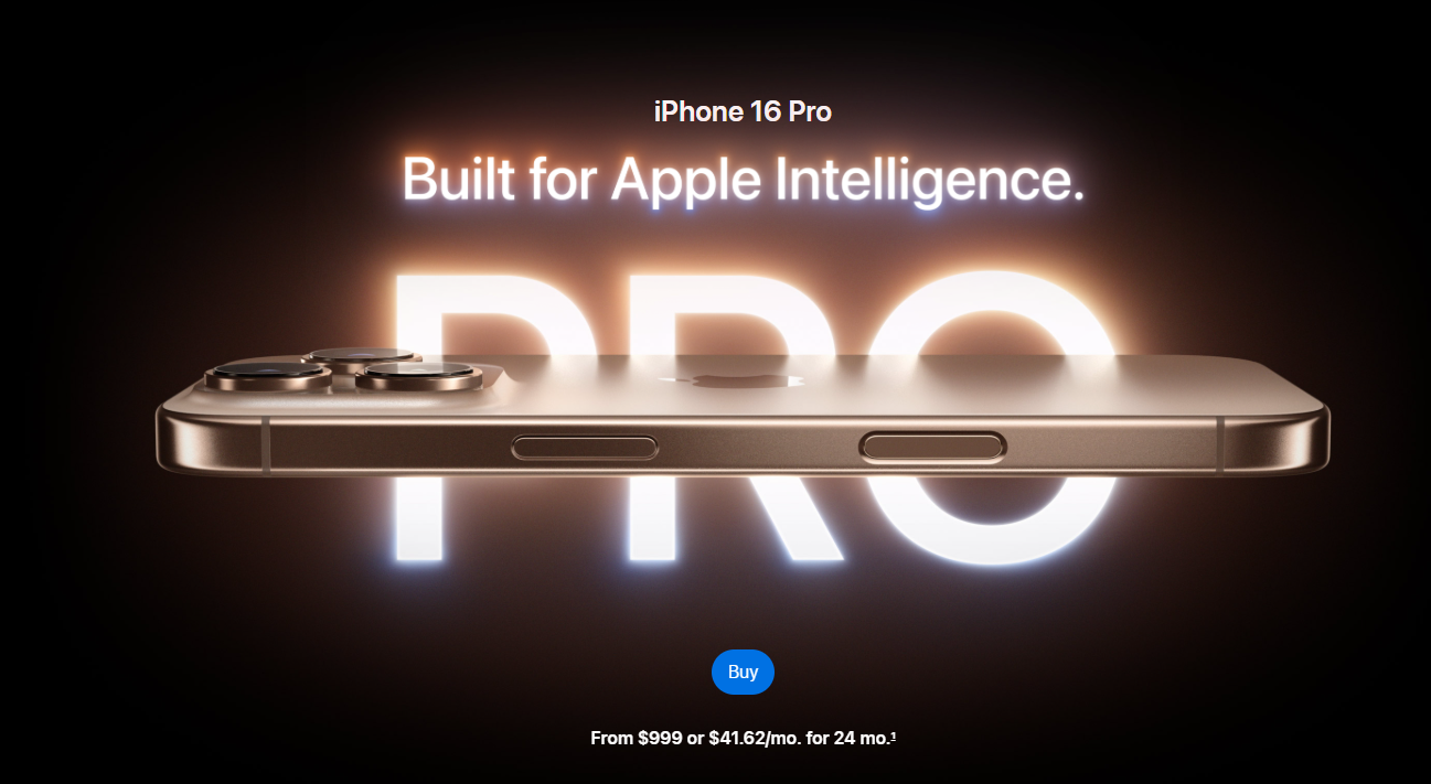
Lesson: Less can be more when your visuals are strong enough. By stripping away clutter and focusing on quality design, you can create a sense of exclusivity and elegance that appeals to modern shoppers.
2. Nike – Personalized Shopping
Nike allows customers to customize sneakers by choosing colors, patterns, and materials. Their product pages also highlight exclusive collections and collaborations. The visuals update instantly as shoppers make their selections, creating a sense of control and excitement.
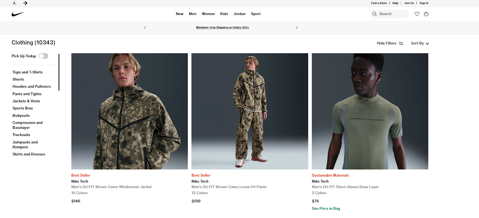
Lesson: Personalization drives engagement. Offering customization options can make customers feel connected to their purchase.
3. Warby Parker – Virtual Try-On Tools
Warby Parker reduces hesitation with a virtual try-on feature that uses augmented reality. Customers can instantly see how glasses look on their own faces. Combined with home try-on options and detailed measurements, the page removes the biggest barrier in online eyewear shopping.
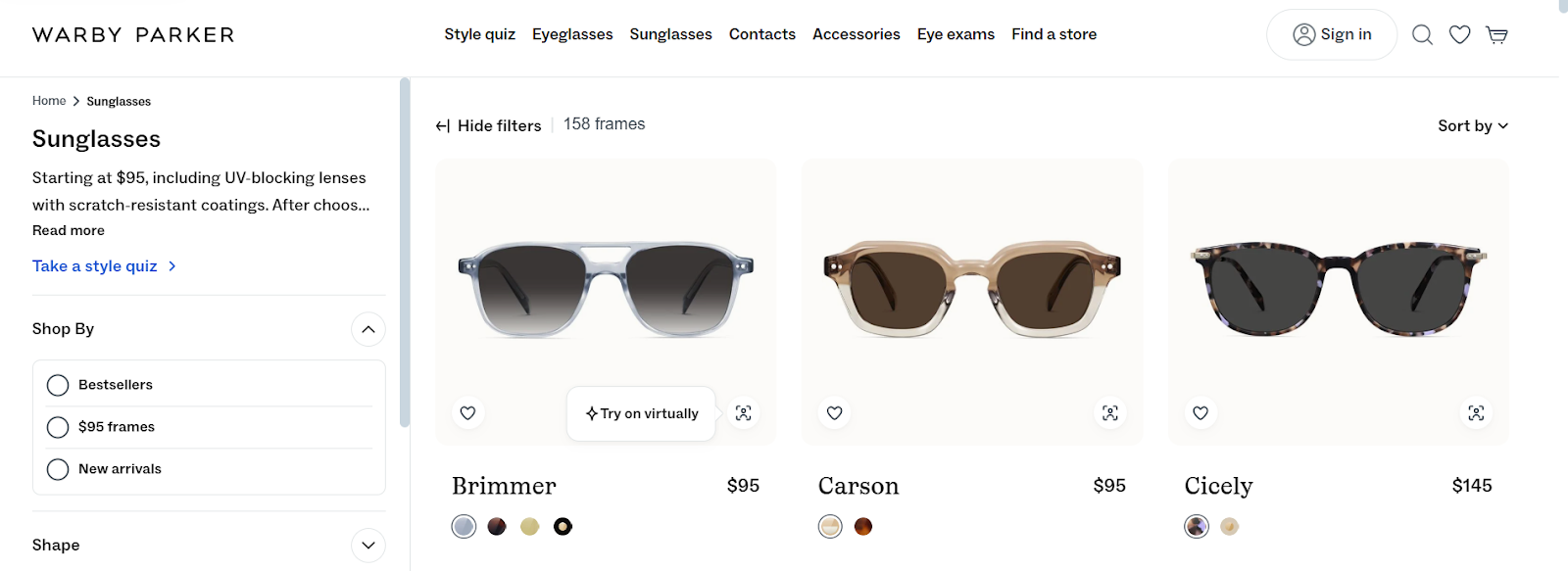
Lesson: Use technology to remove buying doubts and increase confidence.
4. ASOS – Fit Confidence
ASOS tackles the challenge of sizing with interactive size guides, customer reviews on fit, and photos of real people wearing items. They even include height and size details from reviewers for greater clarity.
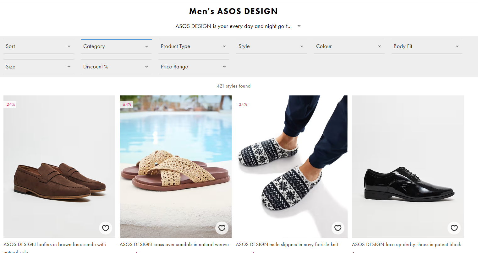
Lesson: Reducing size-related uncertainty decreases returns and builds buyer trust.
5. Glossier – Relatable Copywriting
Glossier writes descriptions that feel conversational and approachable. Instead of overloading with scientific jargon, they use fun, human-like descriptions that highlight real benefits. Their images feature diverse models, which helps shoppers feel represented.
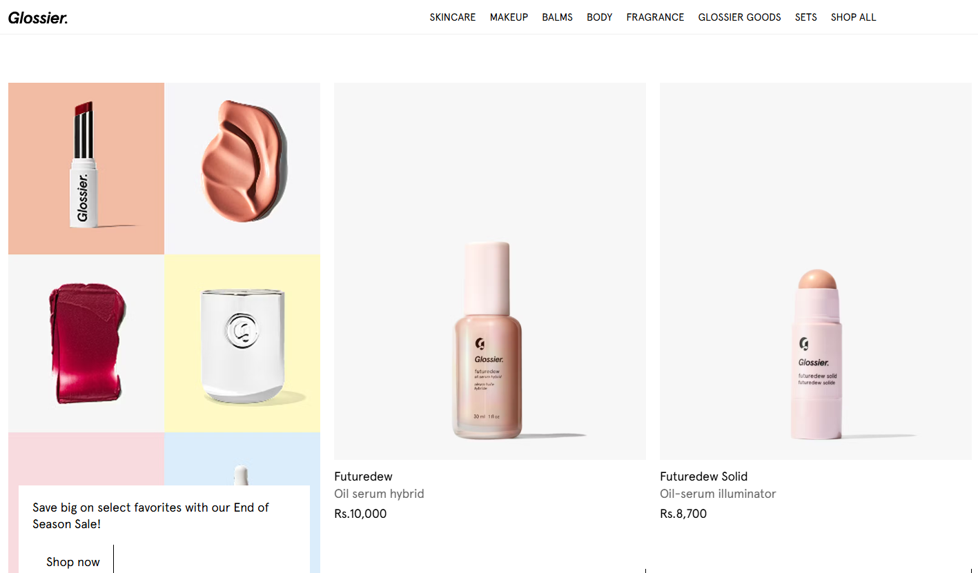
Lesson: Authentic, relatable language builds emotional connections.
6. Casper – Transparent Pricing
Casper openly breaks down mattress costs, shipping times, trial periods, and return policies. The clear explanations of what’s included in the price make customers feel reassured. They also highlight comfort benefits with relatable lifestyle photos.
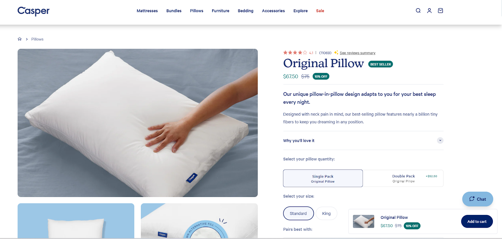
Lesson: Transparency reduces purchase anxiety and builds loyalty.
7. Allbirds – Sustainability Storytelling
Allbirds weaves its eco-friendly mission into every product page, detailing the natural materials used. Icons and short text explain carbon footprint, while lifestyle photos position products as stylish and sustainable.

Lesson: Align product benefits with brand values to appeal to conscious shoppers.
8. Made.com – Real-Life Context
Made.com goes beyond product shots by showing furniture inside styled homes. Their images are designed like catalog spreads, making it easy for buyers to picture items in their own space. They also include detailed product specifications.
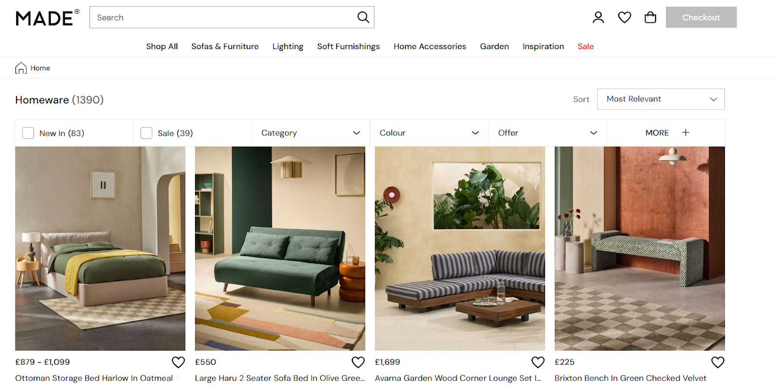
Lesson: Contextual images inspire and guide purchase decisions.
9. Amazon – Everything in One Place
Amazon provides everything: images, technical specs, FAQs, customer reviews, and related products all on one page. With millions of customers relying on reviews, the trust factor is extremely high.

Lesson: Centralize product information to minimize distractions and keep customers on the page.
10. Sephora – Customer-Centric Reviews
Sephora enhances reviews by allowing customers to filter feedback based on skin type, age, and product concerns. They also feature product photos uploaded by customers, adding authenticity.
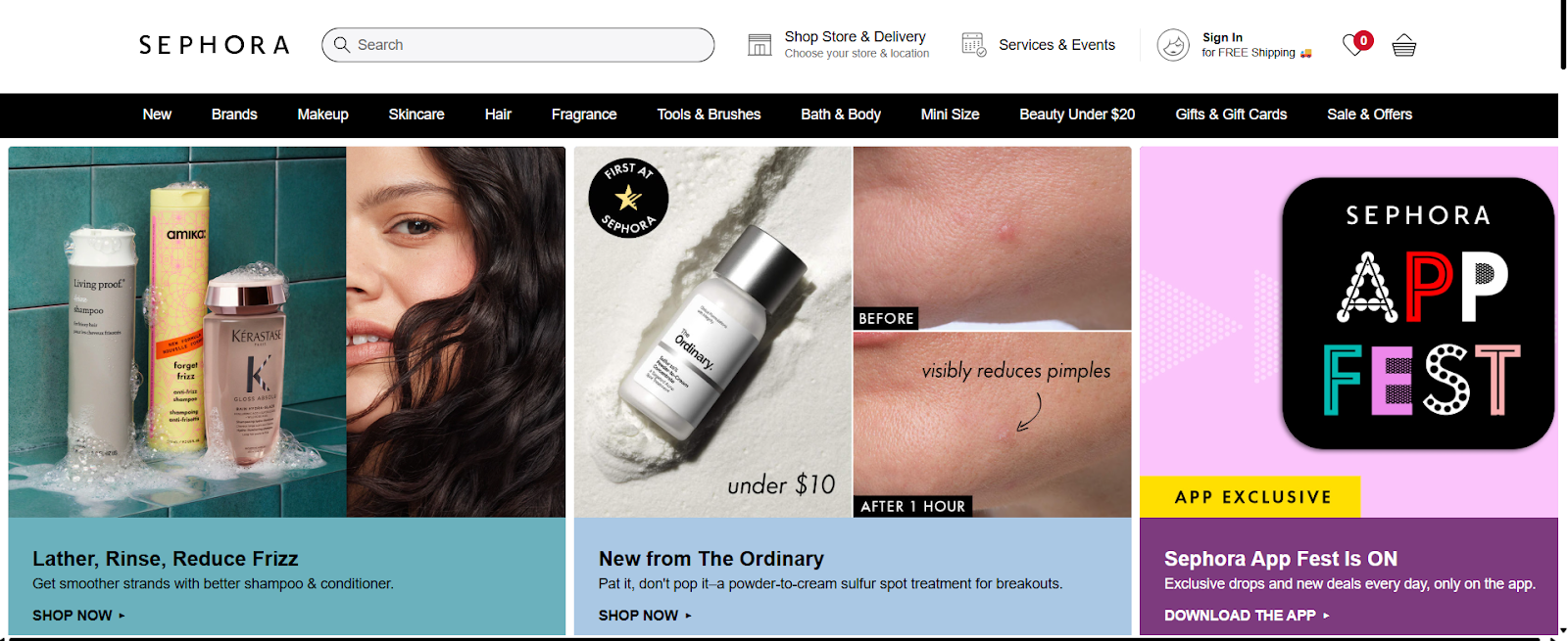
Lesson: Organizing reviews makes them more useful and increases purchase confidence.
11. Zara – Elegant Simplicity
Zara relies on high-quality visuals with plain backgrounds. Descriptions are short, but the overall product presentation aligns perfectly with their minimal brand style. The page layout makes shopping fast and easy.
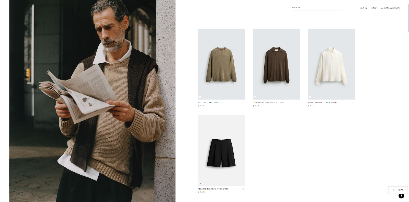
Lesson: Match your product page design with your brand identity.
12. Patagonia – Purpose-Driven Messaging
Patagonia highlights its eco-conscious mission in every product listing, explaining materials, sourcing, and company values. Each purchase feels like supporting a cause, not just buying clothes.
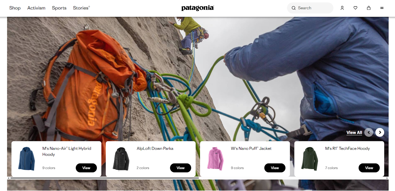
Lesson: Customers connect deeply with brands that stand for something.
13. Bose – Interactive Demos
Bose simplifies complex tech features with animations and motion graphics. Their product pages explain advanced audio technology in ways anyone can understand.
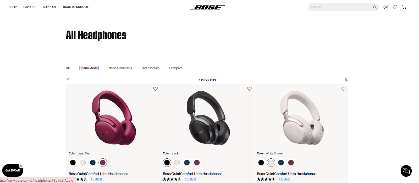
Lesson: Make complicated features easy to grasp with visuals and demos.
14. Peloton – Selling a Lifestyle
Peloton goes beyond selling bikes by highlighting the community, workouts, and sense of achievement. Their product pages feature testimonials, lifestyle images, and real stories from users.
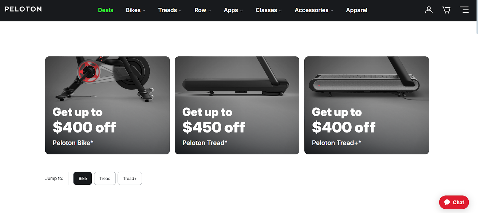
Lesson: Focus on lifestyle outcomes, not just product features.
15. Etsy – Seller Transparency
Etsy emphasizes seller stories, shop ratings, and the handmade nature of products. This transparency fosters trust and adds human warmth to each page.

Lesson: People buy from people. Personalizing sellers builds buyer confidence.
16. Dr. Martens – Easy Returns
Dr. Martens highlights hassle-free returns, making it easy for customers to feel comfortable ordering shoes online. They also include detailed product sizing and fit notes.
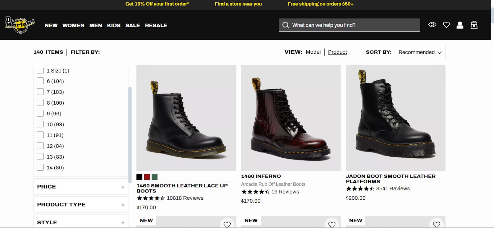
Lesson: Address post-purchase concerns upfront to reduce hesitation.
17. Lego – Engaging Videos
Lego uses videos to show sets in action. Seeing the product being built or played with sparks imagination and increases purchase desire for both kids and parents.
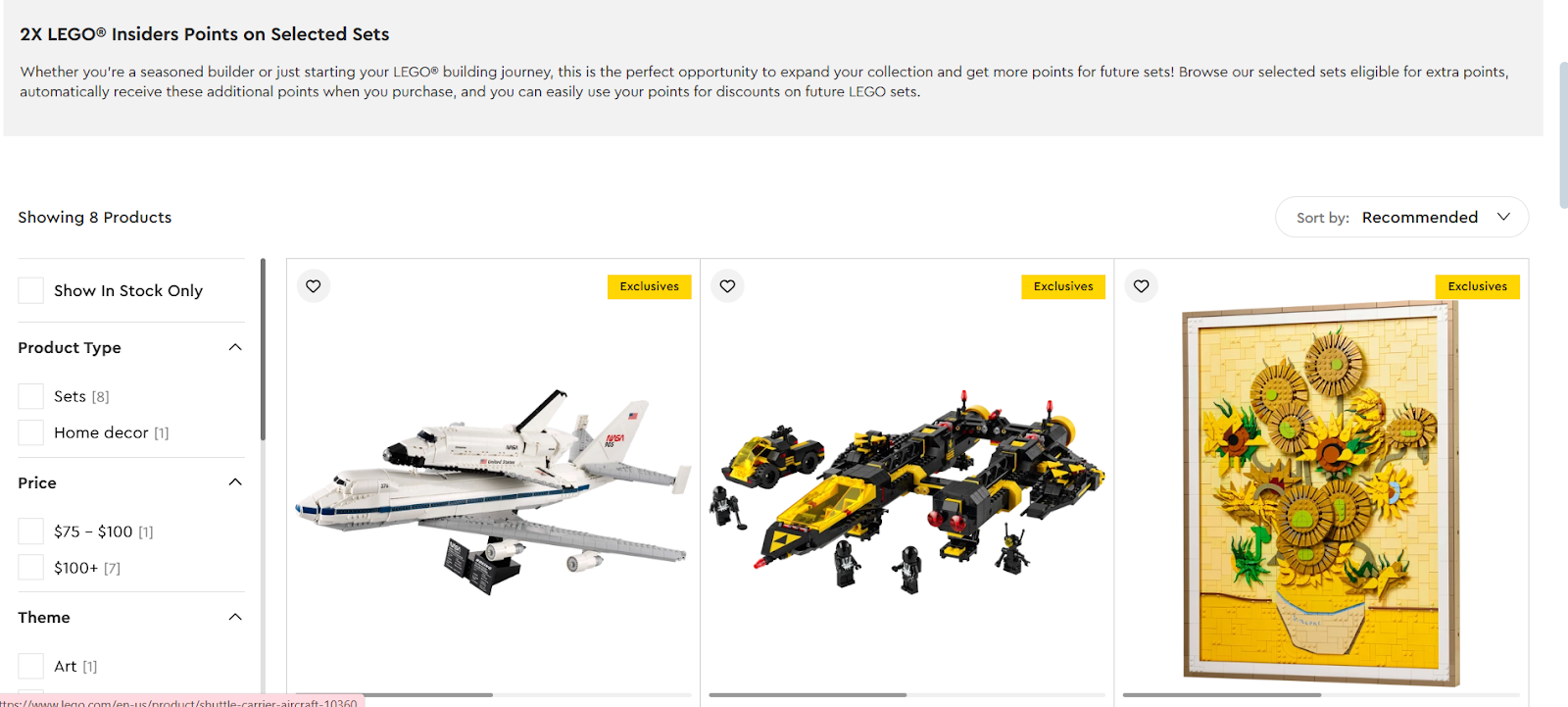
Lesson: Demonstrations inspire confidence and excitement.
18. REI – Expert Guidance
REI adds buying guides, product comparisons, and expert recommendations directly on product pages. These additions provide extra value for outdoor enthusiasts looking for trusted advice.
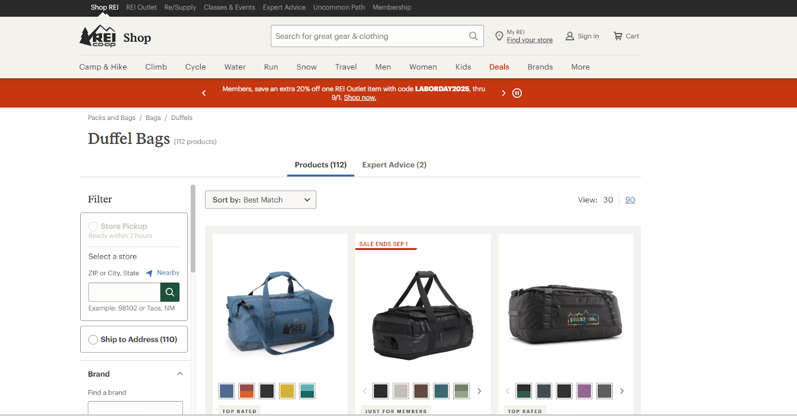
Lesson: Providing expert content establishes authority and trust.
19. Dyson – Innovation Highlighted
Dyson showcases product innovations with 3D animations, close-ups, and detailed descriptions. The visuals make complex engineering easy to understand.
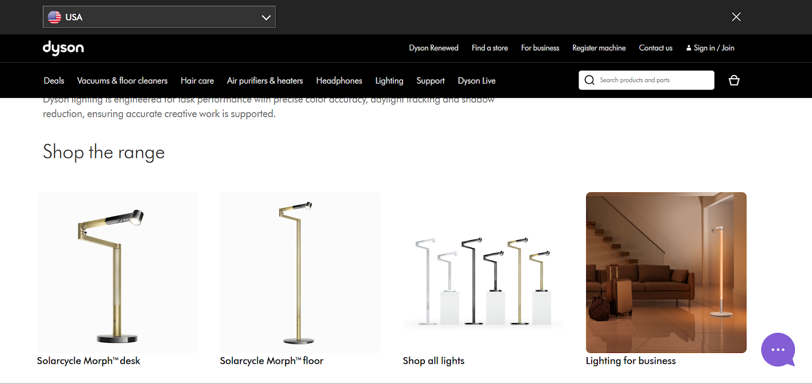
Lesson: Emphasize unique product features that set you apart from competitors.
20. HelloFresh – Simple Subscription Clarity
HelloFresh explains subscription plans with clear visuals and FAQs. Customers understand what they’re signing up for.
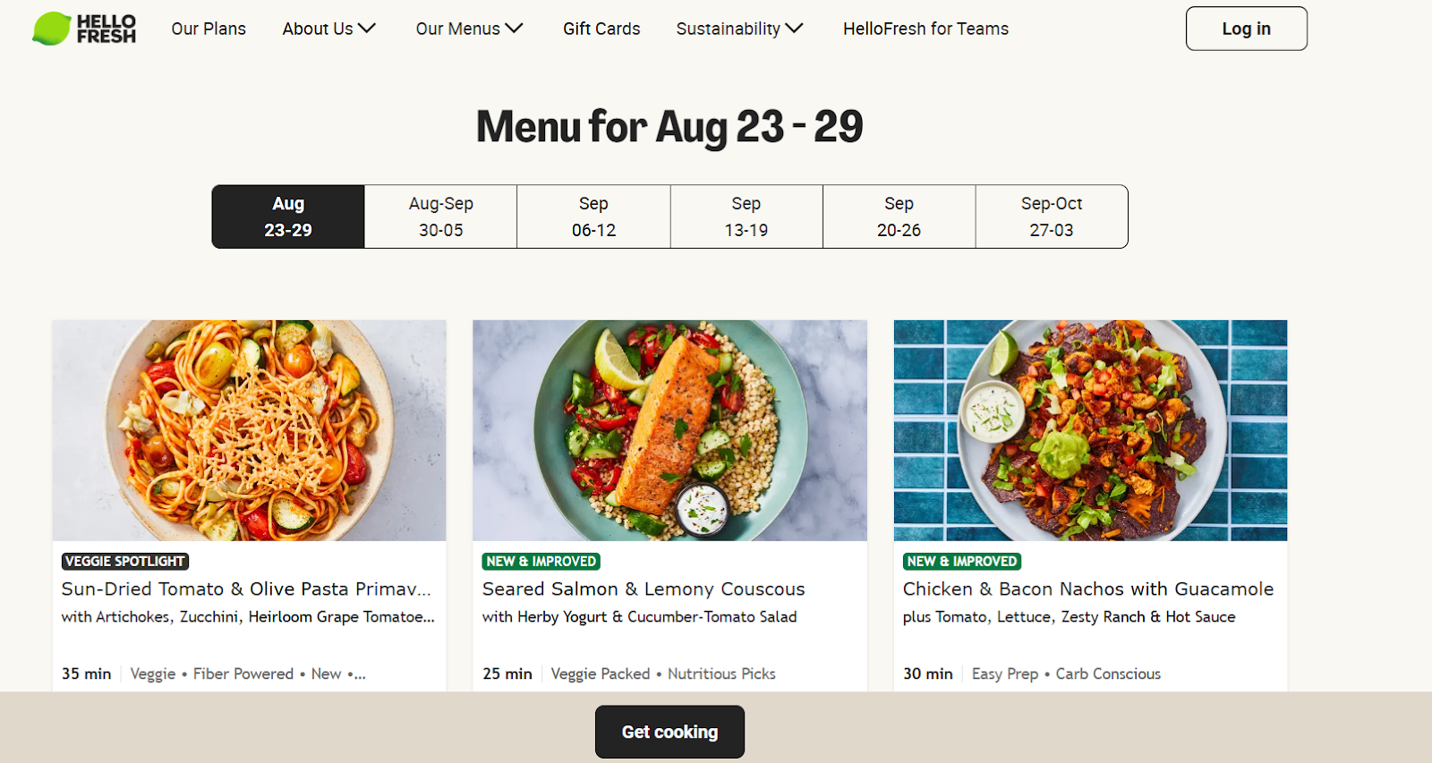
Lesson: Simplify complex buying models.
21. Gymshark – Influencer Trust
Gymshark integrates social proof by displaying influencer content directly on product pages.
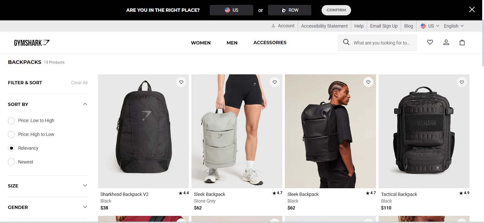
Lesson: Leverage community trust to drive sales.
Lessons From High-Converting B2C Product Pages
From these examples, several lessons emerge:
- Simplicity wins: Clear design and straightforward text convert better.
- Visuals are powerful: Photos, videos, and demos make products real.
- Trust is essential: Reviews, policies, and transparency reassure buyers.
- Personalization works: Customers value tailored experiences.
How to Apply These Strategies to Your Own B2C Product Page
Know Your Audience
In the US and UK, shoppers expect fast shipping, flexible returns, and high-quality visuals. Cater to their preferences.
Invest in Professional Photography
Images are often the first thing shoppers notice. Clear, high-quality images improve confidence instantly.
Use Strong Calls-to-Action
Buttons should stand out visually and use action-oriented wording.
Optimize for SEO
Use your focus keyword naturally. Add descriptive alt text to images and craft clear meta titles and descriptions.
Keep Pages Fast and Mobile-Friendly
Speed and mobile optimization aren’t optional; they’re critical for conversions.
Regularly Update Pages
Review pages often to ensure descriptions, images, and reviews stay fresh.
Final Thoughts
A B2C product page design is not just about showing a product; it’s about creating a complete buying experience. The best product pages combine strong visuals, compelling storytelling, and transparent information to guide customers toward a purchase. The 21 examples above prove that clarity, trust, and creativity are the foundation of high conversion rates. By applying these strategies, your brand can build product pages that stand out in the US and UK markets, inspire confidence, and most importantly, convert visitors into loyal customers.
Book a meeting with us today to kickstart your Idea.

.webp)


.svg)
.svg)
.svg)
.svg)
