
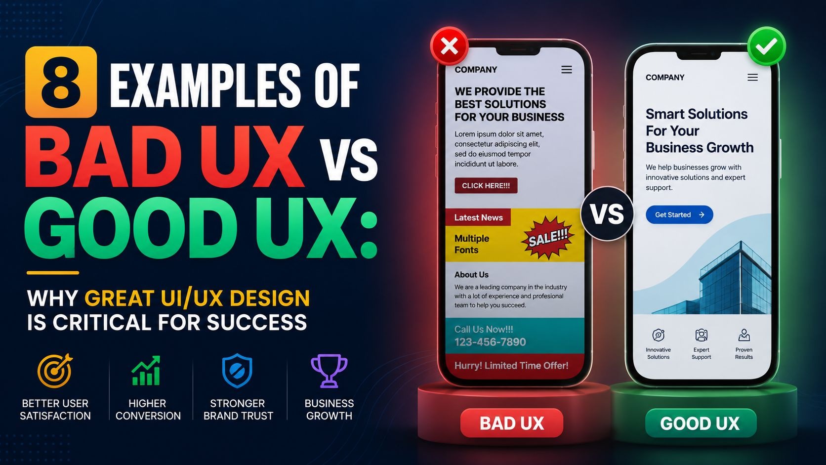
Bad UX vs good UX is not just a design debate. It is a business outcome. When users land on your website or open your app, they decide within seconds whether to stay or leave. That decision is shaped entirely by how your product feels to use. Poor design drives users away, hurts your credibility, and costs you revenue.

Great UI/UX design removes friction. It makes every step feel obvious, every click feel rewarding, and every task feel fast. Across industries, the companies that invest in user experience grow faster, retain more customers, and earn stronger reviews. The ones that ignore it pay the price. Below, we will discuss 8 real examples that show exactly what the difference looks like.
What Is Bad UX vs Good UX?
User experience (UX) is the full journey a person takes when interacting with a digital product. It covers navigation, page speed, content layout, forms, error messages, and every micro-interaction in between.
Bad UX makes users work harder than they should. It confuses them, hides key information, breaks expectations, or adds steps that serve the company rather than the user. The result is frustration, drop-offs, and negative word-of-mouth.
Good UX removes those obstacles. It anticipates what users need and delivers it with minimal effort. It builds trust, increases conversions, and turns first-time visitors into loyal customers.
Here is the biggest truth in digital design: users do not read manuals. They expect your product to guide them naturally. When it does not, they leave.
Why RSA Creative Studio’s Designs are Best for Good UX
RSA Creative Studio's recent designs are excellent examples of modern UX done right. Their work combines clean layouts, intuitive navigation, clear visual hierarchy, and strategically placed calls to action that help users achieve their goals with minimal effort.
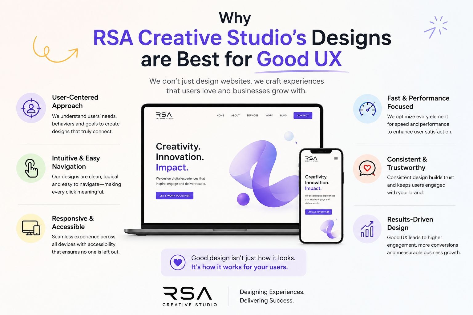
Key strengths include:
- Simple, user-friendly interfaces
- Clear content organization
- Mobile-responsive design
- Consistent branding and visual elements
- Friction-free user journeys
These principles improve usability, build trust, and increase engagement. When you will review the examples below, you'll notice that many of the same UX practices used by RSA Creative Studio are shared by the brands recognized for delivering great user experiences.
8 Companies and Their UX Verdict
1. E-Commerce Niche: Apple (Good UX) vs Confusing Product Pages
What Apple Gets Right on Its Product Comparison Pages
Apple's product comparison page is one of the clearest examples of good UX design in e-commerce. When you visit their site to compare iPhone or MacBook models, the layout thinks for you.
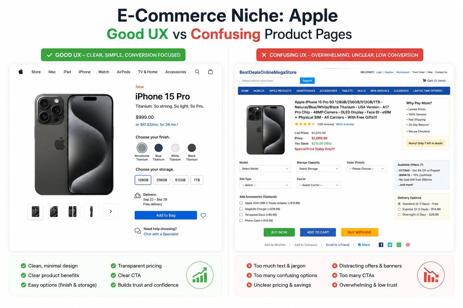
Here is what makes it work:
- The base price and "Buy" button appear at the very top of each product column.
- A "Quick Look" section shows the most important specs immediately below.
- As you scroll, each product name stays anchored to the top of its column. You never lose track of which specs belong to which device.
- Dropdown menus at the top let you swap out any product for a different model without reloading the page.
For expensive, technical products, comparison shopping matters. Apple built its UX around that truth. The page is organized in a hierarchy that matches how real shoppers think: price first, key features second, technical details third.
The lesson here is simple. When your product is complex or expensive, your UX has to do the heavy lifting. Dumping every feature onto a page without structure forces users to do work they did not sign up for. Apple eliminates that problem.
The Bad UX Pattern It Replaces
Many e-commerce brands load product pages with dense specifications, inconsistent layouts, and CTAs buried far below the fold. Users who cannot quickly answer "which product is right for me?" will leave to find an answer elsewhere, often on a competitor's site.
Key takeaway for e-commerce brands:
- Place pricing and primary CTAs above the fold.
- Group specifications by what matters most to buyers, not what is easiest to list.
- Anchor product names when users scroll through comparisons.
2. HR / SaaS Niche: Workday (Bad UX) vs Glassdoor (Good UX)
How Workday's Job Application Process Drives Users Away
Workday has established itself as a globally recognized HR platform, serving companies with comprehensive workforce management tools. It is also one of the most criticized for its bad UX design. The core problem lies in its job application flow.
When a candidate applies for a job through Workday, they are asked to retype every piece of information already on their uploaded resume. Work history, education, dates, references, all of it. The platform has an "Autofill with Resume" feature, but it regularly puts information in the wrong fields, skips entries, or scrambles dates. Users end up editing anyway, which defeats the entire purpose.
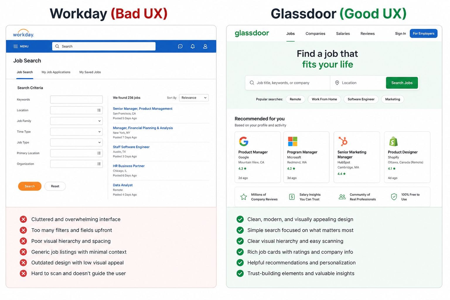
The result? Workday holds a 1.1 rating on Trustpilot. Comments across LinkedIn and forums include phrases like "I stopped applying for jobs that use Workday." That is not a small complaint. That is, users actively avoid companies because of a tool that those companies chose to use. The bad UX on Workday's platform became a negative signal for the employers using it.
How Glassdoor Fixes the Same Problem
Glassdoor's application process takes the opposite approach. Its flow is:
- Add contact and location information.
- Upload your resume once.
- Answer questions the employer specifically requested.
- Review and submit.
That is it. No redundant fields. No broken autofill. No re-entering data that the system already has. Glassdoor respects the user's time, and that respect builds trust.
Key takeaway for SaaS and HR platforms:
- Never ask users for information they have already provided.
- Test autofill features thoroughly before release. A broken feature is worse than no feature.
- Friction in onboarding or key workflows kills adoption rates.
3. Travel Niche: Ryanair (Bad UX) vs Booking.com (Good UX)
Ryanair's Checkout: A Masterclass in Frustrating Design
Ryanair is notorious for bad UX in the travel industry. The airline's booking process is designed around hidden costs and forced opt-outs rather than a smooth customer journey.
During checkout, users must actively deselect pre-ticked seat upgrades, travel insurance, and priority boarding add-ons. If you miss one, you pay for it. The interface presents these add-ons in ways that blur the line between mandatory and optional. The "skip" options are often small, low-contrast text placed near the edges of the screen.
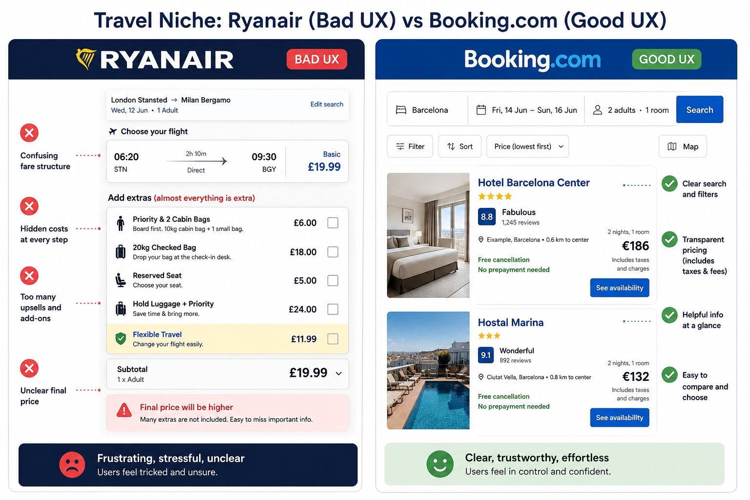
There is also the infamous "Choose a seat" step. To avoid paying for seat selection, users must scroll to the very bottom of the seat map and find a hidden "Don't reserve a seat" link. Most users miss it. Ryanair collects revenue from that confusion. But that revenue comes at a direct cost to trust.
These are not design accidents. They are deliberate dark patterns, design choices that benefit the company at the user's expense. They work short-term but destroy long-term brand loyalty.
What Booking.com Does Differently
Booking.com keeps its checkout flow transparent. Prices are broken down clearly before payment. Add-ons are presented as genuine choices, not pre-ticked traps. Filters on the search page work intuitively. The confirmation screen is clean and leaves no ambiguity about what was booked.
The platform also uses real-time social proof ("8 people looking at this right now") effectively, without hiding core pricing information behind urgency tactics.
Key takeaway for travel brands:
- Dark patterns generate short-term revenue and long-term churn.
- Transparent pricing increases conversion rates and reduces chargebacks.
- Pre-ticked add-ons are a major source of user complaints and trust damage.
4. Messaging / Social Apps Niche: WhatsApp (Bad UX) vs Telegram (Good UX)
WhatsApp's "Delete for Everyone" Problem
WhatsApp's bad UX example is subtle but reveals a bigger design principle: your copy must match what your feature actually does.
The "Delete for Everyone" button implies a message will disappear completely from both sides of the conversation. What actually happens is that the message text is replaced with "This message was deleted." The recipient sees that notification, knows something was sent, and often wonders what it was.
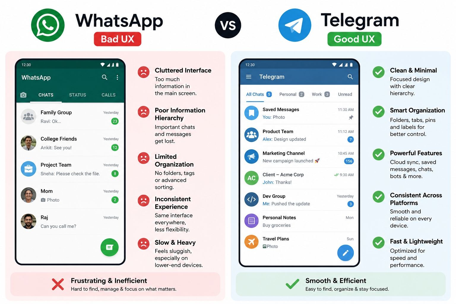
For users who need to retract an accidental message sent to the wrong person, this creates exactly the awkward situation they were trying to avoid. The feature exists, but the copy creates false expectations. That gap between what users believe will happen and what actually happens is a core UX failure.
How Telegram Handles the Same Feature
Telegram's "Delete for Everyone" works exactly as the name implies. The message disappears from both sides without leaving a trace. There is no replacement text. No notification. The conversation continues as if the message was never sent.
That is not a minor technical difference. It is a complete alignment between user expectation and product behavior. When a feature does what users expect it to do, trust in the product grows.
Key takeaway for messaging and social platforms:
- UX copy must set accurate expectations, not aspirational ones.
- When a feature cannot deliver what its name promises, rename it.
- Small copy decisions shape how users feel about your entire product.
5. Productivity / SaaS Niche: Microsoft Teams (Bad UX) vs Slack (Good UX)
Microsoft Teams' Interface Overload
Microsoft Teams has improved significantly over the years, but it still carries a reputation for bad UX design rooted in interface clutter. Open Teams in a large organization, and you see two sidebars, a horizontal menu, channel lists, chat threads, activity feeds, and calendar tabs all competing for attention at once.
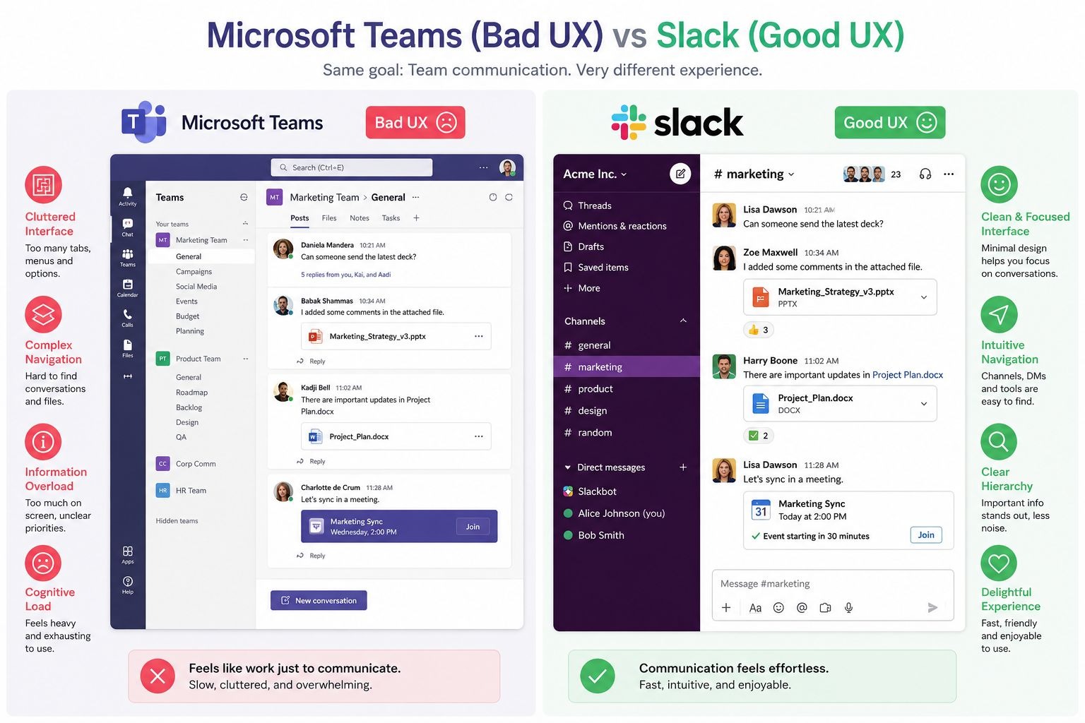
For new users, the onboarding experience is especially overwhelming. There is no clear starting point. Nothing is prioritized. The interface presents everything equally, which means users feel lost from day one.
This is a classic case of cognitive overload: too many choices on screen at once, none of them clearly weighted by importance. Research in UX consistently shows that cognitive overload increases error rates and decreases task completion.
How Slack Gets It Right
Slack keeps its core navigation simple. The left sidebar shows workspaces, direct messages, and channels. The main content area is focused. New features are introduced progressively, not dumped on the user upfront.
When Slack added features like Huddles, clips, and Canvas, they integrated them without disrupting the core navigation. That is a discipline that keeps the interface feeling clean even as the product grows more capable.
Key takeaway for SaaS and productivity tools:
- Show users one primary action at a time during onboarding.
- Add features progressively. Do not surface everything at once.
- A clean interface is a product decision, not just a design preference.
6. EdTech Niche: Duolingo (Good UX) vs Cluttered Learning Platforms
Why Duolingo's UX Keeps Users Coming Back
Duolingo is one of the best examples of good UX design in the education technology space. Its product is built around one psychological insight: habit formation requires low friction and visible progress.
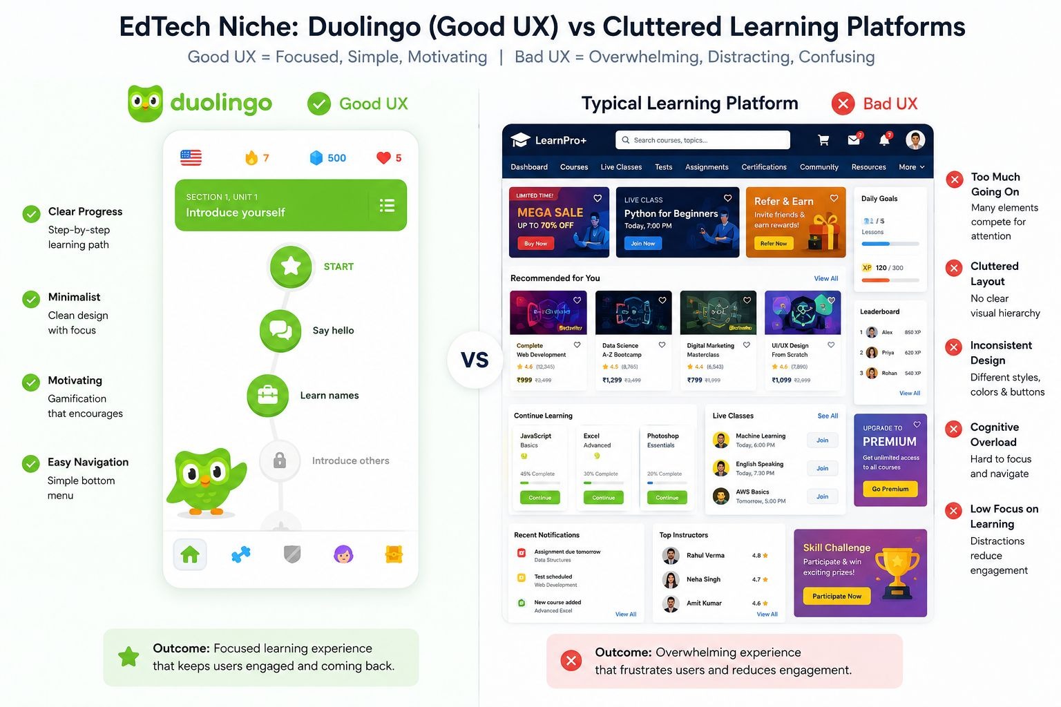
Here is what Duolingo does better than most learning platforms:
- Lessons are short (3 to 5 minutes), so users never feel like they do not have time.
- The streak system creates a daily commitment without punishment that feels too harsh early on.
- Progress bars and XP counters give constant visual feedback. Users always know where they stand.
- Mistakes are corrected instantly with brief, friendly explanations rather than failing the user and starting over.
- The interface uses consistent colors, icons, and placement across every screen. There are no surprises.
The result is a retention rate that most EdTech platforms envy. Users who open Duolingo once tend to come back. The design made that return feel natural.
The Bad UX Pattern in Most Learning Platforms
Contrast Duolingo with legacy learning management systems or many online course platforms. Long video lectures with no checkpoints. Progress bars that only update at module completion. No micro-feedback. Quiz interfaces that look like they were built in 2009 and have not changed since.
Users do not abandon these platforms because the content is bad. They abandon them because the experience makes learning feel like a chore.
Key takeaway for EdTech brands:
- Break content into short, complete units. Small wins drive continued engagement.
- Use progress indicators that update frequently, not just at major milestones.
- Consistency in visual design reduces cognitive load and speeds up learning.
7. Fintech / Developer Tools Niche: Stripe (Good UX) vs Cluttered Competitors
Why Stripe's Homepage Is a UX Benchmark
Stripe serves developers and business owners, two audiences with very different needs. Its homepage manages both without confusing either. That is not easy to achieve, and it makes Stripe a textbook example of good UI/UX design.
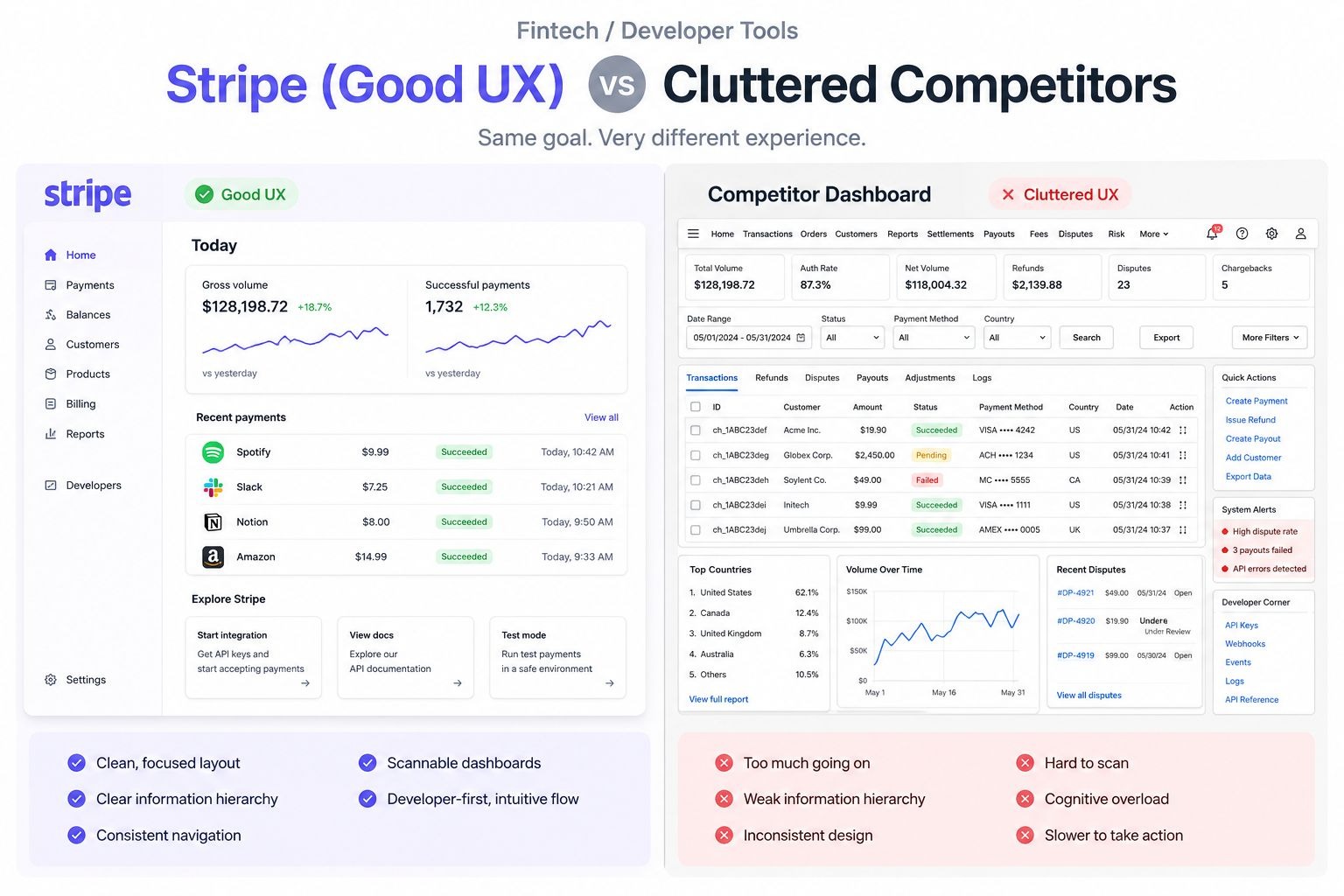
Here is what Stripe's UX gets right:
- The homepage leads with a clear value statement, not a feature list.
- Documentation is written in plain English with copy-paste code examples. Developers can start building in minutes.
- Navigation is minimal. There are no dropdown mega-menus with 40 sub-items. Every link leads somewhere users actually need to go.
- Pricing is transparent. No mystery about what you pay at which volume.
- The visual design uses whitespace to separate sections clearly. Nothing fights for attention.
Stripe proved that B2B SaaS UX does not need to be complex to be comprehensive. Legibility is the goal. Every element on the page either earns its place or gets removed.
What Bad Fintech UX Looks Like
Many fintech platforms bury their core features behind excessive onboarding steps, require document uploads before showing users what they are signing up for, or present dashboards so data-dense that finding a simple transaction takes three clicks. These patterns drive churn in a space where users already feel cautious about handing over financial data.
Key takeaway for fintech and developer tools:
- Transparency in pricing and documentation builds trust faster than marketing copy.
- Every extra click in a user's first session increases drop-off risk.
- Assume your users are smart. Write for clarity, not comprehensiveness.
8. Video / Media Niche: YouTube (Bad UX) vs National Geographic (Good UX)
YouTube's Ad Experience as a UX Problem
YouTube has a bad UX problem that is not about layout. It is about respect for the user's time. On shorter videos, users sometimes watch more ad seconds than content seconds. Non-skippable mid-roll ads on 4-minute videos interrupt the core reason users opened the platform.
YouTube Premium exists as a paid solution, but it means users must pay to access what the platform used to provide freely. The UX here is not accidental. It is a business model choice that treats user attention as a resource to extract rather than an experience to protect. Over time, that erodes trust and pushes users toward ad-blocking or alternative platforms.
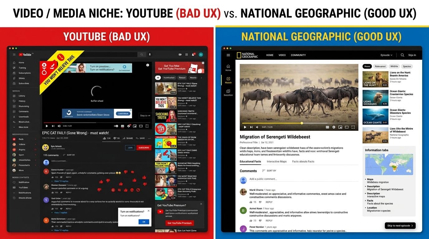
The problem compounds on mobile. Full-screen ads that lock the screen, countdown timers in corners that are easy to miss, and auto-playing ads before each video in a playlist create an experience that feels more adversarial than welcoming.
How National Geographic's Video Platform Respects Its Users
National Geographic's video site takes a different approach. The player is clean. The content is the focus. Navigation between videos is simple. Any ads that appear are balanced according to content length and are placed without interfering with user engagement.
The design understands that the user came for the content, not the wrapper around it. Good UX in media means the interface disappears and the content takes over.
Key takeaway for media and video platforms:
- Ad frequency is a UX decision, not just a revenue one.
- When users feel like the product is working against them, they find workarounds or leave.
- Clean video players with minimal interruptions increase watch time and user satisfaction.
Why Bad UX Is a Business Problem, Not Just a Design Problem
Poor user experience does not stay in the design department. It spreads across the whole business. Here is what bad UX costs in real terms:
- Higher customer support volume. Users who cannot figure out your product email your team.
- Lower conversion rates. Friction at any step of checkout or sign-up reduces completions.
- Weaker SEO performance. Google measures engagement signals. High bounce rates and low session time hurt rankings.
- Negative reviews. Users who feel frustrated talk about it publicly.
- Lost retention. Acquiring a new user costs five times more than keeping an existing one. Bad UX destroys retention.
Good UX design pays back in every one of these areas. It is not a cost. It is infrastructure.
How to Audit Your Own UX for These Problems
You do not need a large budget to start fixing bad UX. Here is a practical starting point:
- Watch five real users attempt a core task on your product without guidance. Take notes on where they pause or backtrack.
- Review your drop-off points in analytics. High exit rates on specific pages signal UX friction.
- Check every form on your site. Remove any field that does not serve a direct purpose.
- Read your UX copy out loud. If a button or label sounds ambiguous to you, it will confuse your users.
- Compare your checkout or sign-up flow against a best-in-class competitor. Count your steps versus theirs.
Small fixes in these areas often produce the largest gains. You do not need to rebuild your product. You need to remove the friction points that are already costing you users.
Final Thoughts
Bad UX vs good UX is not about aesthetics. It is about how well your product serves the people using it. Every example in this article shows the same pattern: the brands that put users first built products that users trust. The ones that prioritized short-term gains or skipped usability testing ended up paying for it in churn, complaints, and lost revenue.
Great UI/UX design is the difference between a product users recommend and one they warn their friends about. Whether you run an e-commerce store, a SaaS platform, a learning app, or a media site, the fundamentals are the same: reduce friction, set accurate expectations, and make every interaction feel worth the user's time.


.svg)
.svg)
.svg)
.svg)
