
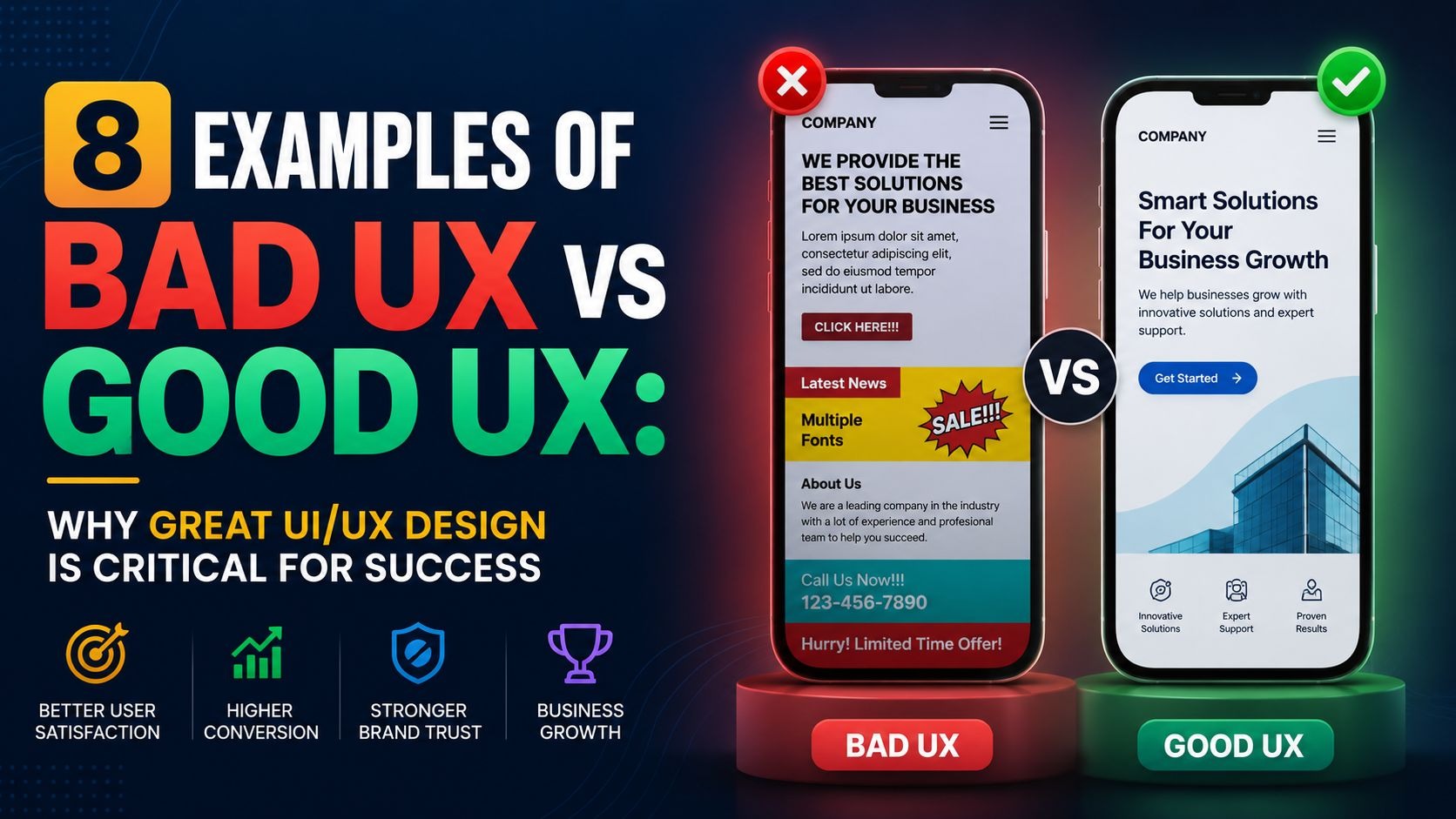
Your About US Page shapes trust from the first moment. Visitors want to know who you are and why your work matters. When this page is simple, honest, and organized, readers stay longer and move toward your products or sign-ups. A strong About Us Page sets the tone for your site and makes people feel safe with your brand.
In this guide, we will give you clear steps, real examples, and practical ideas. You will learn how structure, layout, and tone work together. You will also see what the best brands do and how your About US Page can reach that level.
Why Your About Page Matters
Readers do not guess. They look for proof. They study your story to see if you align with their needs. When this page is easy to read, they get answers without stress. This builds trust. A good story also helps visitors remember you. It sets the mood for the rest of your site. A strong identity shows that your team knows its own direction. Clear language also supports your long-term SEO, since search engines reward useful and honest content.
What People Look For
People want simple facts. They want to understand your purpose. They want to see the team behind the work. They want values that feel stable. They want progress that feels real. When these pieces appear in a clean order, readers stay engaged. If they do not find clear answers fast, they leave.
Why This Page Builds Trust
Trust grows when your tone stays natural. Readers should feel like they are talking to a person, not a script. Real photos support this. Short sections support it too. A page that feels open, calm, and steady gives readers confidence. This encourages them to explore your products, support content, or service pages.
Key Features Every Strong About Us Page Needs
A strong page removes noise and keeps readers focused. Each part should teach something clear about your brand. These features help visitors move through your story without stress.
1. Simple Origin Story
A short origin story helps readers understand where you started and why you built your brand. It gives your message structure and shows intent.
Key points to include:
- When the idea formed
- What problem did you want to solve
- A turning point that shaped progress
- A short moment that changed your direction
- A clean closing line that brings the story back to your purpose
Why this helps:
- Builds connection fast
- Helps readers feel aligned with your goal
- Makes your brand feel human
2. Real Team Presence
Real people build trust. When readers see the team, they understand who stands behind the work.
What to show:
- Clear headshots of your core team
- Natural lighting
- Simple backgrounds
- Small details about each person’s role
- A short section that explains how the team works together
Why this helps:
- Reduces doubt
- Shows real structure inside your brand
- Makes the page feel open and honest
3. Clear Purpose Line
A purpose line acts like a guide. It helps readers understand your focus before they read the full story.
How to shape the line:
- Keep it to one short sentence
- Focus on your main promise
- Use simple language
- Use it at the top of the page
- Make sure it matches your long-term direction
Why this helps:
- Gives readers a quick sense of identity
- Sets the tone for the rest of the page
- Supports clarity and trust
4. Simple Visual Blocks
A clean layout helps readers move through your page without feeling lost. Each block should guide them step by step.
What to include:
- Short sections for each topic
- Clear heading for every block
- Enough white space around text
- Clean icons or small visuals that do not distract
- Mobile-friendly spacing
Why this helps:
- Reduces cognitive load
- Supports fast scanning
- Keeps attention on the main story
5. A CTA That Fits the Story
Your call to action should feel natural. Readers should reach the end and feel ready to move forward.
How to shape the CTA:
- Keep the button text simple
- Use it at the end of your story
- Make the action direct
- Provide one main option
- Keep the colors calm but clear
Ideas for CTA actions:
- Explore Products
- Join Our List
- Book a Call
- Start a Trial
- Visit Our Store
Why this helps:
- Makes the next step easy
- Reduces decision stress
- Converts attention into action
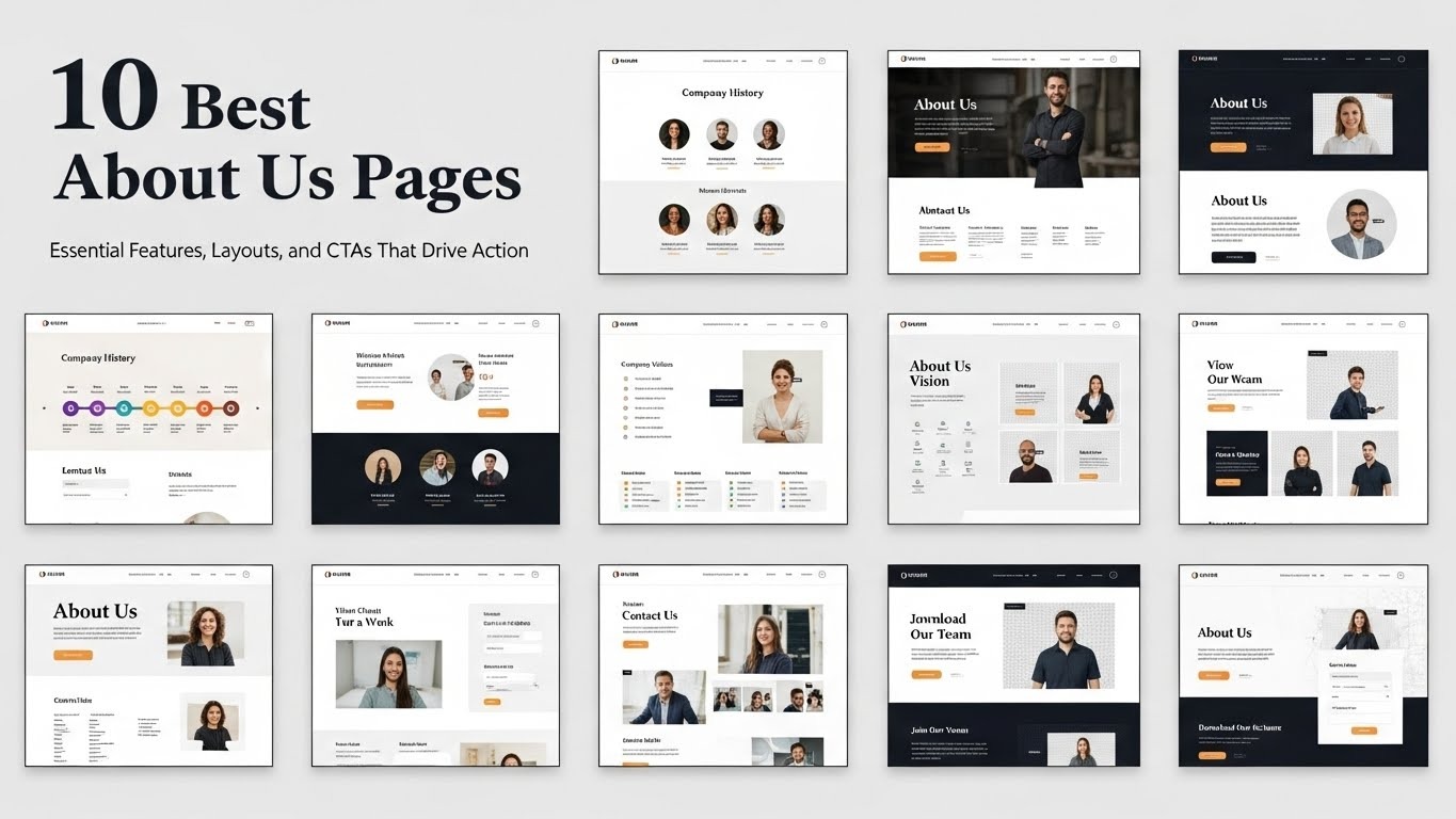
10 Best About Us Page Examples
These brands use strong design and simple writing. Review them to understand what works. Each page shows how structure, tone, and layout shape trust. Use these lessons when you shape your About US Page.
1. Meyka
Meyka’s About Us page stands out for its calm layout and clear storytelling. The design uses space and soft colors to create a welcoming experience. Readers immediately see the brand’s purpose and team, while short paragraphs and real visuals keep attention. The CTA guides action without distraction.
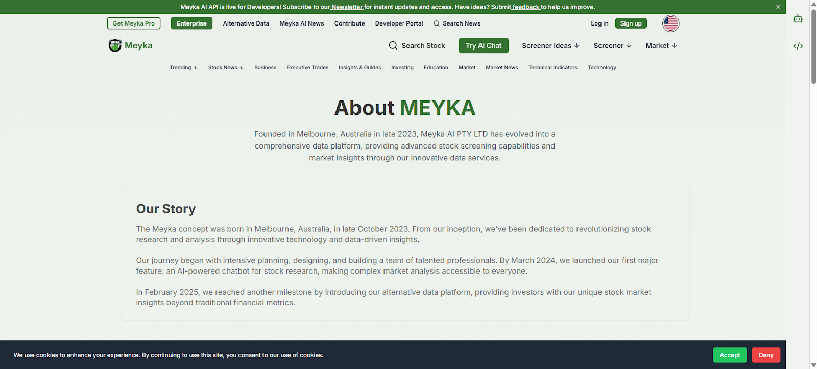
Why it’s good:
- Uses a short, clear purpose line at the top to guide readers
- Features natural team photos to build trust and authenticity
- Soft color palette creates a calm, welcoming reading experience
- Short, intentional paragraphs make the story easy to scan
- CTA at the end directs readers smoothly toward products
2. Mailchimp
Mailchimp’s About Us page feels warm and approachable. Bright yet balanced design supports short, clear sections that tell the brand story in a timeline format. Real staff photos strengthen authenticity. Values are separated into easy-to-read blocks. The CTA at the end guides readers toward the main product without distraction.
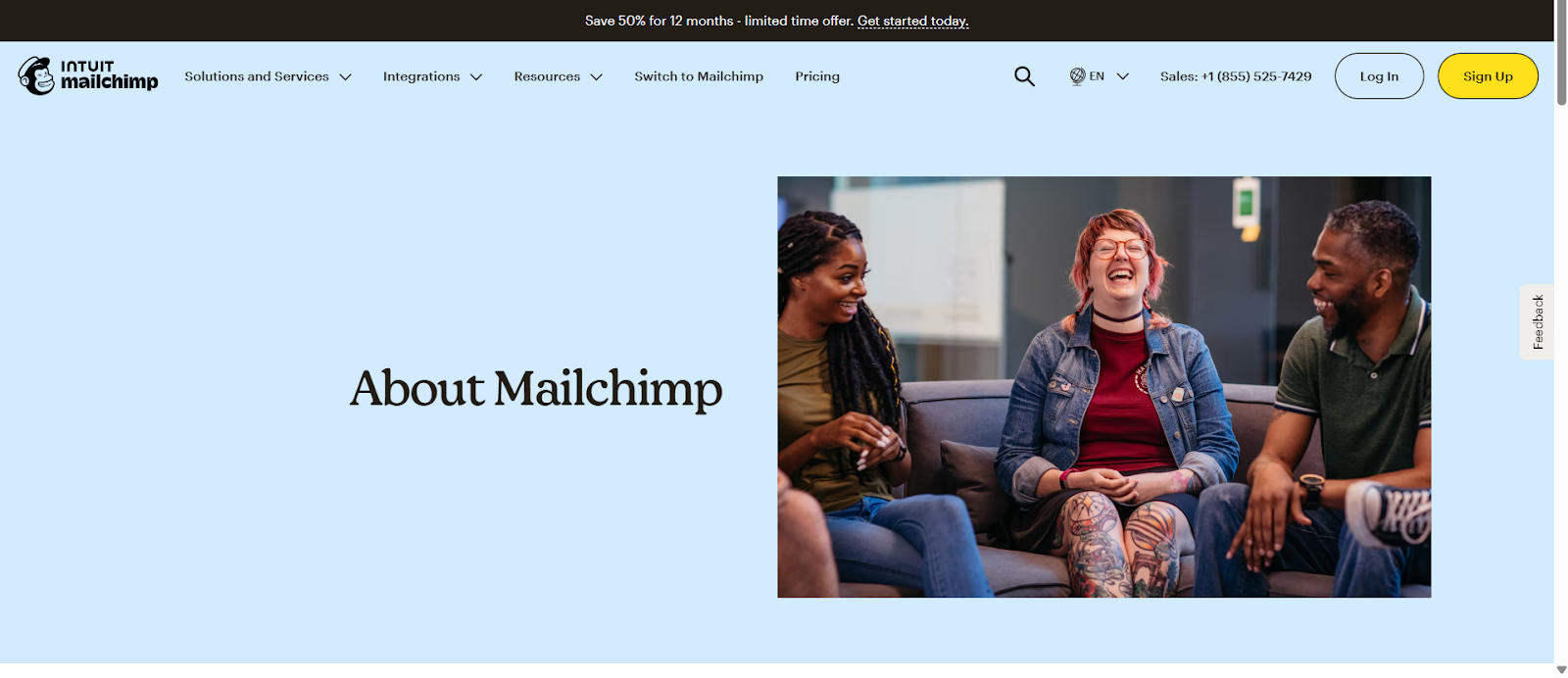
Why it’s good:
- Warm tone and approachable design engage readers immediately
- Short timeline sections make the story easy to follow
- Real staff images increase trust and human connection
- Values presented in distinct blocks for clarity
- CTA at the end directs readers to explore products
3. Squarespace
Squarespace uses clean spacing and a clear structure for its About Us page to guide the reader. The mission statement appears at the top, setting focus. Real team photos and milestone bullets make the story scan-friendly. Each block is short, with visuals enhancing understanding. CTA invites users to explore tools, keeping the flow smooth and intuitive.
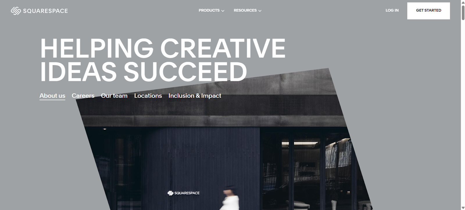
Why it’s good:
- The mission statement at the top clarifies the purpose instantly
- Real team photos build authenticity
- Milestones shown in bullet points for easy scanning
- Short, clean blocks guide the reader's attention
- CTA at the end encourages exploration of tools
4. Patagonia
Patagonia’s About Us page emphasizes purpose and action. Short sections explain the brand’s environmental focus. Real images from fieldwork support authenticity. Values appear clearly and are easy to read. The layout stays simple and factual. CTA at the bottom leads readers to learn more or engage with products.
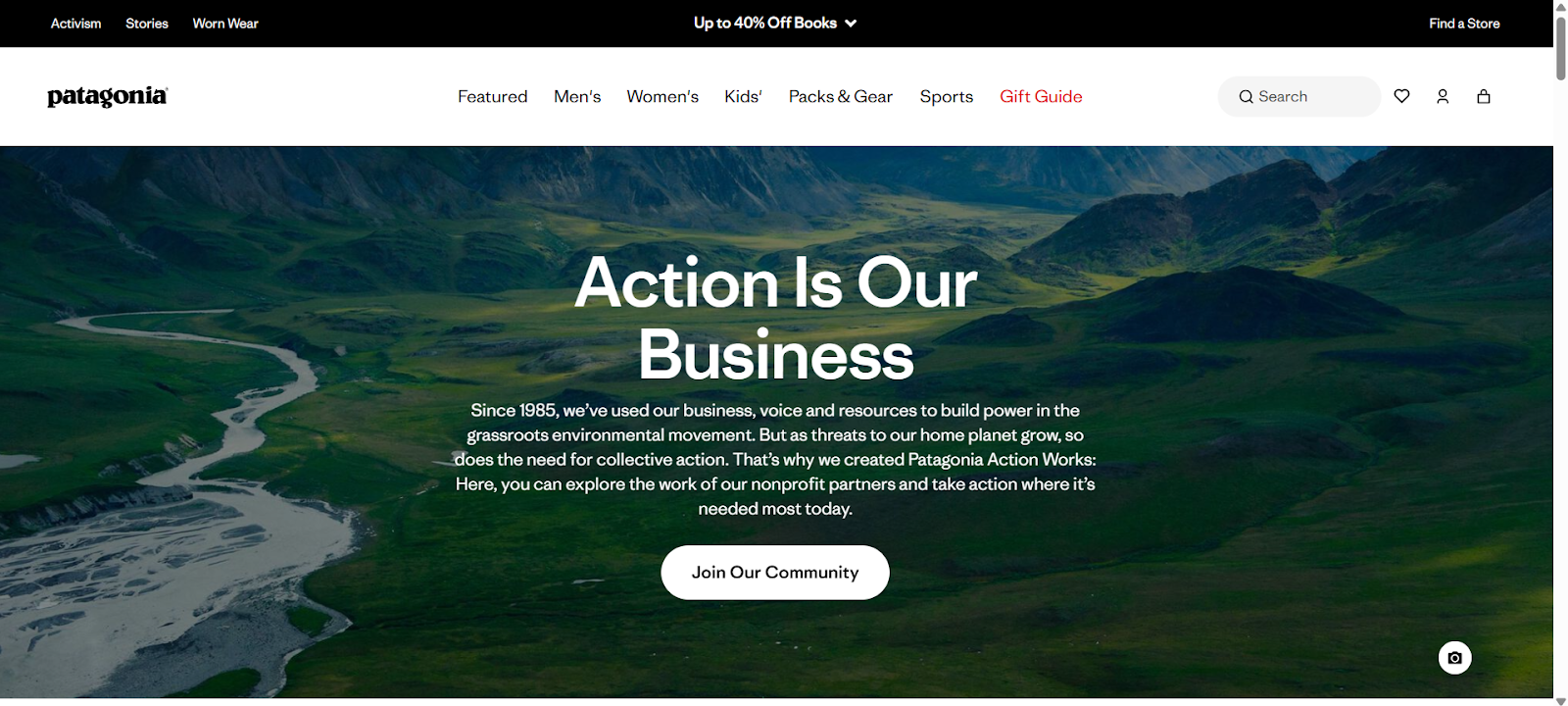
Why it’s good:
- Short sections explain purpose without overload
- Field photos reinforce authenticity and impact
- Values presented clearly in simple blocks
- Clean, factual layout keeps attention on key points
- CTA guides readers toward engagement and action
5. Nike
Nike’s About Us page communicates energy and purpose with simplicity. Strong visuals show movement and performance, while short sections highlight milestones. The layout is open and organized, even for a large brand. The page uses concise, confident language. CTA leads users to product categories or brand stories.
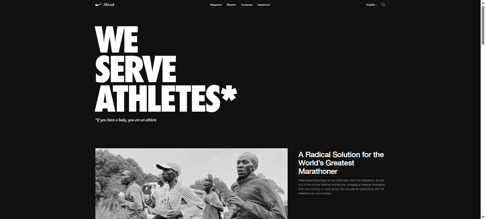
Why it’s good:
- Strong visuals immediately show brand energy
- Short sections highlight key milestones
- Open, organized layout supports readability
- Concise, confident language strengthens messaging
- CTA at the end directs readers to products and stories
6. Zendesk
Zendesk’s About Us page uses a friendly and clear layout. Short sections describe the company story and product focus. Team photos add personality and trust. Each block is simple and centered on one idea. CTA at the end moves readers toward the main product. Tone stays light but authoritative.
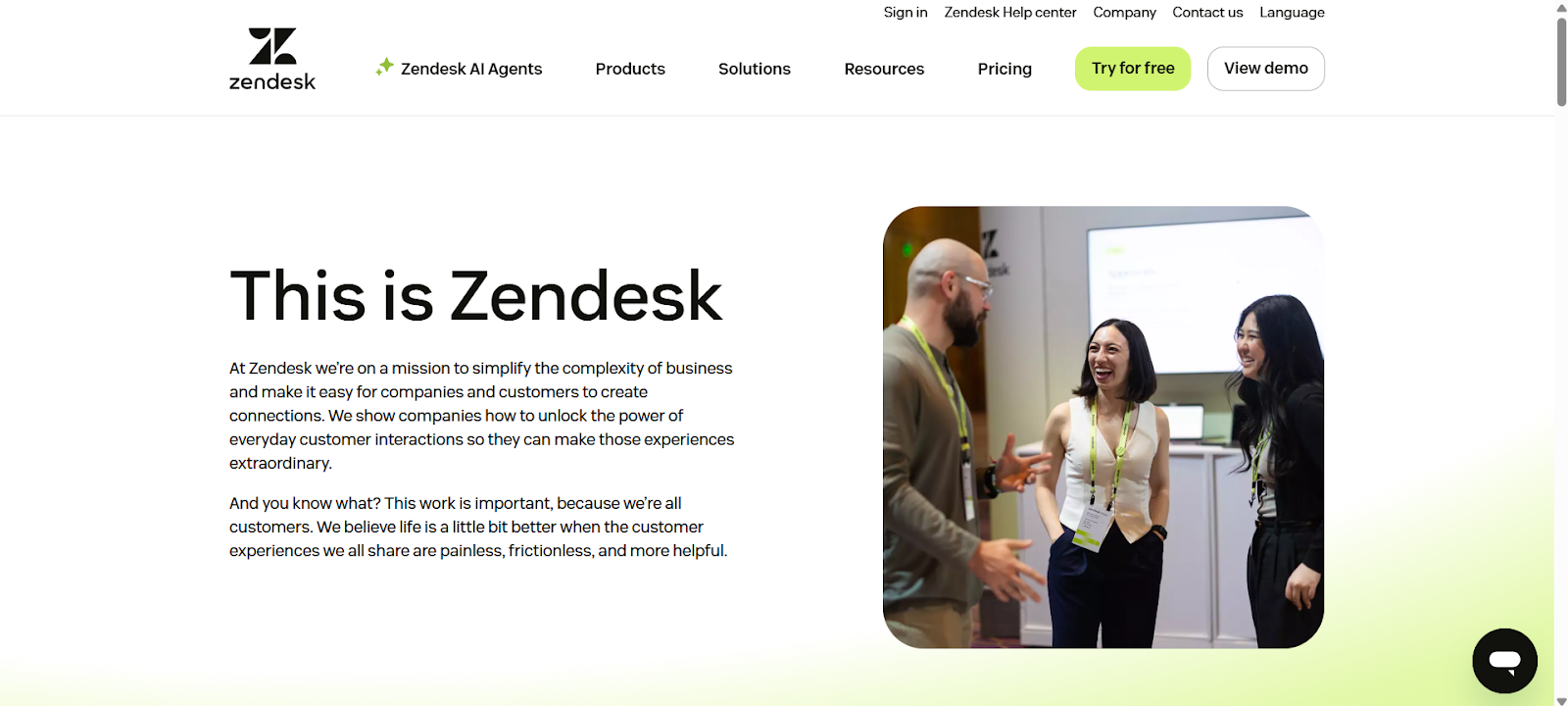
Why it’s good:
- Friendly tone with clear layout engages readers
- Short sections explain the company's story and products
- Team photos build authenticity
- Single-focus blocks keep content clear
- CTA guides users to the main product effortlessly
7. Airbnb
Airbnb’s About Us page centers on community and trust. The story explains founders, milestones, and mission in short sections. Real visuals support credibility. The layout flows smoothly, making it easy to scan. CTA encourages readers to explore hosting or travel options without confusion.
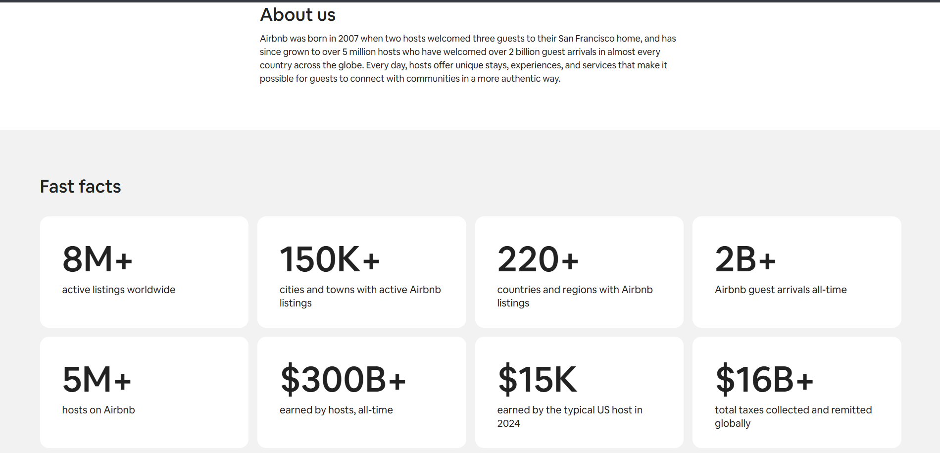
Why it’s good:
- Short sections tell the story of the founders and milestones
- Real visuals increase credibility and trust
- Focused layout ensures smooth reading
- Clear, concise language keeps engagement high
- CTA guides users toward hosting or travel pages
8. Dropbox
Dropbox’s About Us page highlights clarity and simplicity. Short sections cover the brand story, team, and product evolution. Clean visuals support key points without distraction. The layout is minimal yet engaging. CTA at the end directs readers straight to product exploration.
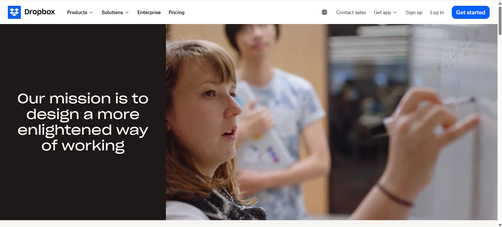
Why it’s good:
- Short sections cover story, team, and growth
- Clean visuals enhance understanding
- Minimal layout keeps focus on content
- Engaging, readable structure supports scanning
- CTA at the end moves users to products
9. HubSpot
HubSpot’s About Us page communicates directly to readers. Short sections explain mission, founders, and team structure. Values and awards are shown in clear blocks. The layout is balanced from top to bottom, making reading smooth. CTA directs readers to free tools or product overview without distraction.
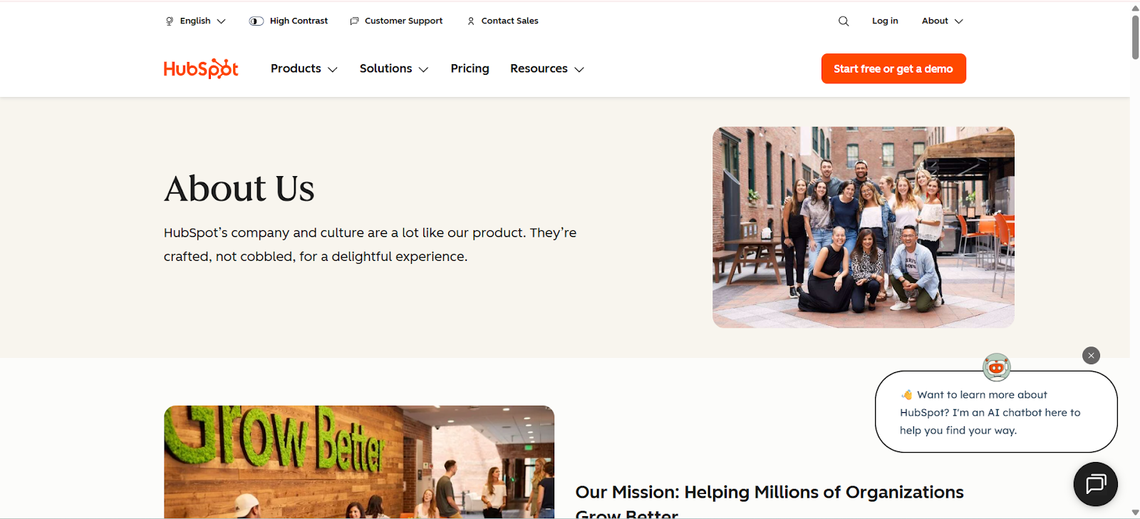
Why it’s good:
- Short sections cover mission, founders, and team
- Values and achievements in easy-to-read blocks
- Balanced layout enhances readability
- Clear language maintains engagement
- CTA guides readers to tools or product pages
10. Notion
Notion’s About Us page uses soft colors and generous spacing. The story introduces founders and product purpose in simple, conversational language. Natural team photos build authenticity. Values are presented in neat lists. CTA at the end guides readers into the product, keeping focus clear and flow smooth.
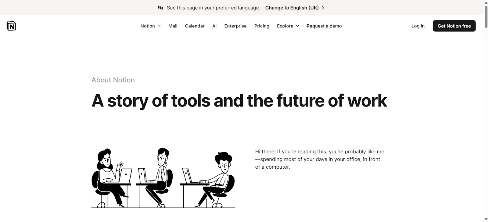
Why it’s good:
- Soft colors and spacing create a calm reading experience
- The story introduces the founders and the product clearly
- Natural team photos reinforce authenticity
- Values listed neatly for clarity
- CTA at the end directs readers to the product
Layouts That Support Fast Reading
The design of your page strongly influences how long visitors stay and how effectively they take in information. A thoughtfully organized About US Page leads readers smoothly through your content, making it easy to scan and understand. Clean layouts enhance trust, improve readability, and keep visitors engaged with your brand.
Short Paragraphs
Breaking content into short paragraphs reduces mental load. Each block should focus on one idea, making it easier for readers to process information quickly. Keep paragraphs around two to three lines.
Tips for short paragraphs:
- Use one main point per paragraph
- Keep sentences concise and clear
- Make mobile reading easy with short blocks
- Avoid long, dense walls of text
Short paragraphs help readers scan faster and retain the key points of your About US Page.
Real Photos
Images make content more relatable. Use real photos of your team, office, or workflow instead of stock images. Authentic visuals create credibility and human connection, helping readers trust your brand.
Tips for real photos:
- Show natural expressions and interactions
- Highlight your workspace or behind-the-scenes moments
- Keep image quality high but simple
- Avoid staged or overly polished visuals
Including real photos reinforces authenticity and makes your About US Page feel genuine.
Simple Headings
Clear headings guide readers and improve page structure. Each heading should summarize the content below it, allowing readers to scan the page quickly. Well-structured headings also help search engines understand your content.
Tips for headings:
- Keep headings short and descriptive
- Use hierarchy (H2, H3) for organization
- Highlight main topics or benefits
- Avoid vague or complicated phrases
Simple headings make your About US Page easier to navigate and more accessible.
Light Visual Breaks
White space and visual breaks prevent the page from feeling crowded. They help readers slow down, focus on key sections, and separate different ideas without overwhelming them.
Tips for visual breaks:
- Add space between sections and paragraphs
- Use subtle dividers or background changes
- Keep visuals balanced with text
- Let important points stand out naturally
Light visual breaks improve readability and make your About US Page more pleasant to explore.
CTAs That Guide People
A call-to-action (CTA) directs readers to take the next step. On your About US Page, a well-placed CTA helps visitors engage with your brand, whether exploring products, joining a list, or contacting you. The key is clarity and timing. A thoughtful CTA guides readers naturally without feeling pushy.
One Clear Step
Offer a single action per CTA to avoid confusing readers. Too many options can overwhelm and reduce clicks. Focus on the most important next step that aligns with your page’s purpose.
Tips for one clear step:
- Keep the action simple and direct
- Use active words like “Explore,” “Join,” or “Start.”
- Avoid multiple CTAs competing for attention
- Make sure the CTA aligns with your story
A single, focused CTA ensures readers know exactly what to do next.
Placed Near the End
The best place for a CTA is at the bottom of your About US Page, after readers have absorbed your story and values. By this point, they are informed, engaged, and ready to act.
Tips for placement:
- Position the CTA immediately after your final section
- Keep it visible without scrolling too far
- Repeat the action subtly if the page is long
- Avoid putting the main CTA in a distracting location
Placing the CTA near the end feels natural and encourages action without pressure.
Offer Optional Links
Some readers want more information before acting. Include optional links near the CTA to guide them to related pages like team bios, product features, or contact forms. These links should be secondary, supporting the main action.
Tips for optional links:
- Keep them small and unobtrusive
- Use text links instead of multiple buttons
- Ensure links are clearly related to the CTA
- Avoid overwhelming the main CTA with too many choices
Optional links provide extra guidance without diluting your primary CTA.
Design for Visibility
A CTA must be noticeable but not overwhelming. Use color, size, and placement strategically to make it stand out while maintaining the page’s visual harmony.
Design tips:
- Use contrasting but brand-appropriate colors
- Make buttons large enough to tap on mobile
- Surround the CTA with enough white space
- Avoid clutter that competes with the CTA
Good design ensures your CTA is seen and clicked while preserving your About US Page’s clean look.
Test and Improve
A CTA should evolve based on user behavior. Track clicks and engagement to see what works best. Small adjustments can significantly improve conversion rates over time.
Tips for testing:
- Try different wording or button colors
- Experiment with placement on the page
- Measure click-throughs and conversions
- Adjust based on data, not guesswork
Continuous improvement keeps your About US Page CTA effective and aligned with your audience.
How To Write a Human Story
A human story on your About US Page connects with readers, builds trust, and makes your brand relatable. It shows who you are, why you exist, and what values guide your work. The story should feel like a conversation, not a formal pitch.
Simple Words
Use clear, short words that anyone can understand. Avoid jargon, complex terms, or overlong sentences. Simple words make your story approachable and keep readers engaged.
Tips for simple words:
- Write sentences under 20 words
- Use everyday language instead of technical terms
- Replace abstract words with concrete examples
- Keep paragraphs short and digestible
Simple language ensures your About US Page is accessible to all visitors.
Real Moments
Include real experiences that shaped your brand. These moments could be challenges, breakthroughs, or lessons learned. Sharing them makes your story authentic and memorable.
Tips for real moments:
- Highlight early struggles or key decisions
- Include a short anecdote that readers can relate to
- Show how your brand adapted or improved
- Avoid exaggeration or fluff
Real moments help your readers feel connected and understand your journey.
Show Your Team
Readers want to know the people behind your brand. Introducing your team makes your company feel human and trustworthy. Include photos, names, roles, and brief personal details.
Tips for showing your team:
- Use natural, unposed photos
- Keep team bios concise and meaningful
- Highlight collaboration and roles clearly
- Avoid overly formal titles or corporate jargon
Featuring your team enhances credibility and relatability on your About US Page.
Focus on Values
Your values guide decisions and show readers what your brand stands for. Include them in a simple, clear way that connects with your story.
Tips for values:
- List 3–5 core values only
- Use short explanations for each value
- Include examples or behaviors that reflect the value
- Keep values consistent with your brand tone
Clearly expressed values make your About US Page trustworthy and memorable.
Connect Purpose to Action
End your story by connecting your brand’s purpose to what readers can do next. This bridges storytelling and engagement, guiding visitors to your CTA naturally.
Tips for purpose-to-action:
- Summarize why your brand exists in one clear sentence
- Link the purpose to the next step, like exploring products or joining a list
- Avoid vague statements; focus on reader relevance
- Place this connection near the CTA for maximum effect
Connecting purpose to action ensures your story moves readers toward meaningful engagement.
SEO Tips That Support Growth
Search engines favor pages that are clear, helpful, and easy to read. A well-optimized About US Page not only ranks better but also improves user experience. Simple, stable SEO habits ensure your content stays relevant, trustworthy, and visible.
Give Each Section Purpose
Every section on your page should focus on one key idea. Avoid filler content that distracts readers or dilutes the main message. Purposeful sections help both users and search engines understand the structure of your page.
Tips for purposeful sections:
- Start each section with a clear heading
- Include only relevant information under each heading
- Keep paragraphs concise and focused
- Use bullet points or lists to organize ideas when possible
Sections with a clear purpose make your About US Page easy to scan and more likely to rank.
Use the Keyword With Care
Your target keyword, About US Page, should appear naturally in important areas like the introduction, headings, and conclusion. Overusing it can look forced and reduce readability. The keyword should support context, not dominate it.
Tips for using the keyword:
- Place it in the first paragraph for early relevance
- Include it in 2–3 headings where appropriate
- Sprinkle it naturally in the body text without repetition
- Use variations like “About Us page” or “our About US Page” sparingly for readability
Thoughtful keyword placement improves SEO without hurting user experience.
Update Your Page Regularly
Search engines favor fresh content. Updating your About US Page shows growth and relevance. Adding milestones, new team members, or refreshed visuals signals that your brand is active and engaged.
Tips for updates:
- Review content at least twice a year
- Add recent achievements, awards, or certifications
- Update team photos or bios when roles change
- Refresh visuals or layout for a better user experience
Regular updates maintain trust with readers and help your page perform better in search rankings.
Steps To Build a High-Trust Page
A high-trust About US Page makes visitors feel confident in your brand. Follow these steps to structure your page clearly, show authenticity, and guide readers naturally toward engagement. Each step ensures your page is helpful, credible, and easy to scan.
Step 1: Write a Simple Story
Tell your brand story in a calm, clear tone. Keep it concise and focused on one idea at a time. Avoid jargon or unnecessary detail. Your story should explain who you are, why you exist, and what makes your brand unique.
Tips for a simple story:
- Keep paragraphs short, 2–3 lines each
- Include real moments or challenges your brand faced
- Focus on the human side of your company
- Make it easy for readers to scan quickly
A simple story builds connection and helps readers trust your About US Page.
Step 2: Add Real Team Photos
Photos of your team bring authenticity and credibility. Show real people in natural settings rather than stock images. Readers connect better with faces they can relate to, and it humanizes your brand.
Tips for team photos:
- Use natural lighting and casual poses
- Include short bios for each team member
- Highlight collaboration or key roles
- Update photos when your team changes
Real photos show transparency and build trust with visitors.
Step 3: Share One Clear Purpose Line
A purpose line communicates your main focus immediately. Place it near the top so visitors understand your brand before reading further. A clear, concise purpose guides the story and sets expectations.
Tips for a clear purpose line:
- Keep it to one short sentence
- Make it stable and aligned with your mission
- Position it above the main content
- Repeat subtly in relevant headings if needed
A purpose line anchors your About US Page and helps readers quickly grasp your brand.
Step 4: Show Proof Through Numbers or Awards
Proof strengthens credibility. Use metrics, milestones, awards, or recognitions to back up your story. This evidence makes your brand feel reliable and authoritative.
Tips for showing proof:
- Highlight key achievements in short, digestible blocks
- Use bullet points for numbers or stats
- Include recent awards or certifications
- Avoid overloading with too many metrics
Proof helps visitors believe your claims and trust your About US Page.
Step 5: Add a Clear CTA at the End
End your page with one focused call-to-action. It should guide readers to the next step, whether exploring products, signing up, or contacting you. A well-placed CTA converts interest into engagement.
Tips for CTAs:
- Keep the action simple and direct
- Place it immediately after your story
- Make it visually noticeable without cluttering the page
- Match the CTA to the story’s tone and purpose
A clear CTA ensures visitors know what to do next and reinforces trust in your About US Page.
Final Thoughts
Your About US Page is often the first place readers look to understand your brand and decide whether to trust you. A simple, clear story combined with real visuals and a calm layout creates an immediate sense of credibility. When visitors can quickly connect with your team, they feel confident in your brand.
A strong About US Page also guides readers toward meaningful action. A steady, well-placed CTA helps them explore your work, engage with your offerings, or learn more about your mission. By balancing clarity, authenticity, and purpose, your page builds trust, encourages interaction, and supports long-term growth for your brand.


.svg)
.svg)
.svg)
.svg)
