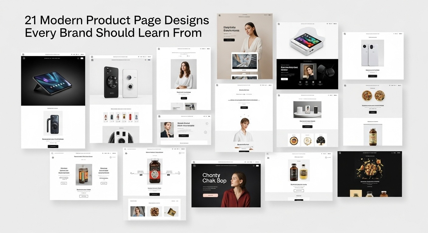
Our product page is where traffic turns into sales. Good Product Page Designs make that conversion easier. From layout to copy to visuals, each choice affects trust, decision speed, and ultimately revenue. Here we will discuss 21 modern Product Page Designs from real brands. For each example, we will explain what works and why.
Use these as inspiration when you build or refine your own product pages to improve user experience, boost credibility, increase conversions, and help your brand stand out in competitive online markets.
Why Product Page Designs Matter
Before we discuss examples, let’s agree on why Product Page Designs matter so much. A well-crafted product page not only attracts visitors but also guides them through the buying process, builds confidence, and increases the chances of conversion.
Answer customer doubts: A strong product page communicates value, highlights benefits, and removes friction during the buying journey.
Boost SEO: Well-structured Product Page Designs with proper headings, internal links, and keyword placement help search engines understand and rank your page higher.
Build trust: Display real reviews, transparent specifications, clear guarantees, and simple return policies to make users feel confident about purchasing.
Support paid campaigns: Fast, conversion-focused pages reduce ad waste, improve click-through rates, and lower cost per acquisition.
Perform across devices: Optimize for speed, mobile responsiveness, and structured data to strengthen visibility and user experience.
Convert, not just look good: Focus on Product Page Designs that clearly communicate value and encourage action, rather than only visual appeal.
What Makes a Product Page Design Engaging and Converting
Before seeing examples, here are some principles that repeatedly appear in the 21 examples below.
Strong hero visuals (multiple high-quality photos or video)
Clear benefit-focused headline & subheads
Product variants, clear pricing, stock info
Sticky or always-visible CTA (Add to Cart / Buy Now)
Trust signals: guarantees, secure badges, shipping/returns info
Detailed spec or feature tabs, but organized so as not to be overwhelming
Upsells, cross-sells, related products
FAQ section near the bottom
Fast load times, mobile-first design
Structured data (schema) so that rich snippets are possible
Now let’s discuss the real examples.
21 Best Product Page Designs to Learn From
Here are 21 real product page designs that hit these traits. Each example includes what works well and what you might adapt.
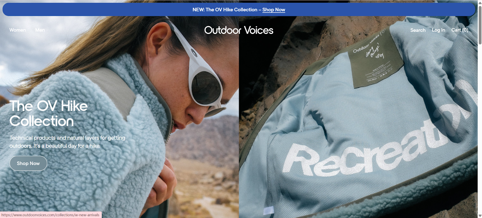
1. Outdoor Voices (activewear)
Outdoor Voices employs a clean, minimalist layout with ample white space, high-resolution lifestyle images, and clearly organized sections for “Description,” “Fabric,” and “Ideal Use.” They also highlight key product benefits at a glance, such as comfort, performance, and durability.
The variant selector is simple and intuitive, allowing shoppers to choose size and color quickly without confusion. The call-to-action (CTA) is prominent and stays visible as users scroll, making it easy to add items to the cart.
Why it’s good:
Simplified layout helps users focus on essential information without distractions.
Crisp, realistic images let shoppers visualize themselves using the product, boosting confidence.
Key benefits are clearly highlighted, making it easy to understand the value quickly.
User-friendly variant selector improves navigation and reduces purchase friction.
Demonstrates that clean Product Page Designs prioritizing clarity and usability outperform cluttered, overly decorative pages.
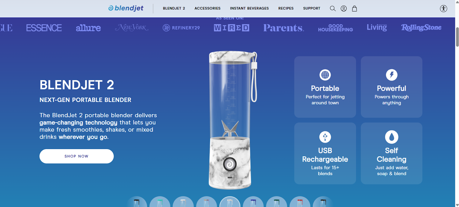
2. BlendJet (portable blenders)
BlendJet’s product page features a looping video above the fold that immediately demonstrates how the blender works in real-life scenarios, showing portability, ease of use, and cleaning. As you scroll, the page highlights key feature callouts, such as battery life, motor power, and safety features, along with concise benefit statements that show why this product is superior. Usage storytelling is woven throughout, illustrating how BlendJet fits into morning routines, travel, and outdoor activities.
They also include quantity bundles and pricing options, subscription or multi-pack deals, and social proof with user photos and reviews embedded near the product images. The page incorporates trust signals like secure checkout icons, shipping info, and a clear return policy.
Why it’s good:
Video demonstrates product function instantly, reducing doubt.
Clear feature callouts highlight key benefits and differentiators.
Bundles and pricing options increase average order value.
Social proof and trust signals boost credibility.
Combines engagement and functionality to guide users toward conversion.
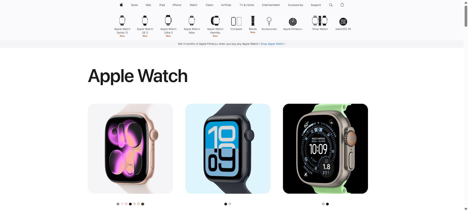
3. Apple (Apple Watch Ultra)
Apple uses immersive storytelling on its product page to showcase the Apple Watch Ultra. Interactive visuals, parallax scrolling, and step-by-step feature reveals let users explore functions easily. Navigation between specs, gallery images, reviews, and purchasing options is smooth. Rich media, including videos and close-ups, demonstrate real-world use. Sticky CTAs, consistent branding, and trust signals like warranties and secure checkout ensure a premium, engaging, and conversion-focused Product Page Design.
Why it’s good:
Interactive visuals engage and educate users.
Smooth navigation between sections reduces friction.
Rich media demonstrates real-world product usage.
Sticky CTAs encourage conversion at any scroll point.
Trust signals and consistent branding reinforce confidence and a premium experience.
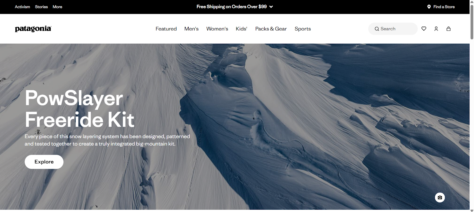
4. Patagonia (outdoor gear)
Patagonia combines detailed specs with sustainability storytelling. Product pages include videos, origin maps, and lifetime guarantees. Key features like materials, durability, and repairability are clearly highlighted. The layout balances narrative and functional information. Social proof and reviews are integrated without clutter. Navigation is intuitive, letting users explore products, variants, and related items.
The page communicates the brand’s mission while giving buyers essential information, helping them make informed decisions efficiently and confidently.
Why it’s good:
Transparency builds trust with detailed specs and guarantees.
Balanced layout prevents overwhelming the user.
Sustainability messaging aligns with brand values.
Integrated reviews and social proof enhance credibility.
Easy navigation keeps users engaged and informed.
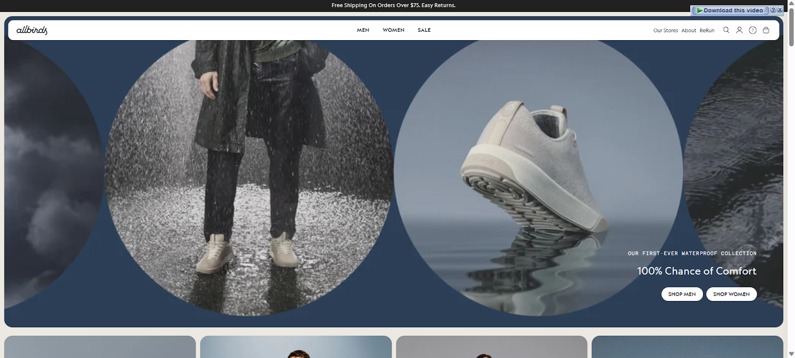
5. Allbirds (sustainable shoes)
Allbirds emphasizes material transparency and eco-friendly messaging. Product pages show size, color, stock, and customer reviews. Key benefits, such as comfort, durability, and sustainability, are highlighted. High-quality images and lifestyle shots help users imagine wearing the products. Navigation between variants, specifications, and purchase options is smooth. Trust signals include clear shipping, return policies, and secure checkout.
The design communicates brand values while simplifying buying decisions for users looking for sustainable and comfortable footwear.
Why it’s good:
Material transparency builds credibility and trust.
High-quality lifestyle images aid product visualization.
Size and stock information reduce purchase uncertainty.
Integrated reviews provide social proof.
Clear Product Page Designs combine usability, storytelling, and brand values.
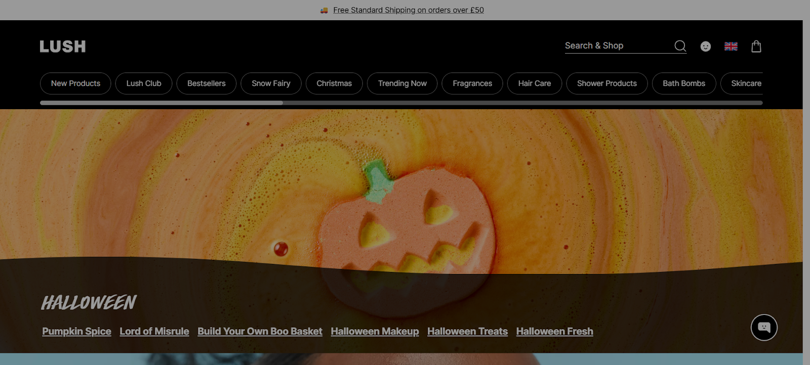
6. Lush (cosmetics)
Lush uses bold images, concise text, and clear product instructions. Ingredients are transparent and highlighted for credibility. Customer reviews and user photos are integrated. Navigation is intuitive, helping shoppers quickly select variants. The page emphasizes product benefits while maintaining visual simplicity. Trust signals like secure checkout and return policies are clearly visible.
The overall design communicates quality, transparency, and ease of use, creating a user-friendly shopping experience for cosmetics and self-care products.
Why it’s good:
Ingredient transparency builds confidence and trust.
Clean Product Page Designs balance aesthetics and usability.
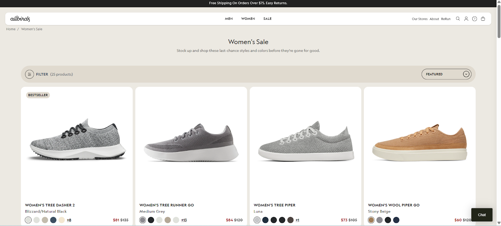
7. Allbirds X00 (variation page)
Allbirds X00 highlights multiple product angles with hover zoom and high-resolution images. Sticky “Add to Bag” buttons keep CTAs visible. Stock levels are displayed to create urgency. Users can easily select size and color. Key benefits and eco-friendly messaging are integrated.
The page layout is uncluttered and guides users seamlessly from exploration to checkout.
Clear, visual Product Page Designs enhance engagement and conversion.
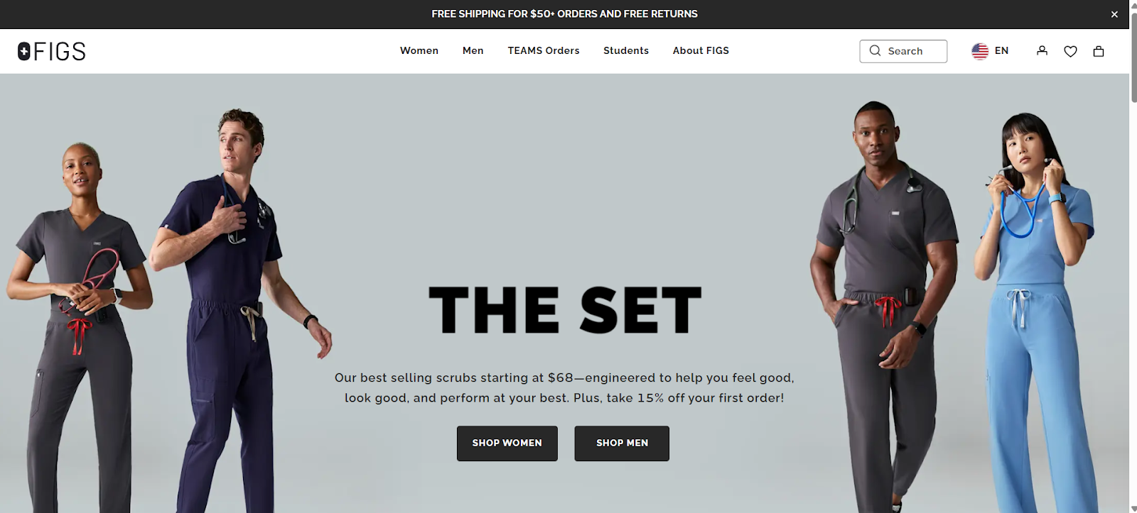
8. Figs (medical apparel)
Figs highlights gender-based fits, detailed size charts, comparison guides, and testimonials. Benefits like comfort, durability, and style are emphasized. Navigation is smooth, making variant selection simple. Trust signals include shipping info and return policies. The page balances visual appeal with practical details, guiding users to informed purchasing decisions.
Why it’s good:
Size charts reduce returns and increase confidence.
Testimonials provide social proof and credibility.
Clean layout highlights key benefits.
Smooth navigation simplifies variant selection.
Usable Product Page Designs combine aesthetics and practicality.
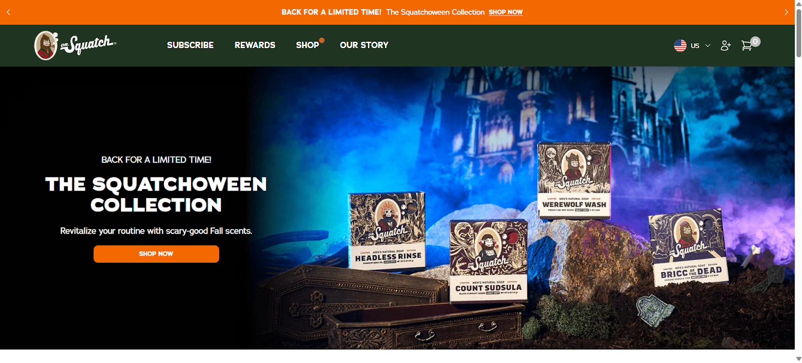
9. Dr. Squatch (personal care)
Dr. Squatch combines humor, visuals, and feature highlights. Videos demonstrate product use. Bundles and gift options are offered. Social proof, including reviews and images, is embedded. Trust signals, such as shipping and return info, are clear. The page guides visitors through benefits, features, and purchase options in a fun, engaging way that aligns with brand personality.
Why it’s good:
Videos clarify product usage.
Humor and personality engage users.
Bundles increase average order value.
Reviews enhance trust.
Product Page Designs merge storytelling with conversion-focused layout.
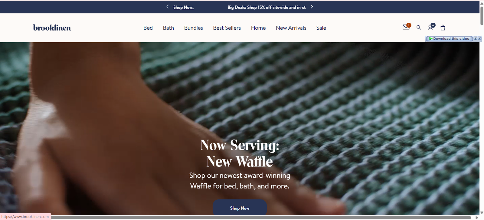
10. Brooklinen (linen & bedding)
Brooklinen uses styled lifestyle images, closeups, and material details. Variants are easy to select. Reviews are integrated, showing real customer experiences. Shipping and returns information is visible. The layout is clean, emphasizing tactile quality and comfort. The page combines visuals, functional info, and social proof to help users make confident purchase decisions.
Why it’s good:
Lifestyle images help users visualize the product.
Clear variant selection reduces friction.
Reviews provide trust and credibility.
Shipping and return info builds confidence.
Effective Product Page Designs blend visuals and information seamlessly.
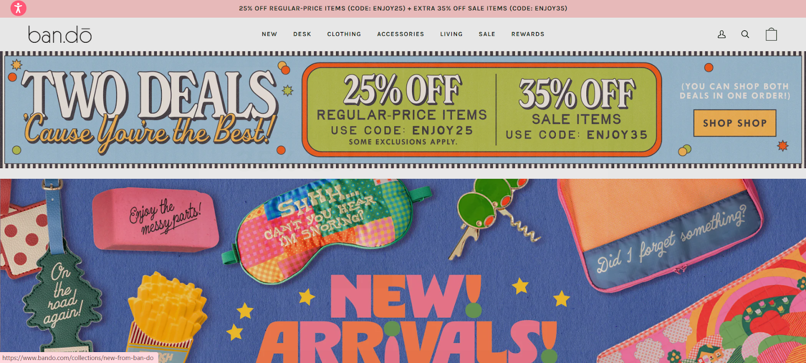
11. Ban.do (accessories & stationery)
Ban.do’s product page highlights bestsellers, trending items, and limited-stock notifications. Large lifestyle images show products in use. Bundles and add-on options are clearly displayed. The layout emphasizes playful visuals while keeping navigation intuitive. Product descriptions are concise, emphasizing features, materials, and usability. Social proof, including user photos and reviews, is integrated without clutter.
The page guides shoppers from inspiration to purchase smoothly, combining fun branding with clear functionality.
Why it’s good:
Lifestyle images showcase the product in real-life contexts.
Bundles and add-ons increase average order value.
Trending and stock info create urgency.
Integrated reviews provide credibility.
Clean Product Page Designs balance brand personality with usability.
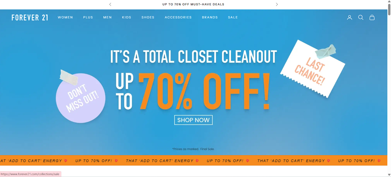
12. Forever 21 (fashion)
Forever 21 uses dynamic fit ratings and size guidance integrated into the product page. Multiple angles and zoom features highlight details. Trend indicators and “new arrivals” help users discover products quickly. Reviews are visible alongside images. Layout prioritizes fast scanning and clear CTAs, while navigation between variants and checkout is intuitive.
This approach simplifies buying decisions and reduces returns, while keeping the page visually consistent with the brand’s fashion-focused identity.
Why it’s good:
Dynamic sizing reduces purchase errors.
Multiple product angles increase understanding.
Trend indicators encourage exploration.
Reviews add social proof and trust.
Effective Product Page Designs reduce friction while engaging shoppers visually.
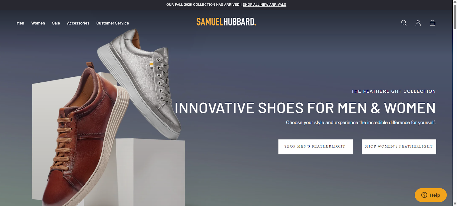
13. Samuel Hubbard (premium shoes)
Samuel Hubbard features 360° spin images and high-resolution closeups of shoe materials. Product benefits like cushioning, comfort, and durability are clearly highlighted. Color and size selection is simple, with stock availability visible. Reviews and testimonials support credibility. The layout balances visual storytelling with functional information, guiding premium buyers confidently toward purchase. Sticky CTAs and consistent branding maintain the high-end feel of the product and brand experience.
Why it’s good:
360° views provide full product understanding.
Close-ups highlight material quality.
Stock and variant info reduce decision friction.
Reviews and testimonials build trust.
Premium Product Page Designs combine aesthetics with clear functional guidance.
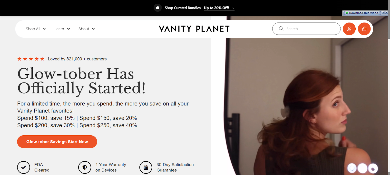
14. Vanity Planet (beauty gadgets)
Vanity Planet embeds demo videos and step-by-step usage explanations. Product descriptions highlight features, benefits, and health/safety considerations. Bundles, subscriptions, and pricing options are clearly displayed. FAQs and customer reviews provide additional guidance. Navigation is intuitive with sticky CTAs.
Rich visuals and clear benefit messaging help users understand the value and function, ensuring confident buying decisions while keeping the page visually engaging and conversion-focused.
Why it’s good:
Demo videos clarify functionality.
Bundles and subscriptions increase order value.
FAQs reduce post-purchase questions.
Reviews provide credibility and trust.
Well-structured Product Page Designs guide users effectively from curiosity to purchase.
15. Love Wellness (health & wellness)
Love Wellness emphasizes product benefits like sleep improvement, pain relief, and hormonal balance. Ingredients, science-backed claims, and subscription options are clearly displayed. High-quality images show usage contexts. Navigation between variants, reviews, and purchase options is seamless. Trust signals, including return policy, secure checkout, and customer testimonials, are embedded.
The layout balances visual appeal with practical information, helping shoppers make informed, confident wellness-related purchases.
Why it’s good:
Highlighted benefits build immediate interest.
Ingredient transparency improves credibility.
Subscription options encourage repeat purchases.
Trust signals reduce hesitation.
Clean Product Page Designs combine clarity, visuals, and functionality.
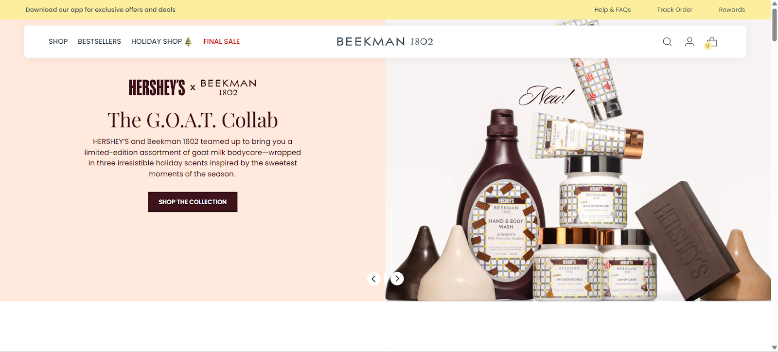
16. Beekman 1802 (skincare)
Beekman 1802 uses neutral colors and a minimalist layout to focus on product quality. Product benefits, ingredients, and usage instructions are clearly segmented. Lifestyle images and videos demonstrate real-life applications. Reviews and ratings are integrated. Navigation between specifications, FAQs, and purchasing options is intuitive. Sticky CTAs encourage immediate action.
The page blends brand story with functional information, guiding users toward confident skincare purchases.
Why it’s good:
Minimalist layout keeps focus on products.
Lifestyle images demonstrate real-life use.
Ingredients and benefits are clearly explained.
Reviews and ratings build trust.
Effective Product Page Designs balance narrative, usability, and conversion focus.
17. Nodiee (sleep device)
Nodiee showcases usage scenarios, app interface visuals, and feature overlays. Detailed product descriptions, benefits, and technical specs are clear. Customer testimonials provide social proof. Navigation is simple, variant selection is intuitive, and sticky CTAs encourage conversions. Rich visuals combined with clear functional messaging help users quickly understand the product’s value and application, reducing friction for first-time buyers.
Why it’s good:
Usage visuals help buyers imagine real-life use.
Technical specs and benefits are clear.
Testimonials provide trust and credibility.
Sticky CTAs improve conversion.
Clean Product Page Designs communicate function and value effectively.
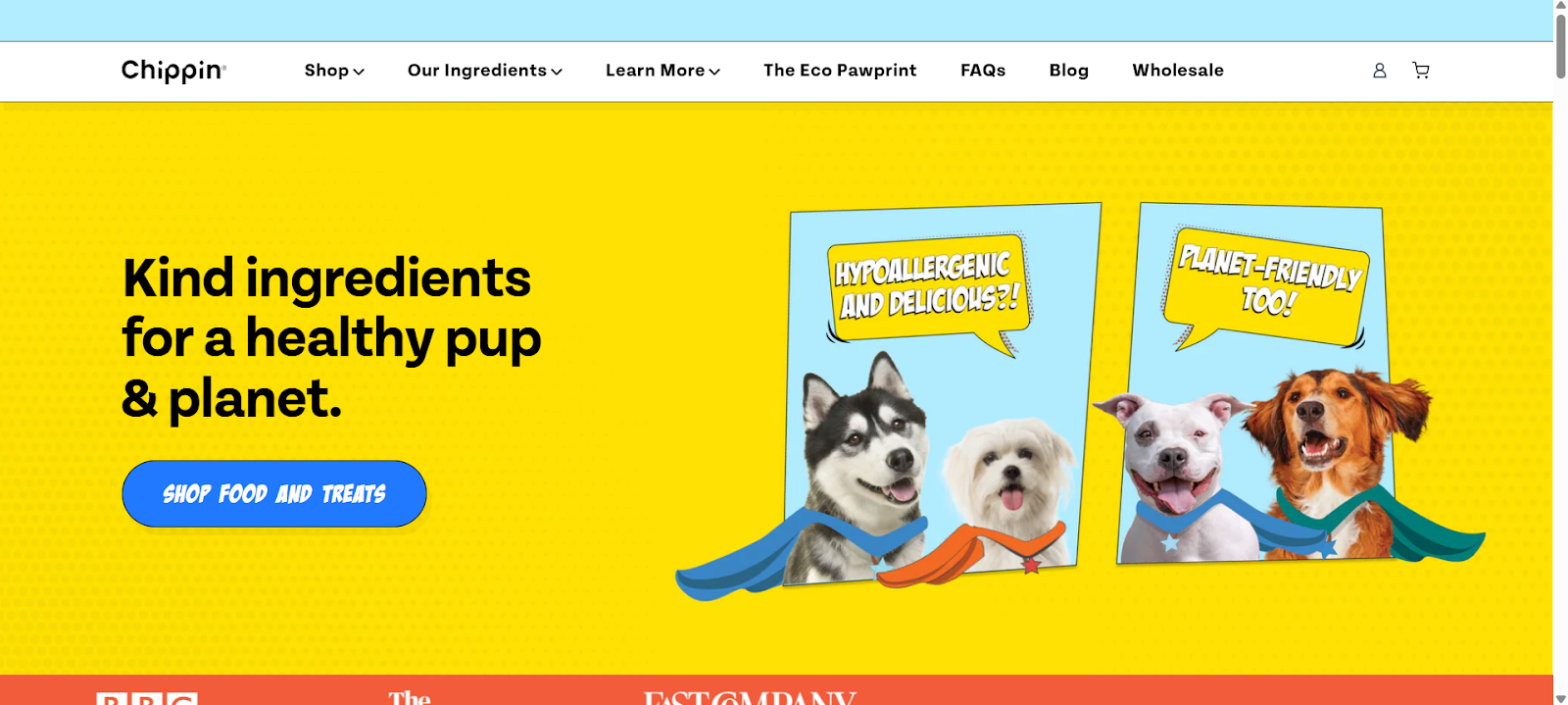
18. Chippin (dog treats)
Chippin highlights eco-friendly ingredients, sustainability, and product benefits. Product images and lifestyle shots illustrate usage. Bundles and quantity options are clearly displayed. Social proof, including reviews and user photos, reinforces trust. Navigation is intuitive, making variant selection and purchase straightforward.
The page emphasizes both environmental responsibility and product quality, guiding pet owners to informed and confident decisions.
Why it’s good:
Eco-friendly messaging aligns with buyer values.
Lifestyle images show real usage.
Bundles and options encourage higher purchase value.
Reviews build credibility and trust.
Well-structured Product Page Designs balance purpose, visuals, and usability.
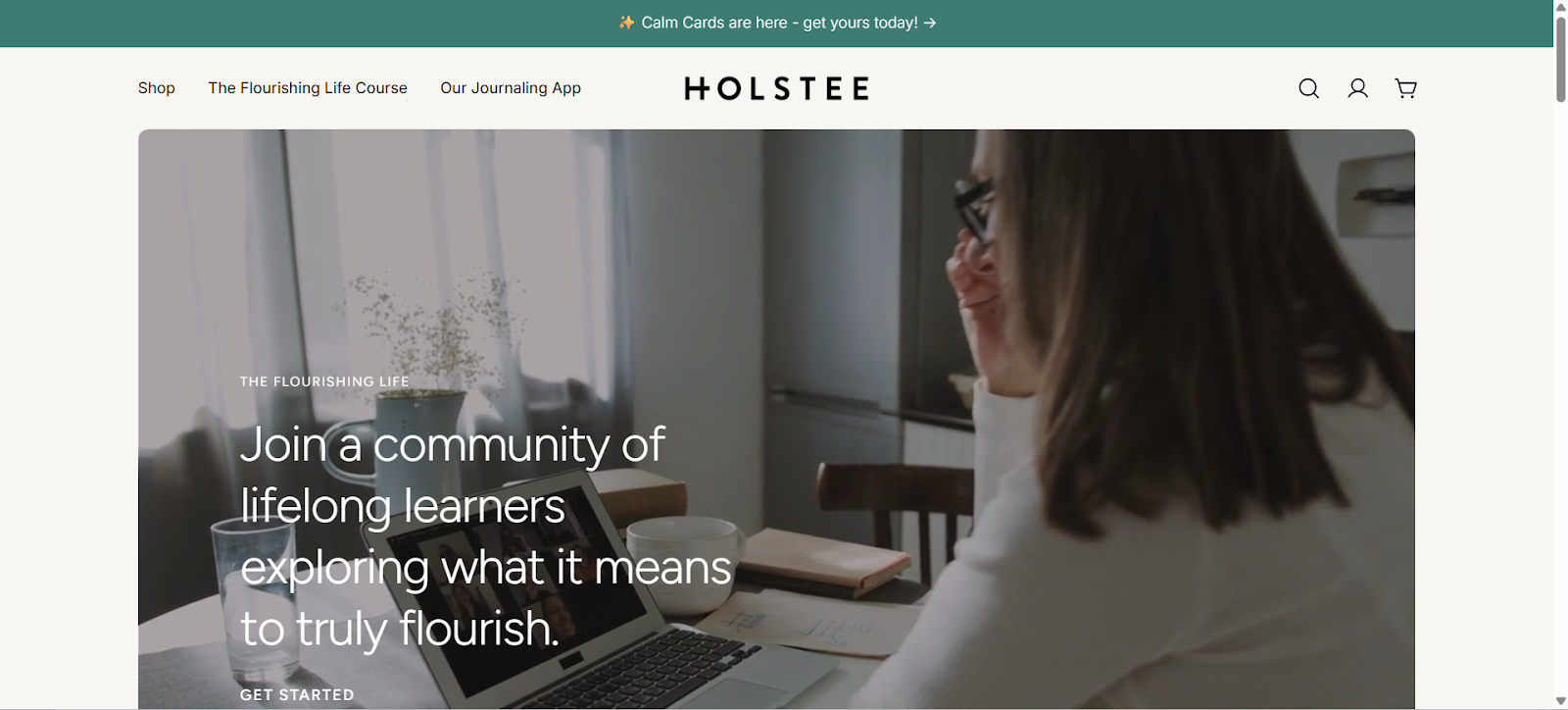
19. Holstee (lifestyle products)
Holstee integrates brand story, craftsmanship, and product materials into the product page. Images show real-life usage, while benefits and specifications are clearly segmented. Navigation between variants, reviews, and purchasing is intuitive. Sticky CTAs guide users toward action.
The page blends narrative and functionality, creating an engaging, informative experience for shoppers seeking mission-driven products.
Why it’s good:
Brand story communicates purpose and mission.
Lifestyle images show real-life application.
Clear segmentation of benefits and specs reduces friction.
Reviews and testimonials increase trust.
Effective Product Page Designs combine narrative, credibility, and usability.
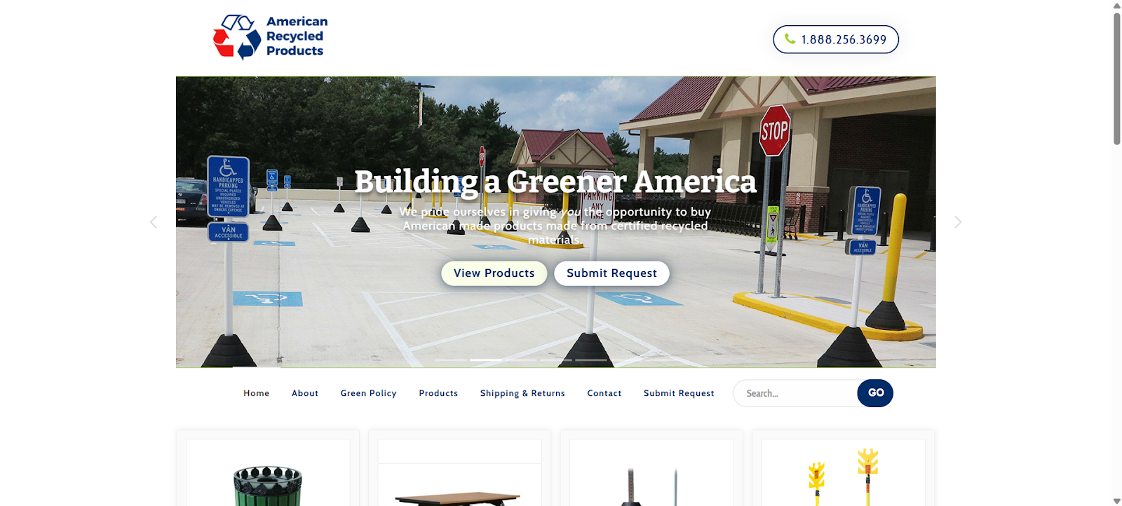
20. American Recycled Products (industrial/B2B)
American Recycled Products displays product images, technical specifications, and request forms. Pages include detailed descriptions and feature highlights. Clear navigation, trust signals, and downloadable datasheets help B2B buyers evaluate products. Visuals and concise copy communicate functionality while maintaining professionalism.
The page demonstrates how industrial and B2B Product Page Designs focus on clarity, data presentation, and decision support rather than purely lifestyle imagery.
Why it’s good:
Technical specifications aid B2B purchasing decisions.
Downloadable datasheets provide detailed product info.
Clear layout reduces cognitive load.
Trust signals enhance credibility.
Functional Product Page Designs prioritize clarity and decision support.
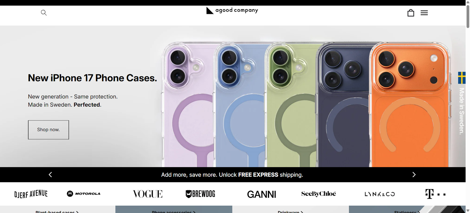
21. A Good Company (eco consumer goods)
A Good Company highlights sustainability metrics, impact statements, and product variants. High-quality images demonstrate use, while clear benefit descriptions guide buyers. Navigation is smooth between reviews, specifications, and purchase options. Trust signals, including secure checkout and return policies, are embedded.
The page integrates mission, product clarity, and usability, appealing to eco-conscious shoppers who value transparency and want confidence in their purchase.
Clean Product Page Designs combine mission, clarity, and usability.
Lessons from These Product Page Designs
Studying successful Product Page Designs reveals consistent patterns. These lessons show how to engage users, build trust, highlight key benefits, and structure pages for higher conversions and better overall performance.
Use multimedia above the fold
Videos, 360° views, and interactive visuals immediately show how the product works, engaging users better than photos alone. BlendJet and Apple demonstrate this effectively.
Prioritize clarity over ornament
Keep designs simple. Avoid unnecessary decorative elements. Use white space, clear typography, and focus on essential product information to make the page easy to scan and understand.
Make CTAs persistent
Sticky or floating Add to Cart buttons ensure users can act at any time, reducing friction and increasing conversions without needing to scroll back up the page.
Show proof early
Integrate ratings, review quotes, and user-generated images near the top. Early proof builds trust, reduces hesitation, and encourages confident purchase decisions quickly.
Provide variant & stock info
Display available sizes, colors, or configurations clearly. Show stock levels and allow hover previews to reduce uncertainty and improve decision-making for potential buyers.
Segment details
Organize specifications, FAQs, and shipping info into tabs or accordions. This prevents overwhelming users while keeping all relevant information easily accessible in one place.
Show mission, story, or credentials
Highlight sustainability, certifications, or brand story to build credibility, especially for high-value or purpose-driven products. Users feel more confident when values align.
Suggest related products
Offer upsells, cross-sells, and bundles thoughtfully. Suggesting complementary products keeps users exploring and increases average order value without being pushy.
Optimize for mobile
Ensure all product pages display and function flawlessly on mobile devices. Many users shop via phones, so responsive design is critical for engagement and conversions.
Speed and performance
Fast-loading pages improve user experience and SEO. Compress images, use lazy loading, and clean code. Slow pages risk losing visitors and ranking in search results.
How to Use These Examples in Your Own Product Page Designs
Pick 2–3 examples you like.
Extract what you love (layout, media, trust elements).
Map these to your product: what features, images, and story you have.
Sketch a wireframe before building.
Test with real users.
Use an A/B test for CTA placement, media inclusion, and copy tone.
SEO Tips for Product Page Designs
Use your focus keyword Product Page Designs in the title, meta description, H2 or H3 headings, and naturally in content.
Use structured data (Product schema) to allow rich snippets (price, rating, availability).
Use descriptive alt text on images (e.g., “modern stainless bench design photo”).
Optimize page speed (compress images, avoid large scripts).
Internally link from category pages, blog posts, and navigation to these product pages.
Use clean URLs with the product name and, optionally category.
Use canonical tags if variants share content.
Final Thoughts
Your product page is among your most critical assets. The examples above show how leading brands execute Product Page Designs with clarity, trust, and persuasive logic. Whether you are B2C or B2B, you can draw from their strengths: visual storytelling, clean layouts, proof elements, and seamless CTAs. Use these 21 product page designs as your benchmark. When you design or refine your pages, aim for clarity, speed, and trust. That approach will help your pages outperform weaker ones and help your conversions rise.


.svg)
.svg)
.svg)
.svg)
