

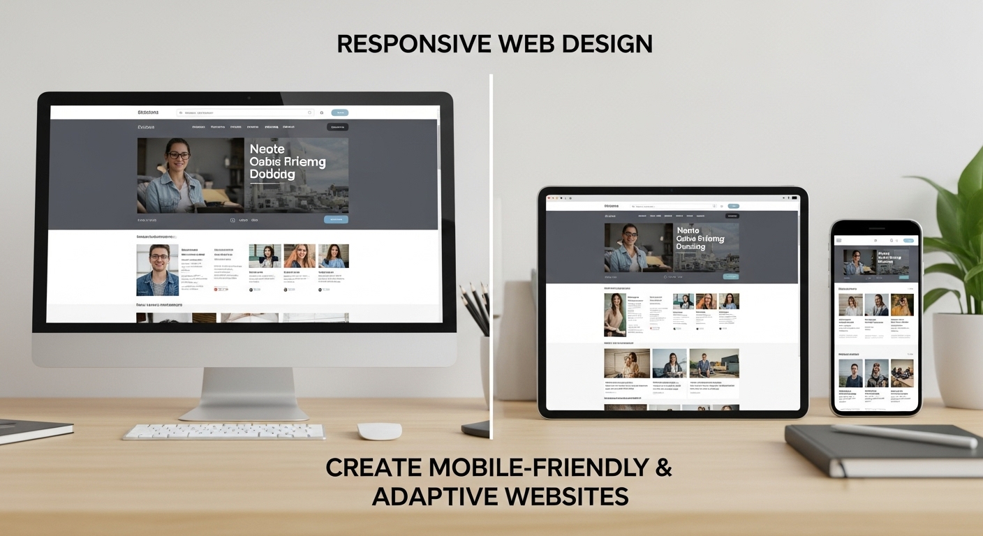
Responsive web design is crucial for creating websites that deliver an optimal user experience across all devices. Whether users access your website via a smartphone, tablet, or desktop computer, it should adapt to their device’s screen size, ensuring ease of use.
We will explore the concept of responsive web design, its importance, key components, best practices, common mistakes, and frequently asked questions, with practical examples to help users understand the concept better.
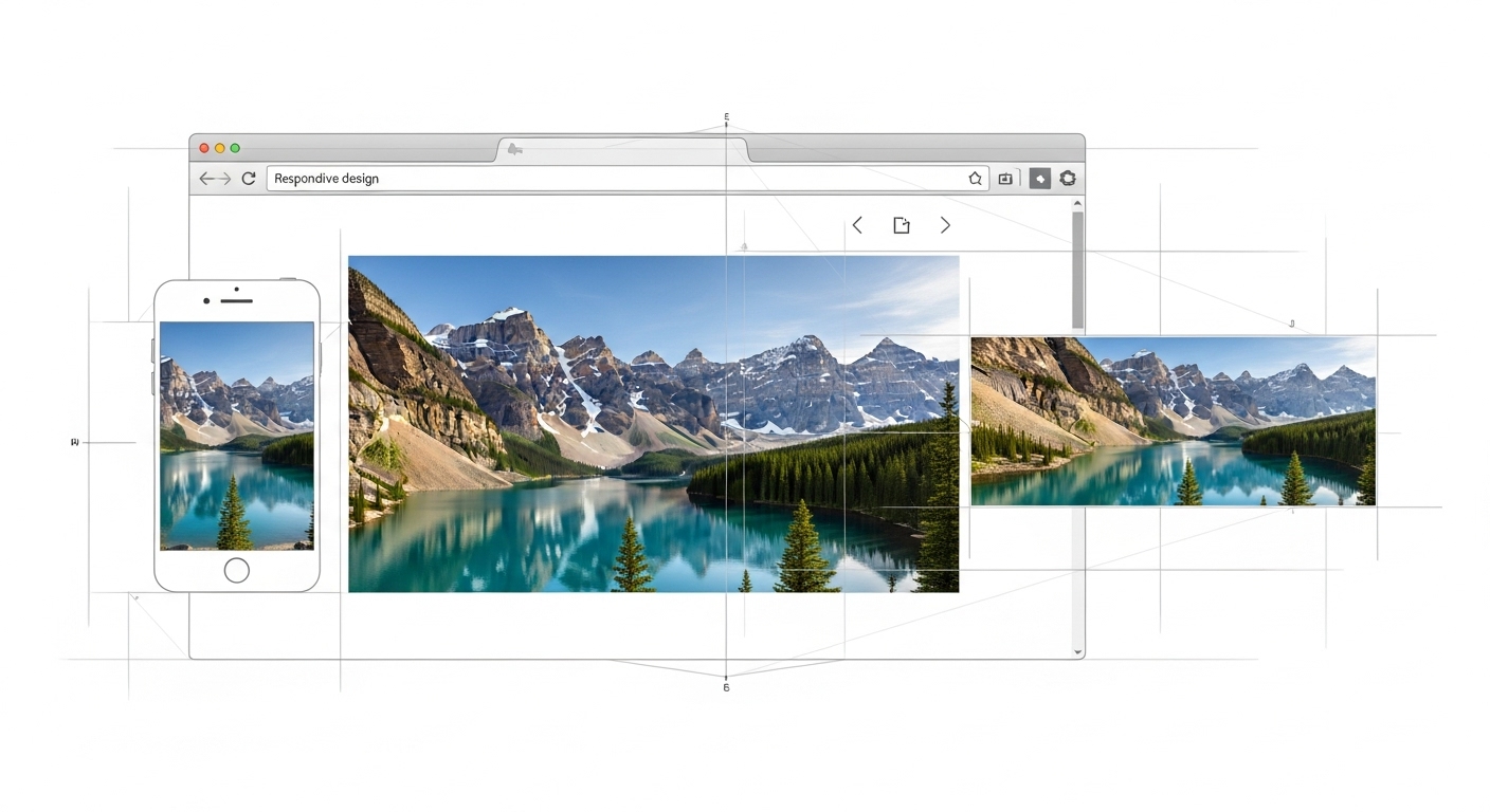
What is Responsive Web Design?
The practice of responsive web design (RWD) involves building websites that modify their structure, content, and functionality to fit the user’s screen size. This ensures that no matter whether someone is browsing your website on a smartphone, tablet, or desktop, they will experience a layout that fits the screen perfectly.
The practice of designing different websites for mobile and desktop users is no longer necessary. With a responsive web, your website adapts to the screen size, providing users with an optimized experience without the need for multiple versions of the same site. This design method removes the need to manage multiple versions of your website, helping you save both time and resources.
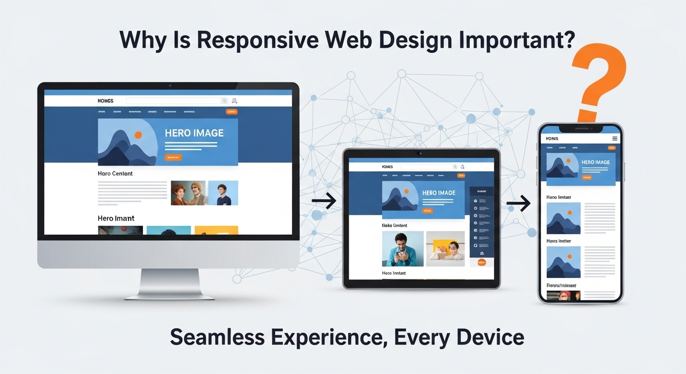
Why Is Responsive Web Design Important?
In an age where mobile internet usage has surpassed desktop usage, the need for responsive websites has never been more pressing. Here are some key reasons why a responsive web is a must for any website:
1. Improved User Experience
A seamless user experience is vital for retaining visitors. If users have to zoom in or scroll horizontally to view your content, they are more likely to leave your site. Responsive design eliminates these issues, offering a smooth and enjoyable browsing experience, which ultimately leads to higher user satisfaction and longer site visits.
Example: If you visit an e-commerce website on your mobile phone, a responsive web design would resize product images and rearrange content for easy navigation. On a desktop, the website displays multiple products per row, while on mobile, it displays one product at a time, optimizing the viewing experience.
2. Increased Mobile Traffic
With more people accessing websites through their mobile devices, a responsive web design ensures your site can cater to this vast audience. By providing a user-friendly mobile experience, your site will attract more mobile visitors, boosting your traffic and potential conversions.

Example: A news website with a responsive design ensures that mobile users can easily read articles, watch videos, and navigate to different sections without frustration. Non-responsive websites might show content too large or too small, causing the user to leave.
3. Better SEO Rankings
Google prioritizes mobile-friendly websites in its search rankings. In 2015, Google officially confirmed that responsive web design is a ranking factor for mobile search results. By adopting RWD, you are ensuring that your website performs well on search engines, improving your visibility and driving more organic traffic to your site.
Example: A blog that adapts to different screen sizes and offers an optimal user experience will rank better in Google’s search results than a non-responsive blog, which might be penalized for poor mobile usability.
4. Cost-Effectiveness
Instead of creating separate mobile and desktop websites, responsive web design allows you to manage one website that works across all devices. This reduces development and maintenance costs while providing consistency across platforms. It also saves you time and resources when making updates, as changes are applied to all devices simultaneously.
Example: A company that offers both a mobile and a desktop version of its website will need to manage two separate websites. With a responsive design, they only need to manage and update one website.
5. Future-Proofing Your Website
Responsive design ensures your website is adaptable to future technologies and devices. Whether it's new screen sizes, mobile devices, or unexpected technology trends, a responsive website can easily accommodate changes without requiring a complete redesign.

Example: When a new device, like a foldable phone, is released, a responsive website will automatically adjust its layout to work seamlessly on that device, without needing a redesign.
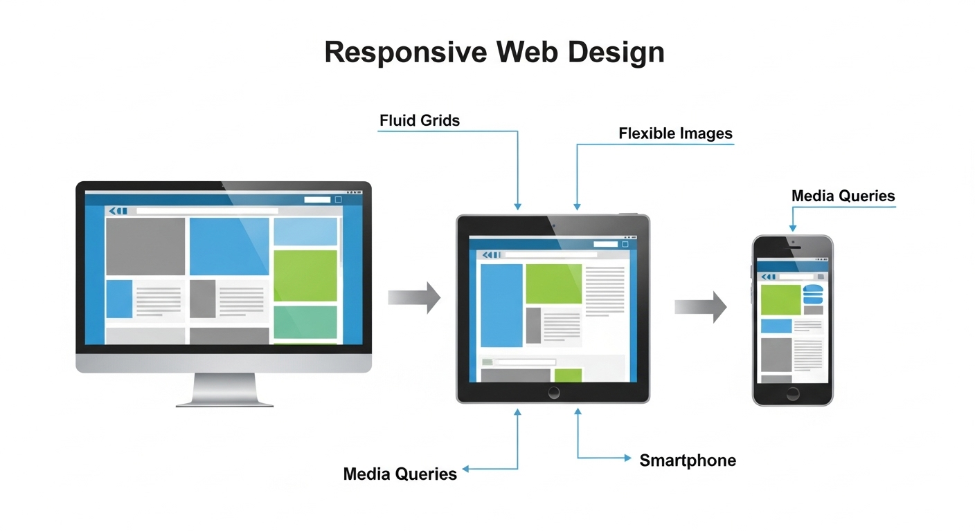
Key Components of Responsive Web Design
For a website to be fully responsive, it must incorporate several key elements. These components work together to create a layout that automatically adjusts based on the screen size and resolution.
1. Fluid Grid Layouts
A fluid grid layout is the backbone of responsive design. Rather than using fixed pixel widths, this approach uses percentage-based widths, allowing elements to resize proportionally. This ensures that content adjusts to fit different screen sizes without causing layout issues or content overflow.
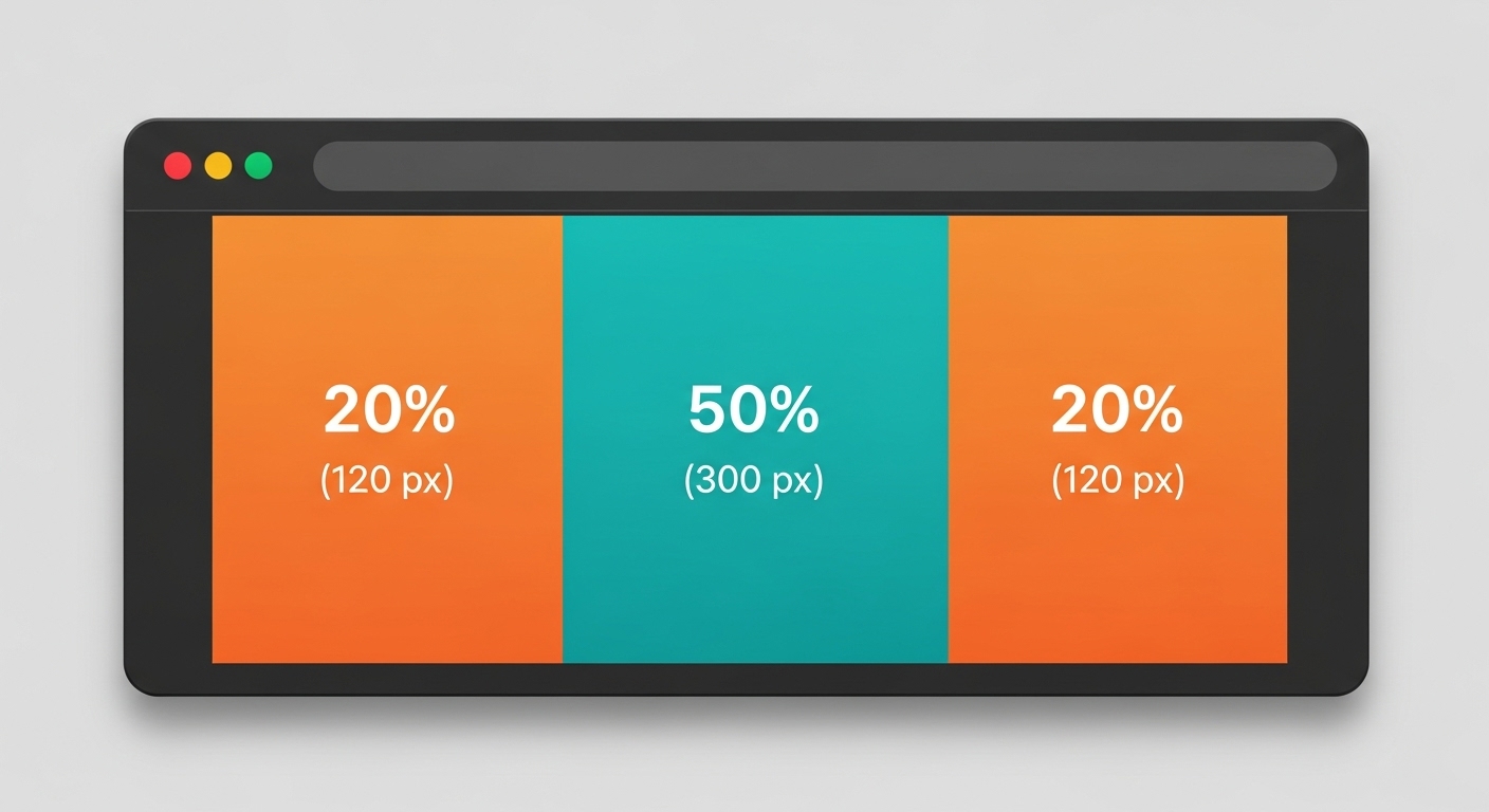
Example: A website with a fluid grid layout might have a navigation bar that takes up 100% of the screen on a small phone but shrinks to 80% on a larger desktop screen.
.container {
width: 100%;
}
.header {
width: 100%;
background-color: lightblue;
}
2. Flexible Images
Images on responsive websites should be flexible, meaning they can resize depending on the screen width. This is achieved by using CSS properties such as max-width: 100% and height: auto. By making images fluid, you avoid issues where images appear too large or too small on different devices.
Example: An image of a product might appear large on a desktop screen, but on a mobile device, the image resizes to fit the screen, ensuring that it doesn’t overflow or become distorted.
img {
max-width: 100%;
height: auto;
}
3. Media Queries
Media queries are a key feature of responsive web design. These are CSS techniques used to apply different styles depending on the characteristics of the device or viewport. Media queries allow you to define custom styles for different screen sizes, ensuring that your website looks great on mobile phones, tablets, and desktops.
For example, you might have one set of styles for screens wider than 768px (tablets and desktops) and another set for screens smaller than 768px (smartphones).
@media (max-width: 768px) {
/* Styles for mobile devices */
}
@media (min-width: 769px) {
/* Styles for tablets and desktops */
}
4. Responsive Typography
Typography is another critical aspect of responsive web design. Text should be legible on all screen sizes, so using flexible font sizes is essential. Instead of using fixed pixel values, relative units like em or rem are preferred, as they allow text to scale appropriately across devices.
Example: A headline on a desktop screen might be 36px, but on a smaller phone screen, it could be resized to 24px for better readability.
h1 { font-size: 2rem;}
5. Viewport Meta Tag
The viewport meta tag is essential for ensuring that your website looks good on mobile devices. It controls how the browser renders your webpage on smaller screens. By setting the viewport width to device-width, the browser can adjust the layout to fit the screen size.
Example: Adding the following meta tag to your website ensures that it will display properly on mobile devices:
<meta name="viewport" content="width=device-width, initial-scale=1">
Best Practices for Creating a Responsive Website
While the key components of responsive web design are essential, following best practices can ensure that your website is not only functional but also aesthetically pleasing and user-friendly.
1. Prioritize Mobile-First Design
Begin by creating your website with mobile devices as the primary focus. Given that the majority of users browse the web on their phones, building your website with a mobile-first approach ensures a smooth user experience on all devices. After designing the mobile version, you can gradually improve the design for larger screens.
2. Optimize Website Speed
Website speed is the key factor, even for those who have slower internet connections on their mobiles. Minimize large files, optimize images, and reduce unnecessary code to improve your website's load time. A fast website improves user experience and is also favored by search engines, which can improve your rankings.

3. Use Responsive Navigation Menus
Navigation is a critical aspect of user experience, and it must work seamlessly across devices. Use collapsible or hamburger-style menus on mobile to save space and make it easier for users to access key sections of your site.
4. Test Your Website Across Multiple Devices
It's crucial to test your website across various devices and browsers to maintain a consistent user experience. Tools like BrowserStack allow you to test your site on various devices and browsers, ensuring that your responsive design works as intended.
5. Keep Content Readable
On smaller screens, readability is paramount. Ensure your content is brief, opt for readable fonts, and make sure the text size is sufficient for easy reading without zooming. Break up large chunks of text with headings, bullet points, and images to make your content more digestible.
Common Mistakes to Avoid in Responsive Web Design
1. Ignoring Mobile Usability
One common mistake is focusing too much on the desktop version of the site and neglecting mobile usability. Always prioritize mobile usability when designing a responsive website, as most users will access your site from their mobile devices.
2. Using Fixed Position Elements
Using fixed-position elements, such as navigation bars or pop-up windows, can disrupt the layout on smaller screens. These elements may not resize properly, causing issues with the user experience. Avoid using fixed-position elements or ensure that they are properly adjusted using media queries.
3. Overloading with Content
While it's important to offer valuable content, overloading mobile users with too much information or too many features can overwhelm them. Focus on delivering key content and features in a clean and simple layout that enhances usability.

4. Failing to Optimize Images
Images that are large and not properly optimized can severely impact the performance of your website, especially on mobile phones. Always optimize images for the web by reducing their size without compromising quality. Choose advanced image formats like WebP for improved performance.
Conclusion
Responsive web design is a crucial practice for ensuring that your website delivers an exceptional experience across all devices. By implementing fluid grid layouts, flexible images, and media queries, you can create a website that adapts to different screen sizes, improving both user experience and SEO performance. By following best practices, avoiding common mistakes, and continually testing your website, you can create a website that meets the needs of your audience and ranks well on search engines.
By adopting responsive web design, you future-proof your website, ensuring it works seamlessly across a wide range of devices and platforms. As mobile traffic continues to grow, investing in responsive design is no longer optional – it is essential for the success of your online presence.
Frequently Asked Questions About Responsive Web Design
What is the difference between responsive and adaptive web design?
While both responsive and adaptive web design seek to optimize user experiences across different devices, responsive design uses fluid grids and media queries for dynamic adjustment, whereas adaptive design applies predefined layouts for set screen sizes.
Is responsive design good for SEO?
Yes, responsive web design is good for SEO because it provides a mobile-friendly experience, which is a ranking factor for Google. A single URL for all devices is easier for search engines to index, which can improve your search rankings.
Is it possible to transform my current website into a responsive design?
Yes, it is possible to convert an existing website into a responsive design. This typically involves updating the HTML, CSS, and possibly the images to ensure they adapt to different screen sizes.
How can I test if my website is responsive?
To test if your website is responsive, simply resize your browser window or use tools like Google's Mobile-Friendly Test or BrowserStack to preview your website on different devices.


.svg)
.svg)
.svg)
.svg)
