

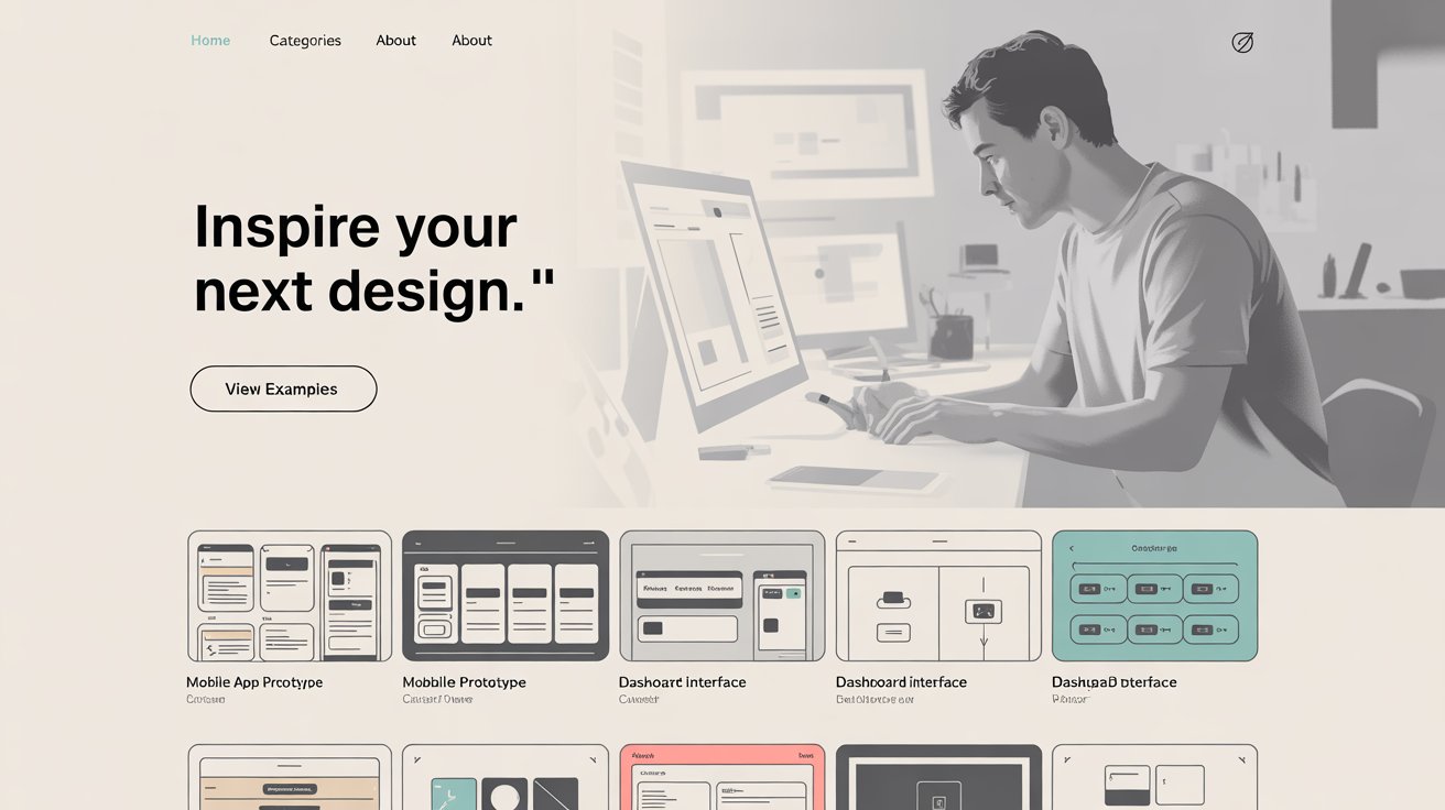
Wireframe examples are the foundation of great web and digital design. These simple blueprints show how your site will look and work without color or copy. Using real wireframes helps you plan pages that guide users where you want them to go. We’ll discuss twenty top examples, explain why they matter, and help you learn how to make them. By the end, you’ll see how these examples will save time, avoid mistakes, and make your design process strong.
What Are Wireframe Examples?
These are simple sketches or digital outlines that show where important things go on a page. They use boxes for headlines, lines for text, and shapes for images or buttons. Designers use it to map content, page flow, and user steps before adding style. By using it, you can show clients the structure first, get feedback, and save hours on design changes.
Why Wireframe Examples Matter
Wireframes matter because they help you
- Plan structure before adding detail.
- Spot problems early.
- Get faster approvals from clients.
- Save time by avoiding major rework.
Wireframes help align on content and flow before visuals. When you work with strong wireframe examples, you look less messy and more professional.
Types of Wireframe Examples
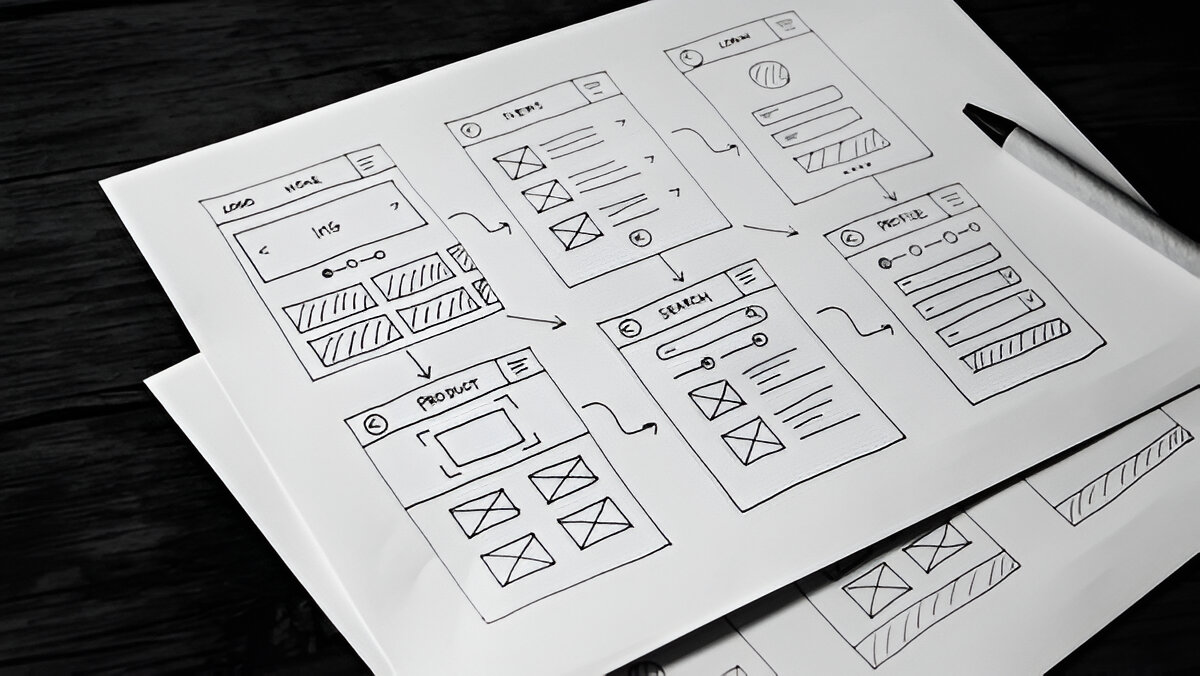
Sketch Wireframe Examples
These are fast pen and paper drawings. You sketch boxes and lines in minutes. A sketch wireframe example might show a main image at the top and a bullet list below. These simple starts help you explore ideas much faster.
Low-Fidelity Wireframe Examples
Low-fidelity wireframes are digital but still plain just outlines and grayscale. They give a clear view of layout and flow without design distractions. One good wireframe example shows a 12-column grid that keeps the layout tidy.
High-Fidelity Wireframe Examples
High-fidelity versions are nearly complete mockups. They include real text, shades of gray, and even small accents of color. In one wireframe example, you can see charts, maps, headers, and buttons all laid out clearly. These help clients visualize the final site before building it.
20 Impressive Wireframe Examples You Should See
Let’s discuss twenty types, grouped by style.
1–5: Sketch Wireframe
- Simple landing page sketch: basic boxes for header, call to action, and text.
- Annotated sketch: uses numbered notes to explain content.
- Shaded grid sketch: light gray highlights for key areas.
- Detailed page sketch: more layout and design ideas on paper.
- Flow sketch: outlines multiple pages and how users move between them.

6–10: Low-Fidelity Wireframe
- Grid-based layout: neat structure with 12 columns.
- Outlined landing page : logo, hero image, and text blocks.
- Gray-scale hierarchy: different shades to highlight important parts.
- Music app flow: shows user steps on mobile.
- User journey map: connects screens in a clear flow.
11–20: High-Fidelity Wireframe
- Mobile flow with content: near-final layout.
- Charts and map page: shows how data fits on screen.
- Landing page mockup: header, subtitle, button, image area.
- Accent color design: grayscale plus one highlight color.
- Signup page wireframe: adds real text and color.
- Responsive wireframe trio: desktop to tablet to mobile.
- Desktop grid layout: clear sections for header, content, and footer.
- Accent color mobile: small color highlights in a mobile screen.
- Real content wireframe: shows how final headlines and images fit.
- Device-responsive grid: scales across screen sizes.

Tips to Create Better Wireframes
Start on Paper
Use pen and paper first. It’s fast and flexible for early use.
Use Simple Labels
Write real headings so you can see how text will flow before design.
Think About Grid Systems
Use columns to align things. It keeps your layout clean in your wireframes.
Add Light Color Highlights
In high-fidelity wireframes, use one color to draw attention.
Show Flow Between Pages
Use arrows to connect pages. It makes your show how users move.
How to Use Wireframe Examples in Your Process
- Research & Goals: Know what your site must do.
- Sketch First: Create a quick wireframe on paper.
- Go Digital: Use software to make low-fidelity versions.
- Share and Revise: Get feedback early to improve.
- Polish with Color & Text: Final wireframes are almost ready.
- Move to Final Design: Use your wireframe as a guide to build the real site.
We call this a clear roadmap from quick sketch to final wireframe.
Conclusion
Using wireframes is smart, fast, and clear. They help you plan, get client approval, and avoid extra work. We’ve seen twenty top examples, from sketches to pixel-perfect layouts. Each one teaches us new ideas about structure, flow, and clarity.
Start with a sketch on paper, then build low-fidelity outlines. Share them, add small highlights, then finish with near-design high-fidelity wireframes. This approach keeps your process smooth and effective.
Your next project? Grab a paper, sketch wireframes, and build from there. You’ll save time, spot issues early, and end up with a impressive website design. Use these examples as your guide and watch your designs get better and faster.


.svg)
.svg)
.svg)
.svg)
