
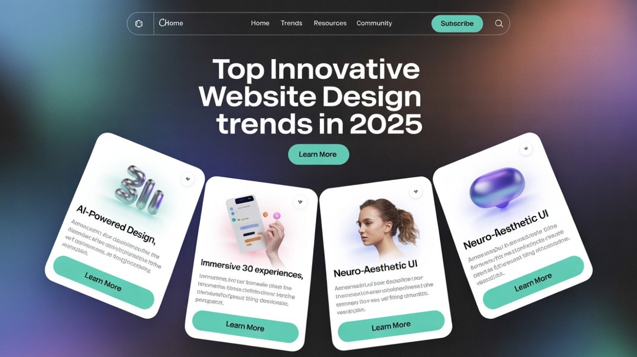
Innovative web design is changing fast in 2025. As users want quicker, easier, and more fun online experiences, designers must stay ahead of the curve. Website design is not just about how things look, it’s about how they feel and function. This year, websites are becoming more interactive, smarter, and more personal than ever before.
We’ll look at the top innovative web design trends in 2025. We’ll explore what makes these trends special, why they matter, and how real websites use them. If you want your website to stand out and stay modern, keep reading.
Need for Innovative Web Design in 2025
A well-designed website can do more than just show information. It helps visitors connect with your brand. In 2025, innovative web design is key to building trust, keeping users engaged, and increasing online success. Websites must load fast, feel alive, and adjust to each visitor’s needs. Search engines also notice design. Google now favors websites that are easy to use, mobile-friendly, and rich in interactive design.
Trend 1: AI-Powered Personalization
What It Means
AI (Artificial Intelligence) is now being used in web design to learn from visitors. It looks at what users click, how long they stay, and even what time of day they visit. The site then changes what it shows. This can mean showing different products, changing the homepage layout, or even changing colors and text.

Real Example
Netflix
Netflix is a leader in AI-driven personalised innovative website design. It shows different banners, thumbnails, and titles depending on what users watched before. Each person’s homepage looks and feels different.
Sephora
Sephora uses AI to suggest makeup based on skin tone and past purchases. Their website recommends items like a helpful shopping buddy.
Why It’s Innovative
It saves users time, increases sales, and builds trust. A personal website experience feels more like a real conversation.
How You Can Use AI-Powered Personalized Design Innovation
You don’t have to be a tech giant to use this trend on your website. There are tools and platforms today that make personalisation easy for all types of businesses. Here’s how:
- Personalized Product Recommendations: Use AI plugins (like Shopify’s AI tools or WooCommerce extensions) to suggest products based on browsing and purchase history.
- Smart Content Display: Show blog articles or services based on what users have read before. For example, if a visitor always clicks on health-related content, show more wellness articles or products.
- Dynamic Homepages: Design a homepage that updates depending on the time of day, the user’s location, or their device. A travel site could show warm vacation spots in winter or beach deals to mobile users.
- Interactive Quizzes: Let visitors answer a few questions, and use AI to guide them to the right service, product, or page. This feels helpful and saves time.
- AI Chatbots: Use chatbots that get smarter with each question. These bots help visitors find answers faster and suggest next steps based on the conversation.
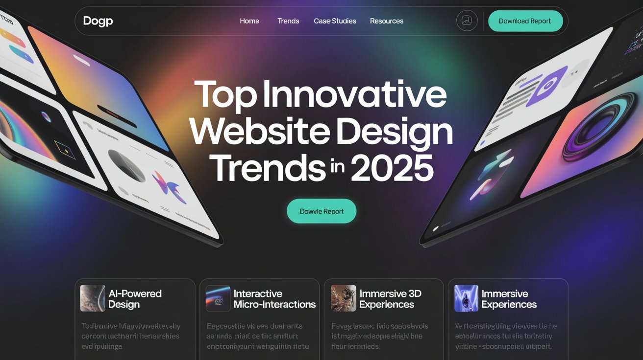
Trend 2: 3D Elements That Pop
What It Means
Websites are no longer flat and still. Now they feel alive. Thanks to new tools, designers are adding 3D models, floating images, moving shapes, and scroll-based effects that respond to your actions. These elements change when you scroll, move your mouse, or tap on your screen.
Instead of just looking at a photo, you feel like you’re holding the product in your hands. You can spin it, zoom in, or explore it from different angles. These 3D visuals make your website fun, modern, and interactive, perfect for brands that want to stand out.
Real Examples That Stand Out
Nike
Nike’s sneaker pages are a perfect example of 3D done right. When you visit a product page, you can rotate the shoe, look at it from the top, side, and bottom all without leaving the page. This makes shopping online feel more like trying the product in a real store.
BMW
BMW’s website lets users explore the interior of a car in 3D. You can change colors, open doors, and check out every part of the car. It gives buyers confidence without needing to visit a showroom.
Why It’s Innovative
3D design in websites used to be hard to build. It required heavy coding and slowed down pages. But now, with better web tools like WebGL and faster internet speeds, it’s easier and smoother.
Here’s why 3D elements matter in innovative web design:
- Makes products feel real: Visitors get a better sense of shape, size, and texture.
- Increases trust: Customers feel more confident when they see details up close.
- Boosts time on site: People stay longer to explore.
- Shows creativity: Makes your site feel high-end, modern, and memorable.
How You Can Use It on Your Website
You don’t need to be a big brand like Apple to use 3D. Start small and focus on where 3D can help most.
- Product Display: If you sell physical items (like shoes, gadgets, furniture), use 3D product viewers to let customers spin and explore each item.
- Hero Sections: Use 3D graphics or animations in your hero banner, the first thing people see. A floating object or shape can grab attention quickly.
- Background Depth: Instead of flat designs, add layered backgrounds that move when the user scrolls. It adds depth without slowing down your site.
- Storytelling: Tell your brand story with 3D visual steps. Use objects that guide users through a journey, like moving through a scene or unfolding layers.
- Education and Training: If you offer services or lessons, you can use 3D models to explain how things work great for industries like health, engineering, or beauty.
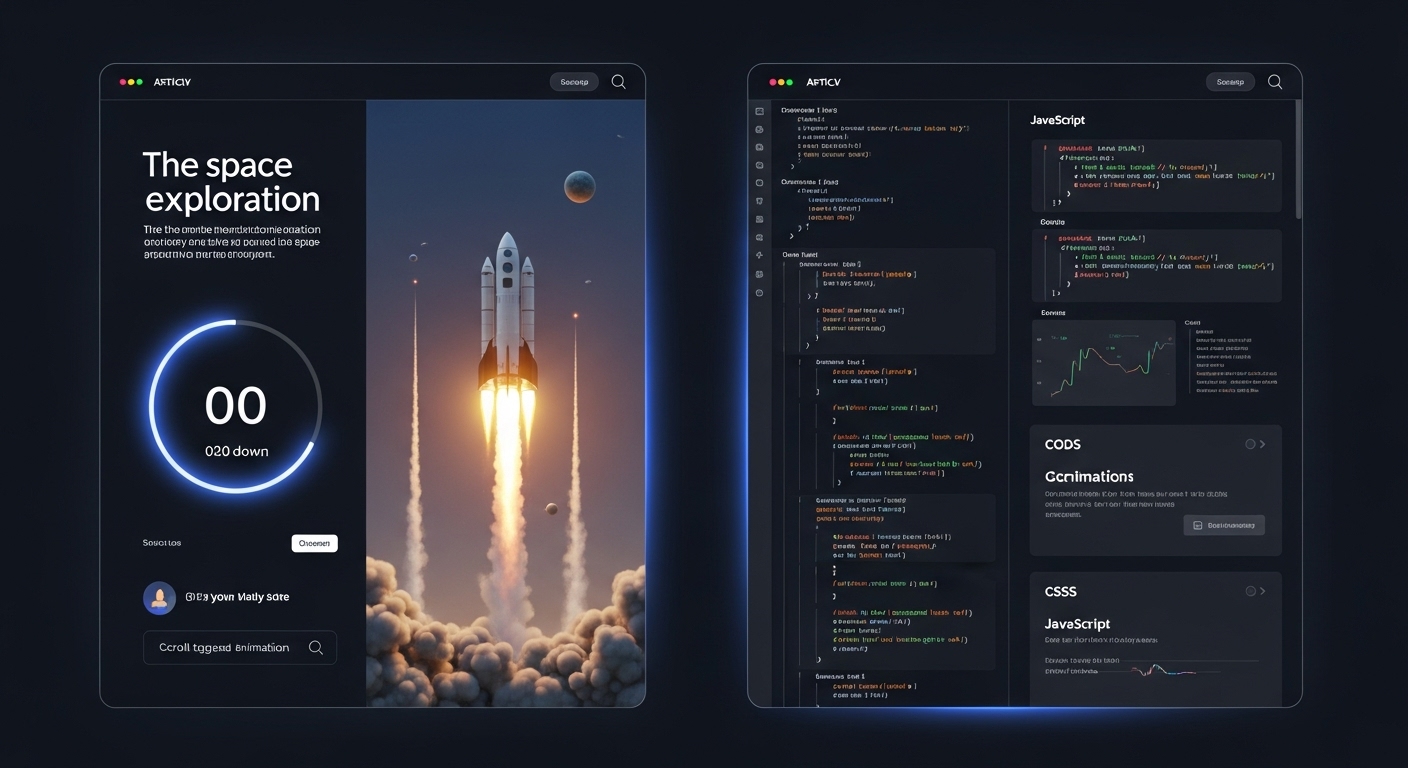
Trend 3: Scroll-Triggered Animations
What It Means
Scroll-triggered animations are effects that happen as users move down the page. Instead of just reading text and looking at pictures, the website responds to the scroll. This means elements can slide in, fade, zoom, rotate, or even change color based on where the user is on the page. It adds life and motion to the site, turning a simple scroll into a guided experience.
Real Example
Apple – Product Pages
Apple uses scroll-triggered animations brilliantly. On their iPad Pro and MacBook pages, as you scroll, the product zooms in or rotates, and detailed text slides in beside it. It feels smooth, polished, and futuristic, just like their brand.
Green Meadow – Sustainable Farming Website
This eco-focused site uses a scroll to show a growing plant. As you scroll down, the seed becomes a sapling, then a full plant. Facts about farming pop up at each stage. It’s a fun and powerful way to tell a story.
Why It’s Innovative
It turns reading into an experience. You don’t just scroll; you explore.
How You Can Use It
- Add fade-in effects for images or text.
- Animate icons or numbers as users scroll.
- Build a story section by section with motion.
Trend 4: Micro-Interactions for Big Impact
What It Means
These are small actions like hovering over a button and it changes colour, clicking a heart and it pulses, or moving your cursor and watching something react.
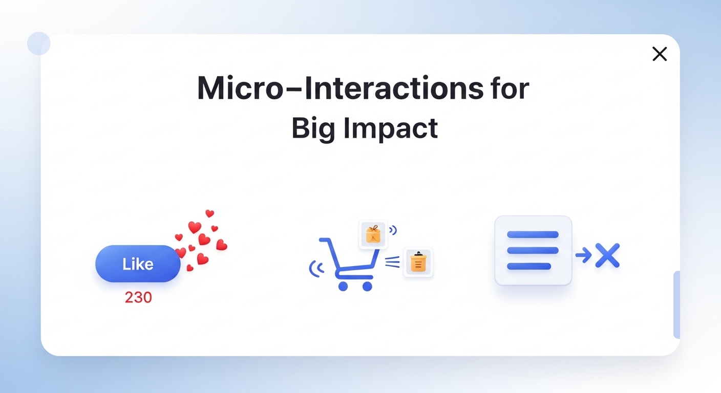
Real Example
Facebook’s "Like" button has a small animation when clicked. These small touches make actions feel real.
Mailchimp uses micro-interactions in their signup forms tiny bounces, colour changes, and even small illustrations that respond to clicks.
Why It’s Innovative
They improve the user experience. It feels like the site is alive and paying attention.
How You Can Use Micro-Interactions
You don’t need a big budget or a full design team to add these. Start simple. Even a few thoughtful micro-interactions can change how users feel about your site.
Here’s how to apply them:
- Buttons That React: Make your buttons change shape, colour, or size slightly on hover. Add a short animation when clicked, like a ripple or a bounce.
- Forms That Talk Back: When someone fills in a form field correctly, show a small checkmark. If they miss something, highlight it in red and add a gentle shake effect.
- Icons That Come Alive: Use animations for icons (like hearts, stars, or shopping carts) to confirm actions, like saving or adding to the cart.
- Scrolling Effects: As users scroll down, let images slide in, words fade in, or numbers count up. These help keep people engaged.
- Loading Screens: Instead of a plain spinner, show a fun animation while a page or file loads. This makes waiting feel shorter and more enjoyable.
- Notifications and Alerts: Use soft sounds, subtle motion, or small animations to alert users of a message, update, or action needed without being annoying.
Trend 5: Voice-Activated Interfaces
What It Means
Voice-activated interfaces allow users to talk to a website instead of using their fingers. This means users can search, ask questions, shop, or get help just by speaking. It makes using a website faster, easier, and more accessible for everyone, including people with disabilities or those who prefer hands-free browsing.
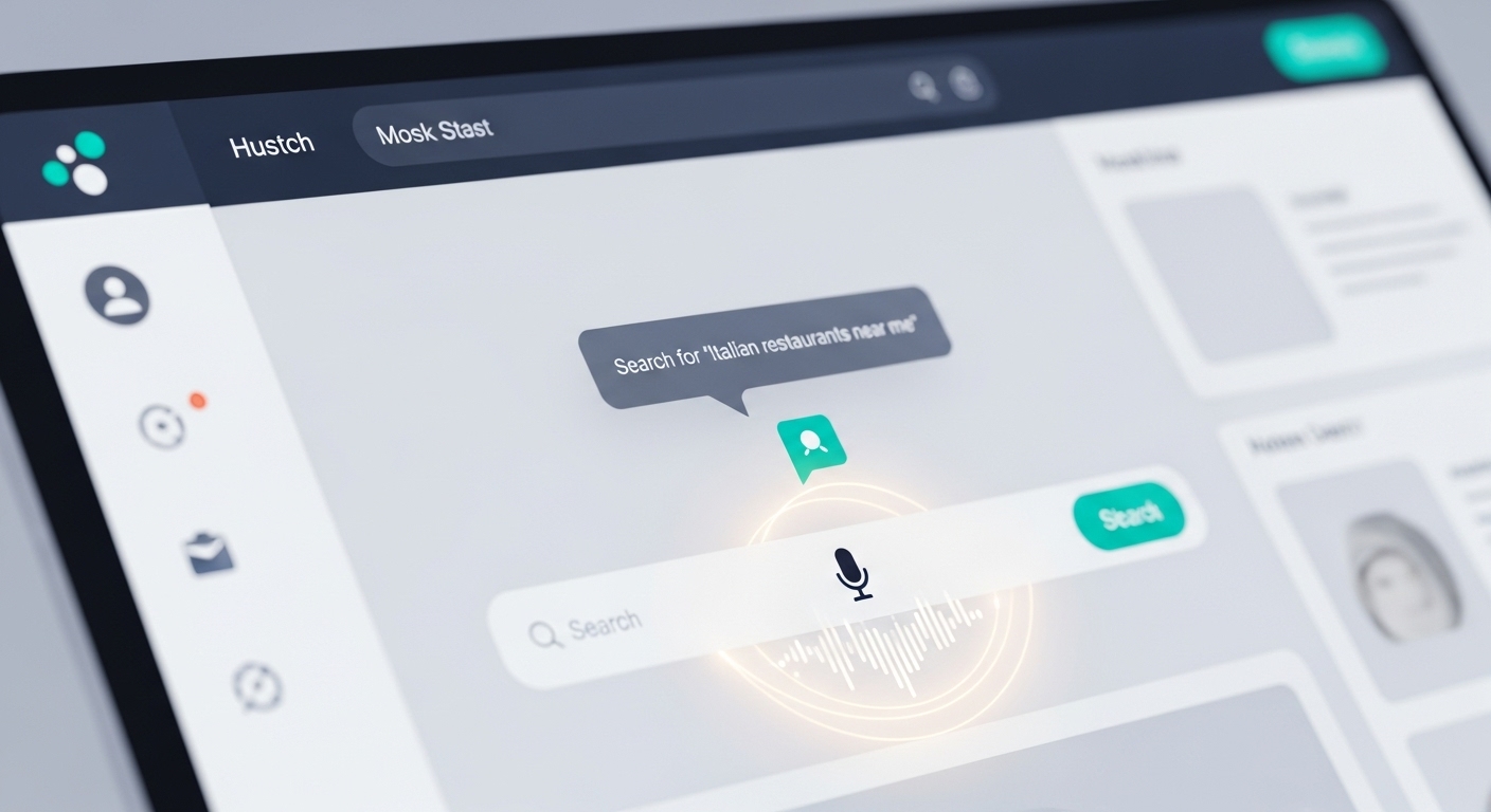
Voice technology has been common in phones and smart speakers. But now, it’s a major part of innovative web design in 2025. More websites are adding this feature to make user experiences smarter and smoother.
Real Example
Domino’s Pizza
Domino’s allows customers to place pizza orders using voice commands. You can talk to their site or app and say things like, “Order my usual” or “I want a large pepperoni pizza.” It remembers past orders and guides users through checkout using voice interaction.
BBC Story of Life
The BBC created an interactive website where users could explore animal stories by speaking. You say, “Show me sea creatures,” and the website brings up videos, facts, and pictures. It’s both fun and educational.
Why It’s Innovative
It’s fast, fun, and easy, especially for users with limited vision or mobility.
How You Can Use Voice Design To Innovate Your Website
You don’t need to rebuild your site from scratch. Here are easy ways to add voice features:
- Add a Voice Search Option: Use a voice search plugin or code to allow users to speak instead of typing. This is great for blogs, e-commerce stores, and service sites.
- Use Smart Voice Forms: Instead of making users type on mobile, let them fill out forms by speaking answers. This saves time and improves conversion rates.
- Allow Voice Navigation: Set voice commands like “Go to homepage,” “Show FAQs,” or “Play video” that trigger actions on your site.
- Combine Voice With Chatbots: Let users speak their questions to a chatbot and get voice or text responses. This makes support faster and more natural.
Trend 6: Bold, Custom Typography
What It Means
In 2025, bold, custom typography is no longer just a style choice; it’s a design powerhouse. Fonts have taken center stage as a key part of innovative web design. Websites are now using large, eye-catching letters to tell stories, show emotion, and guide users through the page. These fonts aren’t just big; they’re creative, hand-drawn, animated, and made specifically for each brand.
Instead of relying on standard system fonts, designers are building custom letterforms that feel personal and modern. These fonts often stretch, bounce, change colour, or even respond when hovered over. The type itself becomes part of the visual experience, as important as photos, colours, or layout.
Real Example
Spotify Design
Spotify’s design blog uses gigantic, creative text blocks that shift depending on screen size. Their fonts are playful yet professional, bold on desktop, and neat on mobile. They mix serif and sans-serif styles to keep each page fresh and readable.
Readymag
Readymag’s homepage features oversized, animated typography that changes as you scroll. Words stretch, shrink, and glide across the screen, guiding you from section to section. It’s storytelling through type without relying on heavy images.
Why It’s Called Innovative Designing
Fonts are a fast way to show mood and personality. You don’t need images to make an impact.
How You Can Use It
You don’t need to be a big brand to use custom typography. Here’s how small businesses or bloggers can join this 2025 trend:
- Use oversized headers: make your headlines big and bold to instantly grab attention.
- Pick a strong font pairing: Choose one custom font for titles and a clean font for body text.
- Add animations: try simple hover effects where letters shake, fade, or grow.
- Create a font that’s yours: Use tools like Fontself or Calligraphr to make your own lettering.
- Stay readable: Always check how your fonts look on mobile devices and different browsers.
Trend 7: Dark Mode Done Right
What It Means
Dark mode is when a website or app uses dark colours for the background instead of white or light shades. This doesn’t just look coolit also helps people in real ways. It reduces eye strain, especially at night, and saves battery on mobile devices. In 2025, innovative web design will use dark mode not just as an option but as a key part of the overall user experience.
Real Example
YouTube and Slack let users choose dark mode. They also remember your choice the next time you visit.
Stripe uses dark mode beautifully with neon effects, glowing borders, and clean layouts.
Why It’s Innovative
It’s more than a colour switch; it’s about user control and comfort. In 2025, dark mode isn’t just a trend. It’s expected. Great innovative web design uses it to improve focus, save energy, and offer choice. Modern sites also use adaptive dark mode, which automatically switches based on the time of day or the device’s settings. This means users don’t even have to click anything; it just works.
How You Can Use It
- Add a Dark Mode Toggle: Let visitors choose. Put a simple moon icon or switch in the top corner.
- Match Colours Carefully: Don’t just make everything black. Use deep blues, greys, and purples. Add bright text and buttons for contrast.
- Test Both Versions: Make sure your light and dark designs look and work great. Icons, images, and charts should be clear and colourful in both modes.
- Use Dark Mode for Mood: If your site is creative or tech-based, dark mode gives it a modern edge. For music, games, or fashion, it sets the tone.
Trend 8: Mobile-First, Desktop-Second
What Makes The Design Catchy
Mobile-first design means building a website for smartphones and tablets before designing it for desktops. In the past, designers made websites for computers and then tried to shrink them down to fit phones. But today, most people use phones to browse the web, especially Gen Z and Millennial users. That’s why innovative web design in 2025 starts small and scales up.
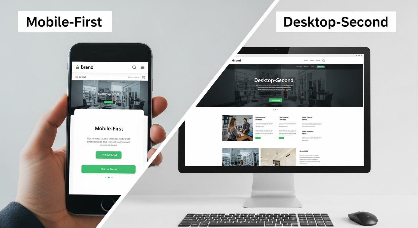
This trend ensures that the site looks great, works fast, and is super easy to use on smaller screens. It also helps websites load faster because mobile designs use fewer heavy images, cleaner layouts, and simplified features. Once the mobile site is perfect, designers expand it to the desktop, not the other way around.
Real Example
Uber: Its mobile site is one of the fastest and easiest to use. Riders can book a car, check prices, and confirm locations all with just their thumbs. Everything fits on a single screen, and the buttons are easy to tap.
Glossier: This beauty brand’s site uses big product images, swipe-able galleries, and thumb-friendly navigation. Their checkout is also one of the simplest, even on older mobile phones.
Why It’s Customer Centric
More people use phones than computers. Starting with mobile first means you reach more people.
How You Can Use It
- Start With Mobile Wireframes: When designing your site, plan how it will look on a phone before thinking about desktops or tablets.
- Test on Different Devices: Check how your site works on Android, iPhones, and tablets. Every small fix adds up to a better user experience.
- Cut What’s Not Needed: On small screens, less is more. Use only the most important buttons, images, and sections.
- Use Thumb Zones: Make sure key actions like “Buy Now”, “Submit”, or “Next” are in easy-to-reach areas of the screen.
Trend 9: Interactive Storytelling
What It Means
Storytelling is not just for books anymore. In innovative web design, storytelling becomes a full experience. It’s when a website takes visitors on a journey using text, visuals, animations, sounds, and scroll effects, just like a short film or a comic strip that you can explore at your own pace.
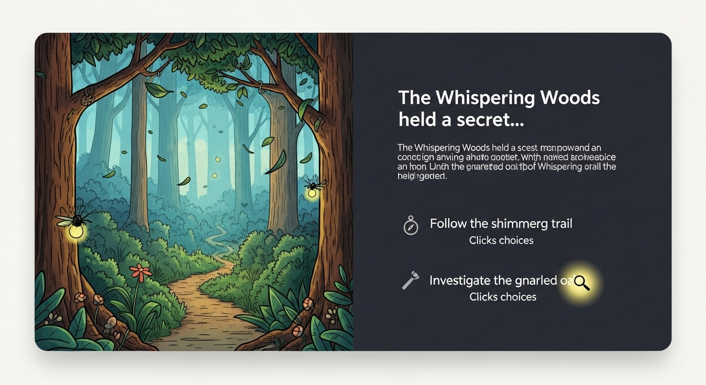
Instead of just reading or watching, users interact with the story. They click, scroll, or speak and the story changes based on their actions. This creates a powerful emotional connection and makes the website memorable.
Real Example
Spotify Wrapped
Every year, Spotify turns each user’s listening data into a fun, scrollable journey. People see their top songs, genres, and minutes listened to all wrapped in bright colours, music clips, animations, and personal messages. It feels like your own storybook.
The Ocean Agency’s “Glowing Glowing Gone”
This ocean conservation website takes users deep underwater. As they scroll, the background turns dark, fish glow in neon colours, and stats pop up to show the dangers coral reefs face. It’s a great example of innovation.
Why It’s Innovative
Interactive Website Design for storytelling doesn’t just share information; it creates an experience. It holds attention longer and helps people understand your message better. It’s not just about looking nice; it’s about making the visitor feel something.
This is especially useful for:
- Non-profits telling impact stories
- Brands launching a new product
- Artists or designers showing their creative process
- Educational sites teaching complex topics
When users are involved in a story, they are more likely to engage, share, and return.
How You Can Use It
You don’t need a big budget to use storytelling in your web design. Even small touches can turn a basic page into an adventure.
Ideas to try:
- Create a step-by-step journey: Use scroll-triggered animations to show how your product is made or how it solves problems.
- Add sound: Use background music or voiceovers on key sections to guide your users or set the mood.
- Use full-screen visuals: let your images, illustrations, or videos take up the whole screen, making users feel like they’re inside the story.
- Let users choose their path: Add buttons or sliders that allow users to choose what comes next.
- Include progress markers: show users where they are in the story and how much is left, like a chapter layout.
Trend 10: Floating Navigation Menus
What It Means
Floating navigation menus (also called sticky menus) are menus that stay visible as you scroll down the page. Instead of disappearing at the top, they “stick” to the screen, so users can always see and use them.
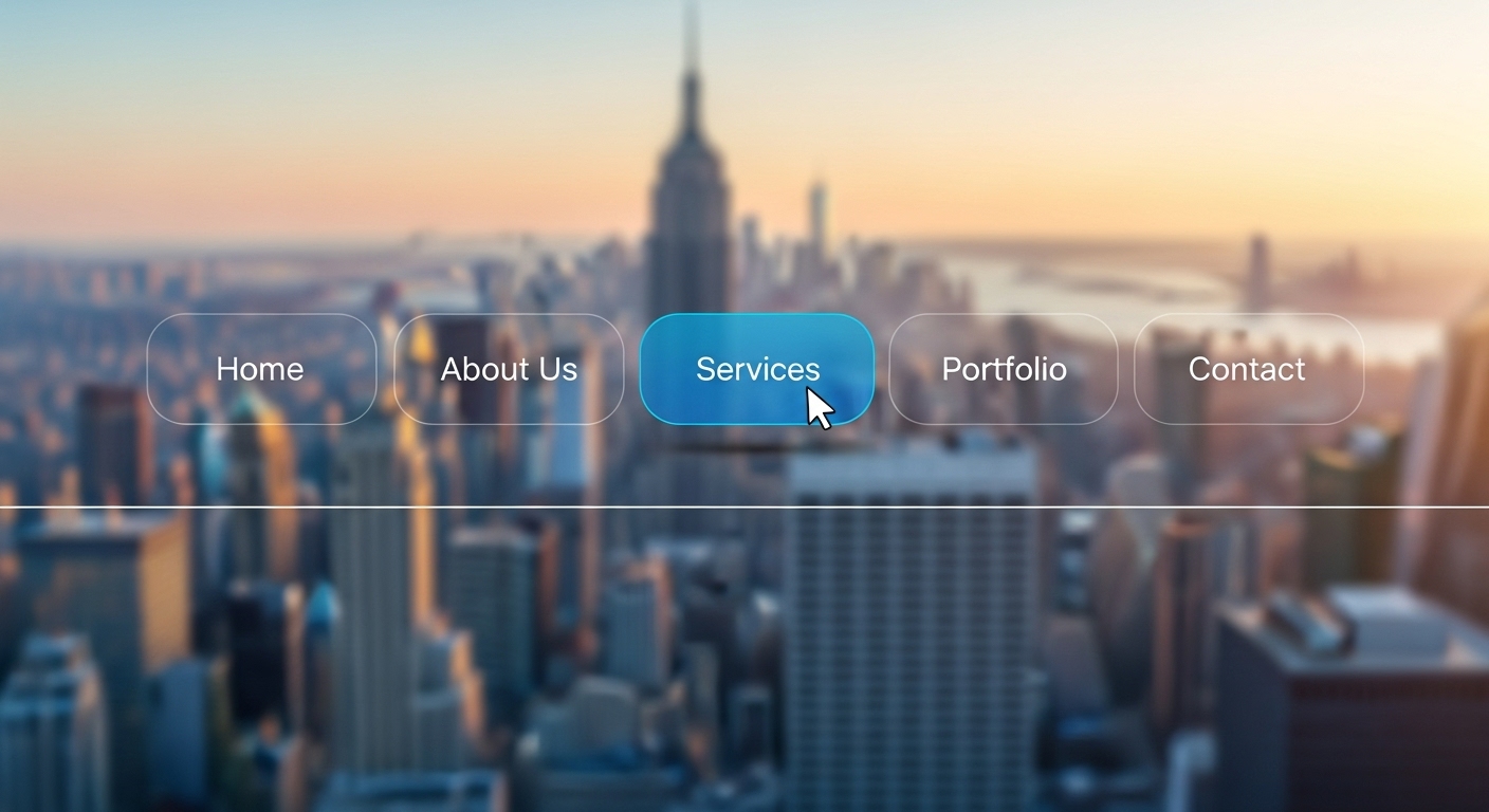
In innovative web design, these floating menus help users move around faster without needing to scroll back up. They're smart and simple and save time, especially on long or content-heavy pages.
Real Example
Amazon
On Amazon’s mobile site, the bottom navigation bar stays fixed. It gives quick access to the cart, home, and user profile. No matter how far you scroll, it’s always there to help you shop faster.
Medium
Medium, the blogging platform, uses a floating "clap" (like) and share bar that stays visible while reading. It keeps engagement tools in view without interrupting the reading flow.
Why It’s Innovative
In the past, menus would disappear as soon as you scrolled. Users had to scroll back up or hit “Home” again, which was frustrating. Floating menus fix this problem in a smart, user-friendly way.
They also let you show important items like a product link, sign-up button, or search bar at all times. This keeps users on track and helps increase sales or sign-ups.
How You Can Use It
You don’t need a full sticky menu. Start with these ideas:
- Sticky top menu: Keep your logo, menu items, and a CTA like “Contact” or “Get Started” always visible at the top.
- Floating bottom bar (for mobile): Add a sticky bar with quick links like “Call,” “Map,” “Home,” or “Buy.”
- Sticky sidebar (for blogs or guides): Show a list of sections users can jump to instantly, great for long-form content.
- Scroll-triggered CTA bar: After scrolling down a bit, show a small bar with a sign-up form or discount offer that follows the user.
Bonus Trend: Minimalist Layouts with a Twist
What It Means
Simple doesn’t mean boring. In 2025, minimalist layouts are still popular, but they now include exciting extras like bold colours, geometric shapes, or unexpected animations. These websites use fewer elements, but every detail has a purpose. It's clean, clear, and fun.
Instead of filling the page with too much text or graphics, these designs use smart white space, simple fonts, and sharp contrasts to guide the user’s eyes.
Real Example
Humaan, a digital agency, uses a minimalist layout with clever use of color blocks and hover effects. It feels modern, yet very easy to use.
Studio Rotate, a design studio, uses large white backgrounds, black text, and sudden bright colour flashes when hovering over links. This keeps the focus on their work without boring the viewer.
Why It’s Innovative
In a noisy world, minimalism with a twist stands out. It loads fast, looks professional, and feels calming. But the added “twist” makes sure it’s not forgettable.
It’s a perfect balance between beauty and clarity; less clutter means more focus.
How You Can Use It
- Stick to 2–3 colours, then add a surprise element like a neon button or rotating shape.
- Use big headings with plenty of space around them.
- Let images breathe; give them room instead of stacking everything close.
- Add small animations to links or icons so they stand out without overpowering the page.
You don’t need to use all the trends. Start with one or two that fit your audience best. What matters most is that your site works well and feels fresh.
Future Needs Innovation In Web Design
In 2025, innovative web design is not about following rules. It’s about breaking them in the right way. Whether it’s adding 3D effects, using voice controls, or creating bold type, each trend aims to make websites better for real people. To succeed online today, your site needs to feel personal, simple, and exciting. Use these design ideas to improve your website, stand out in a crowded internet, and keep visitors coming back. As trends continue to grow, one thing is clear: the future belongs to websites that think differently. Embrace innovative web design and lead the way forward.


.svg)
.svg)
.svg)
.svg)
