
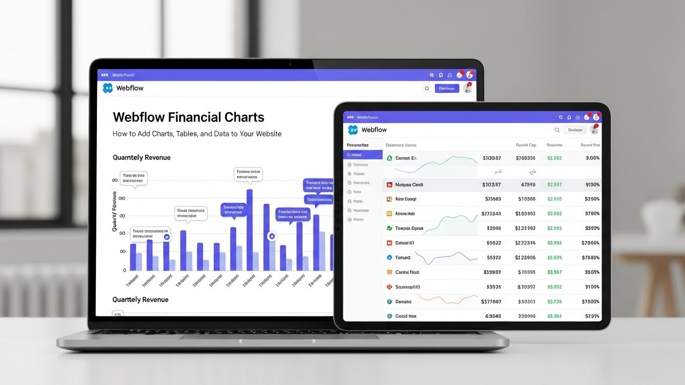
Webflow financial Charts help website owners turn raw numbers into clear stories. When visitors see clean charts and simple tables, they understand the data more quickly and trust it more. This matters for finance pages, reports, dashboards, and even blogs that explain trends.
Webflow financial Charts also improve how people stay on your site. Visual data keeps users engaged, supports informed decisions, and demonstrates that your website is trustworthy. When done right, charts feel natural, not heavy, and they guide readers instead of confusing them.
Why Webflow Financial Charts Matter for Modern Websites
Webflow financial Charts play a key role in how users read, understand, and trust information online. Most visitors do not want to spend time decoding long blocks of numbers. They visit a page to get answers fast and move forward with confidence. Charts make that possible by turning raw data into something easy to scan and easy to remember.
When numbers are shown visually, users can spot trends, changes, and comparisons in seconds. This is especially important for finance pages, pricing breakdowns, performance reports, and data-driven blog content. A clear chart removes doubt and reduces mental effort, which keeps users focused on your message instead of struggling with the data.
Clear charts help you:
- Explain complex data in seconds without long explanations
- Build trust by showing transparent and structured numbers
- Keep users engaged longer by guiding their attention visually
- Support decisions with visual proof instead of claims
Search engines also reward clarity. Pages that present information cleanly and helpfully often see better engagement. When users stay longer, scroll more, and interact with content, it sends strong quality signals that support ranking goals.
How Webflow Financial Charts Improve User Experience
Webflow financial Charts improve user experience by reducing effort at every step. Instead of reading paragraph after paragraph, users can glance at a chart and understand the main idea right away. This makes your content feel lighter, clearer, and easier to trust.
Charts guide the eye naturally. They help users focus on what matters most without distraction. When charts are placed near related text, users connect the explanation with the data instantly. This creates a smooth reading flow that feels natural and helpful rather than forced.
Good charts:
- Reduce bounce rates by keeping users interested
- Increase time on page by making content easier to explore
- Make content easier to share because visuals stand out
- Support accessibility when labels and context are clear
When users understand your data quickly, they feel confident. Confident users stay longer, explore more pages, and return when they need reliable information again. This is how strong user experience supports both trust and long-term growth.
Types of Webflow Financial Charts You Can Use
Webflow financial Charts come in different formats, and each one serves a specific purpose. Choosing the right chart type matters because it affects how fast users understand your data. A good chart does not just show numbers. It helps users see meaning, patterns, and relationships without confusion.
Using the correct chart type also improves trust. When data is shown in the right format, it feels honest and well-organized instead of forced or misleading.
Line Charts for Trends Over Time
Line charts work best when you want to show how values change over a period of time. They help users follow movement, direction, and pace at a glance. This makes them ideal for showing growth, decline, or steady performance.
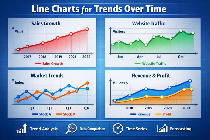
Line charts are commonly used to:
- Track revenue changes across weeks, months, or years
- Show monthly or quarterly performance
- Compare past and present data clearly
To keep line charts effective, avoid adding too many lines on one chart. Use clear labels and consistent spacing so users can follow the trend without effort.
Bar Charts for Clear Comparisons
Bar charts are ideal when the goal is comparison. They allow users to see differences between values instantly. This makes them useful for showing how items perform against each other.
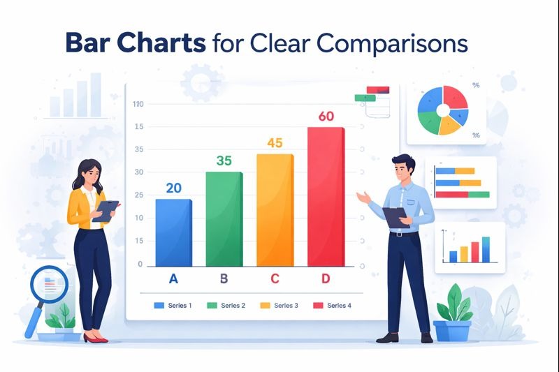
Bar charts are useful for:
- Comparing product or service sales
- Showing yearly or quarterly results
- Displaying performance across categories
Bars should be evenly spaced and easy to read. Use clear labels and keep the design simple so users can compare values without stopping to think.
Pie Charts for Simple Breakdowns
Pie charts work best when showing how parts fit into a whole. They help users understand proportion rather than exact numbers. When used correctly, they provide quick insight with minimal explanation.
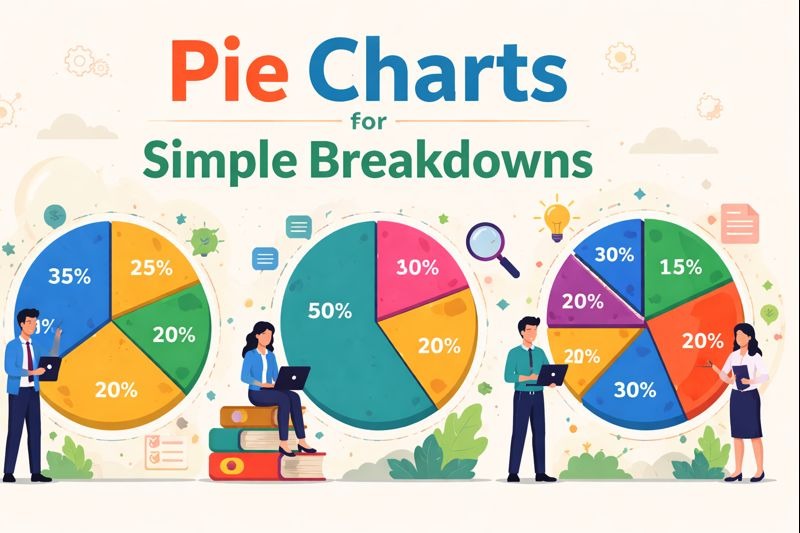
Pie charts are effective for:
- Budget allocation
- Market share comparison
- Expense distribution
To keep pie charts readable, limit the number of slices. Too many segments make the chart hard to understand and reduce its value.
Tables for Exact Financial Data
Tables support Webflow financial Charts by showing exact values. While charts show patterns, tables provide precision. They are useful when users want to review or verify specific numbers.
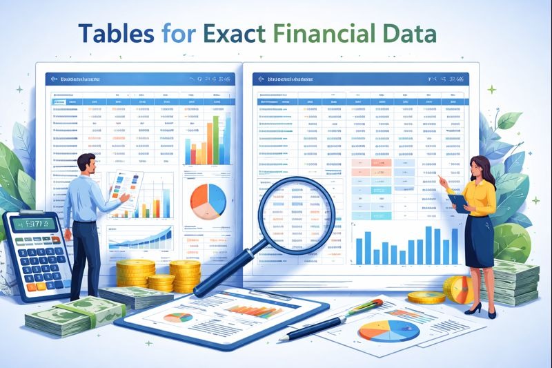
Tables are best used for:
- Detailed financial reports
- Downloadable or reference data
- Transparent financial records
Always pair tables with short explanations. This helps users understand what the numbers represent and how they should be read. Clear context makes tables more useful and easier to trust.
Ways to Add Webflow Financial Charts Without Coding
Webflow financial Charts do not require a complex setup or technical skills. Webflow works well with external tools that let you create charts visually and add them to your site in minutes. This makes it easy for designers, writers, and business owners to share financial data without touching code.
By using trusted tools, you can keep your charts accurate, responsive, and easy to update. These methods also reduce errors and save time when data changes.
Using Google Sheets for Live Data
Google Sheets is one of the easiest ways to manage Webflow financial Charts with live updates. It works well for ongoing reports, price tracking, and performance data that changes often.
You can:
- Create charts directly inside Google Sheets
- Publish the chart so it updates automatically
- Embed the published chart inside Webflow
This method keeps data fresh without manual edits. When numbers change in the sheet, the chart updates on your site. It also allows teams to manage data without logging into Webflow each time.
Google Sheets charts are simple, reliable, and ideal for small to medium data sets.
Using Chart Embed Tools
Many chart platforms offer ready-to-use embed links that work smoothly with Webflow. These tools handle the visual design while Webflow displays the result.
The steps are simple:
- Build your chart using the tool’s editor
- Copy the provided embed code
- Paste it into a Webflow embed element
These tools often include responsive settings, so charts adjust to screen size automatically. Always test charts on mobile and tablet views to make sure labels remain readable, and nothing is cut off.
Embed tools are a fast option when you need clean visuals without extra setup.
Using External Chart Platforms with Webflow
Webflow financial Charts can also come from trusted external platforms that specialize in financial data. These platforms add depth and credibility when used with clear explanations.
TradingView Charts for Market Data
TradingView offers real-time charts used by analysts and investors. These charts work well for websites that cover financial markets or price movements.
They are helpful for:
- Stock data
- Crypto trends
- Market movement over time
TradingView charts update automatically, which helps maintain accuracy. When using them, keep the layout simple and explain what users are seeing in plain language. This avoids confusion and improves trust.
Datawrapper for Clean Visuals
Datawrapper focuses on clarity and ease of reading. It is well-suited for Webflow financial Charts in reports, blog posts, and research pages.
It helps you:
- Create readable charts with clean layouts
- Adjust colors to improve accessibility
- Embed charts smoothly into Webflow
Datawrapper works especially well when you want charts that feel neutral, professional, and easy to understand. It also supports responsive design, which keeps charts usable on all screen sizes. These methods give you flexible options to add Webflow financial Charts without technical barriers. The key is choosing the tool that matches your data size, update needs, and audience expectations.
Best Practices for Designing Webflow Financial Charts
Webflow financial Charts must be easy to read at a glance. A chart can hold correct data and still fail if the design feels confusing or heavy. Good design helps users trust the numbers without effort. When charts look clean, users focus on meaning instead of trying to figure out what they are seeing.
Before listing specific tips, remember this rule: a simple design builds trust and avoids confusion. Every visual choice should support understanding, not decoration.
- Use clear labels
Labels should explain what each value represents. Axis names, dates, and units must be easy to spot. If a user cannot understand the chart in five seconds, it needs improvement. - Avoid bright or harsh colors
Strong colors distract and tire the eyes. Soft, neutral tones work better for financial data. Use one highlight color only when you want to draw attention to a key point. - Keep fonts readable
Text inside charts should match your website style and stay readable on small screens. Avoid thin fonts or tiny text that disappears on mobile devices. - Show only useful data
Do not add extra lines or bars that do not support your main message. Too much data creates noise and weakens trust. One clear idea is always better than many unclear ones. - Add short explanations below the charts
A short sentence below the chart helps users understand why the data matters. This connects the visual with the story you are telling and improves clarity.
Each chart should answer one clear question. If it does not, it does not belong on the page.
How to Keep Financial Charts Accurate and Updated
Webflow financial Charts lose their value when the data is old or unclear. Even a well-designed chart can damage trust if users suspect the numbers are outdated. Accuracy shows responsibility and respect for your audience.
Before listing habits, remember that users rely on financial data to make decisions. That responsibility should guide how charts are maintained.
Good habits include:
- Regular data checks
Review your charts often to make sure numbers match the latest information. Small errors can reduce trust quickly. - Clear update schedules
Decide how often data should be updated and stick to that schedule. Whether weekly or monthly, consistency matters more than speed. - Visible date labels
Always show when the data was last updated. This removes doubt and helps users judge relevance. - Source mentions
State where the data comes from in simple language. Trusted sources improve credibility and support transparency.
Accuracy supports trust and aligns with search quality standards. When charts are current and honest, users stay confident, and search engines see your content as reliable.
SEO Benefits of Webflow Financial Charts
Webflow financial Charts support SEO when they are used with care and clear intent. Search engines aim to rank pages that help users understand information quickly and accurately. Charts do exactly that when paired with helpful explanations.
Visual data keeps users engaged. When visitors spend more time reviewing charts and related content, it sends positive engagement signals. These signals suggest that the page is useful, which supports stronger visibility in search results.
They help by:
- Increasing visitor interaction through longer page visits and deeper scrolling
- Supporting topical depth by explaining data visually and in text
- Encouraging backlinks when charts are clear, useful, and easy to reference
- Making content easier to understand, which reduces confusion and exits
Charts also support content clarity. When users understand numbers without effort, they trust the page more. Search engines notice this behavior and tend to favor pages that present information cleanly and honestly.
Accessibility Tips for Webflow Financial Charts
Webflow financial Charts should be usable by all visitors, including those who rely on assistive tools. Accessibility is not only a usability improvement, but also a quality signal that supports long-term SEO.
Accessible charts make sure that every user can understand the data, even if they cannot see the visuals clearly. This improves overall site experience and reduces frustration.
Accessibility basics include:
- Text labels for every chart so data is clear without color alone
- Color contrast that meets readability standards for all users
- Descriptive headings that explain what each chart shows
- Table alternatives so screen readers can read the data
Accessible design supports both users and rankings. When charts are clear, labeled, and supported by text, they serve a wider audience and align with search quality guidelines.
Common Mistakes to Avoid with Webflow Financial Charts
Webflow financial Charts can lose their value when they are used without care. Even accurate data can confuse users if it is presented poorly. Small mistakes often lead to lower trust, weaker engagement, and missed ranking opportunities.
One common issue is trying to show too much at once. When a page is crowded with charts, users feel overwhelmed and stop paying attention. Each chart should answer one clear question and support the main topic of the page.
Avoid:
- Overloading one page with charts that compete for attention
- Using unclear labels that force users to guess the meaning
- Hiding data sources or failing to mention them
- Showing outdated numbers that reduce credibility
Charts should guide users, not distract them. If a chart does not add clarity or value, it does not belong on the page. Simplicity always performs better than excess.
Building Trust with Transparent Financial Data
Webflow financial Charts help build trust when they are paired with honesty and clear context. Users are quick to question numbers that appear without explanation. Transparency removes doubt and creates confidence.
A short explanation near each chart helps users understand what the data represents and why it matters. When users know where numbers come from, they are more likely to believe them and act on them.
Always:
- Explain where the data comes from in plain language
- Avoid exaggeration or selective numbers
- Match charts with supportive text that adds meaning
- Update numbers regularly to keep content accurate
Trust builds when users feel educated, not pushed toward a decision. Honest charts show respect for the reader and strengthen long-term credibility.
How Webflow Supports E-E-A-T Standards
Webflow financial Charts support strong experience, expertise, authority, and trust when used correctly. Search engines look for clear signals that content is reliable and created with care.
You show:
- Experience by sharing real, relevant financial data
- Expertise through clear explanations that remove confusion
- Authority by citing reliable sources and tools
- Trust by keeping information accurate and updated
When charts are accurate, explained clearly, and updated regularly, they align naturally with search quality standards. This approach supports rankings while also serving real people who want clear and honest information.
Scaling Webflow Financial Charts as Your Site Grows
Webflow financial Charts should grow alongside your website. As you add more pages, reports, and data, charts must stay easy to find and easy to understand. Without structure, even good data can feel overwhelming and reduce trust.
As traffic increases, visitors expect clarity. They want to locate relevant charts quickly and understand how current data compares to older information. A clear system keeps users confident and reduces confusion.
As your site grows:
- Group charts by topic so users can follow related data easily
- Use consistent styles for colors, labels, and layout across all charts
- Create data hubs where users can explore related charts in one place
- Archive old data clearly so users know what is current and what is historical
This structure keeps your site organized and easy to navigate. It also helps search engines understand your content better, which supports long-term ranking and visibility.
When to Use Charts and When Not To
Webflow financial Charts are powerful, but they should be used with purpose. Charts work best when they clarify information, not when they repeat what text already explains well.
Use charts when:
- Patterns matter, and trends need to be seen over time
- Comparisons help users make decisions quickly
- Data supports claims and adds visual proof
Avoid charts when:
- A short sentence explains the point clearly
- The data set is too small to justify a visual
- Context is missing and could confuse users
Balance is key. Charts should be relevant to your message, not distract from it. When used at the right moments, Webflow financial Charts strengthen clarity, trust, and user experience.
Final Thoughts on Webflow Financial Charts
Webflow financial Charts turn financial data into clear stories. They help users understand numbers without effort and build trust through transparency. When charts are simple, accurate, and well placed, they support both readers and search engines.
Webflow financial Charts work best when paired with honest explanations and regular updates. Focus on clarity, accuracy, and purpose. Do that well, and your charts will support strong rankings and confident users.


.svg)
.svg)
.svg)
.svg)
