

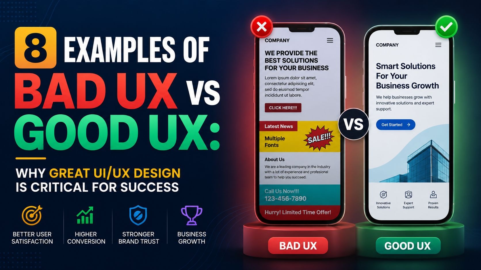
A well-designed mega menu can make or break user experience. Whether you run an e-commerce store, a blog, or a corporate website, a mega menu helps users navigate effortlessly while boosting engagement. Below, we explore 15 must-see mega menu examples that combine creativity, functionality, and responsiveness perfect for 2025 and beyond.
The Power of a Well-Designed Mega Menu
A mega menu is more than just a big dropdown. It's a powerful tool that helps organize a lot of information in a way that's easy to understand and use. Think of it as a super-powered table of contents for your website. When done right, a mega menu can improve how long people stay on your site, how many pages they visit, and even how many sales you make. It’s all about making the journey through your website smooth and enjoyable.
We've found that the best mega menu designs balance looking good with being super useful. They don't just show links; they often include images, short descriptions, and even calls to action, guiding visitors exactly where they need to go. This level of detail and organization is what sets truly effective mega menu examples apart from the rest.
Why a Mega Menu Matters for Your Website
In Digital Landscape, where attention spans are short, a mega menu helps cut through the noise. It immediately gives visitors a clear overview of your site's content. This means less clicking around, less frustration, and more happy customers. For businesses with many products or services, a mega menu becomes a critical navigation tool, preventing visitors from getting lost or overwhelmed. It's about providing a clear path, every time.
Top 15 Must-See Mega Menu Examples for 2025
Let's dive into some of the most impressive mega menu designs we’ve seen, perfect for inspiring your next website project. These 15 Must-See Mega Menu examples showcase creativity, user-friendliness, and responsiveness across various industries.
1. ASOS: The Visual Powerhouse

ASOS uses a mega menu that’s incredibly visual and easy to navigate. It uses large images and clear categories to help shoppers find what they need quickly. When you hover over a main category like "Women," a large panel appears with subcategories, trending items, and even promotional banners. This design works because it gives a lot of options without feeling cluttered, using white space and clear typography. It’s effective because it helps shoppers see the variety of products at a glance, making their shopping journey simpler and more enjoyable.
2. Macy's: Department Store Organization
Macy's offers a classic example of a mega menu built for a massive inventory. Their menu organizes products by department, making it simple to browse. When you hover over a category like "Home," a wide dropdown shows columns for different home goods, brands, and even specific sales. This system works by providing a structured, hierarchical view of their vast product range, which helps customers quickly narrow down their search. It’s an effective design for large retailers as it mirrors how people typically shop in a department store.
3. Nike: Sporty and Streamlined

Nike's mega menu is all about simplicity and speed, reflecting their brand identity. It uses clean lines and focuses on key product categories. When you select a main item like "Men," the menu reveals clear subcategories such as "Shoes," "Clothing," and "Accessories," often with popular featured items. This menu works by keeping the design minimal yet highly functional, allowing users to quickly jump to desired sections without distraction. It's particularly effective for a brand with a strong focus on specific product lines.
4. Adidas: Bold and Brand-Focused

Adidas's mega menu is visually striking, using large images and clear calls to action within the menu itself. When you hover over a category like "New Arrivals," the menu displays large product shots alongside categorized links. This design works by immediately drawing the eye to key products and promotions, making the Browse experience more engaging and visually rich. It’s effective because it combines navigation with marketing, showcasing new and popular items directly within the menu.
5. Amazon: The Ubiquitous Navigator
Amazon's mega menu, while often subtle, is a masterclass in handling immense complexity. Their "All" categories menu is a powerful example of how to organize countless products. When you click on "All," a comprehensive list of categories appears, allowing for deep dives into specific product types. This menu works by providing an exhaustive, yet organized, index of everything available on the platform, which is crucial for a marketplace of its size. It’s effective because it allows users to navigate a colossal inventory with surprising ease.
6. Nordstrom: Elegant and Curated

Nordstrom's mega menu is designed with an upscale feel, offering curated categories and featured collections. When you hover over "Women," for example, you see not just clothing types, but also designer sections and style guides. This approach works by combining practical navigation with a curated shopping experience, guiding customers through a refined selection. It’s effective because it helps customers discover items beyond a simple product search, appealing to a sense of style and quality.
7. The North Face: Adventure-Ready Navigation

The North Face uses a mega menu that clearly focuses on product categories for outdoor enthusiasts. When you select "Men's," the menu shows subcategories for jackets, pants, footwear, and even specific activity gear. This menu works by logically segmenting their specialized product lines, making it easy for adventurers to find gear for specific needs. It's effective because it caters directly to their niche audience, providing quick access to relevant products.
8. Lululemon: Health and Lifestyle Focused

Lululemon's mega menu reflects their brand's focus on active living and wellness. It organizes products by activity and also highlights lifestyle categories. When you hover over "Women," the menu might show yoga wear, running gear, and also accessories and community links. This menu works by connecting products to activities and lifestyle choices, appealing to their target audience's broader interests. It’s effective because it reinforces brand identity while providing clear product navigation.
9. Target: User-Friendly for Everyday Shopping
Target's mega menu is designed for the everyday shopper, focusing on broad categories and easy access to departments. When you click "Departments," a large panel displays categories like "Electronics," "Home," "Groceries," often with popular sub-sections. This menu works by offering a clear, straightforward path to various shopping areas, making it quick for customers to find common items. It’s effective for a general merchandise retailer as it prioritizes ease of use and familiarity.
10. Best Buy: Electronics Made Simple
Best Buy's mega menu is tailored for electronic products, using clear categories and sometimes highlighting popular tech trends. When you hover over "Computers & Tablets," you might see links for laptops, desktops, gaming PCs, and even specific brands. This menu works by breaking down complex electronic categories into manageable sections, helping customers navigate a vast range of technical products. It's effective because it simplifies the often-overwhelming process of buying electronics.
11. Zappos: Shoes and More, Seamlessly

Zappos employs a mega menu that excels in organizing a massive inventory of shoes and accessories. Their menu focuses on precise categorization by gender, type, and even brand. When you hover over "Women," the menu shows detailed subcategories like "Boots," "Sandals," and "Heels," alongside popular brands and sales. This design works by offering highly specific filters within the menu, making it easy for customers to quickly narrow down their search for the perfect pair. It's effective because it caters to the highly specific nature of shoe shopping, allowing for quick and accurate navigation.
12. Wayfair: Home Goods Galore

Wayfair’s mega menu is designed to handle an enormous catalog of home furnishings and decor. It organizes items by room, product type, and even style. When you select "Furniture," the menu expands to reveal subcategories like "Living Room Furniture," "Bedroom Furniture," and even specific furniture pieces like "Sofas & Couches." This menu works by providing a logical and detailed breakdown of home goods, helping customers find specific items within a vast selection. It’s effective because it allows for efficient Browse across a diverse range of home products, making a large inventory feel manageable.
13. Staples: Office Essentials Organized

Staples uses a mega menu that efficiently categorizes office supplies and technology. Their menu typically groups items by type of product or common office needs. When you hover over "Office Supplies," the menu displays sections for "Paper," "Pens & Pencils," and "Desk Organization," often with quick links to popular items or deals. This design works by providing a clear and functional roadmap to their comprehensive range of office products, catering to both business and home office users. It’s effective because it streamlines the process of finding specific office essentials quickly and effortlessly.
14. Sephora: Beauty Unveiled

Sephora's mega menu is visually appealing and organizes beauty products by category, brand, and sometimes by specific concerns. When you hover over "Makeup," the menu often shows categories for "Face," "Eyes," and "Lips," alongside featured brands or new arrivals. This menu works by combining a clear product hierarchy with a visually engaging presentation, making the discovery of beauty products enjoyable. It's effective because it simplifies Browse through a wide array of beauty items, from skincare to fragrances, making it easier for customers to find what they need or explore new products.
15. The Home Depot: DIY Navigation Master
The Home Depot's mega menu is built for a vast array of home improvement products and services. It categorizes items by department, project type, and even specific brands. When you hover over "Tools," the menu typically displays sections for "Power Tools," "Hand Tools," and "Tool Storage," often with links to project guides. This design works by providing a comprehensive and logically structured overview of their extensive product range, helping both casual DIYers and professional contractors. It’s effective because it allows users to navigate quickly through specific sections relevant to their home improvement needs, making a huge inventory easy to manage.
Crafting Your Own Mega Menu for 2025 Success
When we think about building a mega menu that truly works, we focus on a few key things. First, it has to be responsive. This means it looks and works great whether someone is on a big computer screen or a small phone. A good mega menu will adapt to different screen sizes, making sure everyone has a smooth experience.
Second, it needs to be modern. This isn't just about looking fancy; it's about using the latest design ideas to make it intuitive. Think clean lines, easy-to-read text, and clear images. A modern mega menu doesn't clutter the screen but instead guides the eye to important information.
Third, and perhaps most importantly, it must be creative. While following best practices is good, a truly stand-out mega menu finds unique ways to present information. This could be through interesting layouts, smart use of icons, or even subtle animations that enhance the user experience without being distracting. The goal is to make it memorable and effective, encouraging people to explore your site further.
The Future of Navigation: Responsive and Intuitive
Website Design is always changing, but one thing remains constant: the need for easy navigation. As we look towards 2025 and beyond, we see the importance of responsive mega menu designs growing even more. With so many different devices out there, a menu that seamlessly adjusts is not just a nice-to-have; it's a must-have.
We also believe in intuitive design. This means a mega menu should feel natural to use, almost as if it knows what you're looking for before you even click. This is achieved through clear labels, logical grouping of items, and a visually appealing layout that doesn't overwhelm the user. The goal is to make the journey through your website feel effortless, guiding visitors to their desired content with ease.
Final Thoughts on Your Mega Menu Strategy
Creating a top-tier mega menu is a crucial step in making your website a leader in its field. It's about more than just aesthetics; it's about making your site genuinely useful and enjoyable for every visitor. By carefully considering the layout, visuals, and responsiveness, you can build a mega menu that not only looks fantastic but also significantly improves your site's performance and user engagement. Remember, a great mega menu is a clear indicator of a well-thought-out website, and it can be the key to outranking the competition.


.svg)
.svg)
.svg)
.svg)
